While covering Kernest in Episode 53 of our podcast we came across Kernest (@Kernest), a hosted font service. Jay was particularly impressed with the Konstellations font pairing subscription that Kernest offers. So we asked Garrick Van Buren the service’s founder if he’d spend some time talking with us on Skype about what he as going on with Kernest.
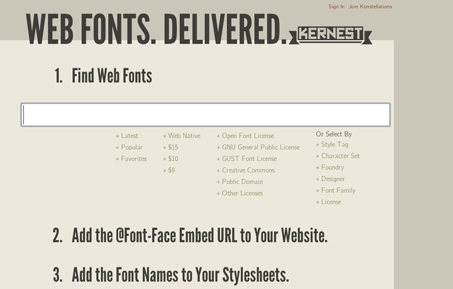
Kernest is a hosted font service using @font-face for delivery, which aims to keep the many complex variations of font licensing simple and straightforward for you the designer. Garrick noted that he originally conceived of and created Kernest as a service for himself. Kernest serves up the fonts directly from their servers and offers downloads too. They also have a Drupal plugin if you need it.
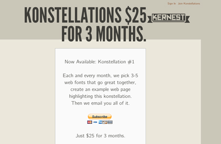
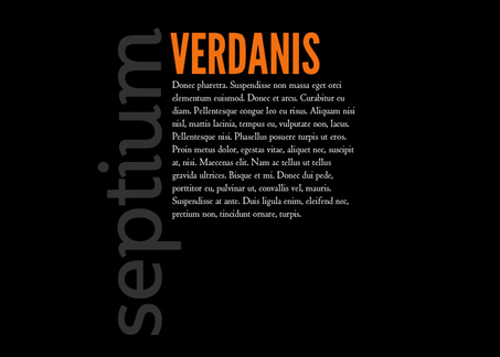
Konstellations was really the thing that caught our eye. It’s such a cool idea, pairing of typefaces that are available for you to use, it seems so simple… Garrick noted in the interview that he really wants to help push web typography in a way that it was pushed offline. Because a particular font can now be used on your website doesn’t mean it should be used by default. You need to make sure it’s appropriate. Also with all these new font combinations we have to be able to make good decisions in what we select, things traditional designers have been dealing with for years but for us in this industry are really new issues as it relates to truly working with these newly available typefaces.
Make sure you check out Kernest and the Konstellations subscription service, we think it’s an intriguing product and denotes the direction type for the web is starting to go in.
As an added bonus, Garrick is going to give away a 3 month subscription to Konstellations. Just leave us a comment below about how you’ve used web fonts in a recent project or want to use web fonts in a future project. We’ll choose randomly from the commenters on Wed (Dec 15, 2010). The winner will be refunded the 3 months subscription price when they signup for Konstellations.
A little more about Garrick Van Buren (from garrickvanburen.com)
 Garrick Van Buren is President of Working Pathways, Inc. a web application strategy and design company. He has assisted companies like Sun Microsystems, Target, Orbitz.com, and countless start-ups in developing and maintaining a customer-centric web presence. Garrick co-founded and contributes to the MNteractive.com and PodcastMN.com communities, and continues to publish one of the first podcasts – The First Crack Podcast. Garrick also built Kernest – the first web font licensing service.


I am just now discovering the joys of using non-system fonts on the web after 15 years of building websites. Garrick’s Konstellations series has inspired me to try new things in my designs from more than strictly a font perspective.
Konstellations really pushes the envelope in terms of font positioning and rotation. Fun stuff!
I am a “type snob” when it comes to print; I know a nice font when I see it, yet I have never purchased or spent time on a site due to awesome fonts. So don’t waste your money trying to impress other designers. After all they are the only ones that even care.
I can gather a test group and I know if you show two sites one with Georgia and another with a House font then next day ask them about the text they wont have a clue.
So unless your market is to designers don’t burn money. You can make device fonts communicate well.
For free.
@Dino – I couldn’t disagree with you more, plus I think you’re missing the point.
Great interview. I too am excited about the progression of non-system fonts on the web.
@Dino – I guess i’m having trouble with you being a ‘type snob” yet not seeing the value of “awesome fonts” on the web. There seems to be a disconnect here. Do you not like paying for the font license? Or are you just against designers using non web standard fonts?
I agree with you that most people will not consciously notice a font change, but to think that it goes unappreciated is simply ignorant. You say that people will not buy items on a site based on fonts alone, which may or may not be true. But fonts, as you know are a huge part of the experience and push the realm of design on the web. Style, nuance, texture and branding can all be conveyed simply through a header with a specific font., and it shows!
Although I appreciate the different point of view, from a design standpoint it seems that you are rallying for stagnation and uniformity instead of pushing the limits of design and creativity – which ultimately is what it’s about.
Congratulation to Toby Cryns, for the subscription to Kernest/Konstellations. We’ll email you but if you don’t hear from us please email us back here at UMS for info on how to be hooked up.
Actually, everyone. Garrick is so cool he’s giving each of you commenters a free 3 months of Konstellations. Email us at info@unmatchedstyle.com so we can send you the signup form!