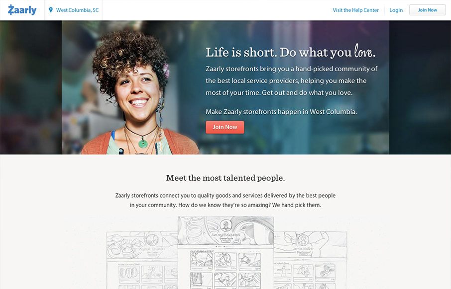
zaarly.com has a soft elegant aesthetic that beautifully balances multiple styles. The open layout and dark grey type keep the design from feeling cluttered, even on site specific pages (like zaarly.com ). It’s a ‘no fluff’ design style doesn’t feel utilitarian. Very sweet.


The Call to Action, Revisited
The Call to Action hasn’t changed in a decade, but the bar has. A fresh look at prominence, copy, mobile tap targets, and accessibility, with lessons from three major design systems.


0 Comments