Web Design Inspiration Curated
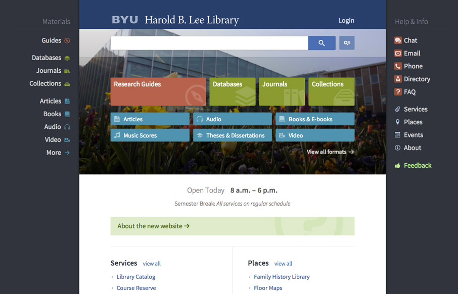
BYU Library
Very interesting user experience design going on. I really dig the fixed side menus a lot. Very smart interactions. Wow. Just wow. New website for @BYU Libraries: http://t.co/xxO000oA9E Soon to be the envy of all #libweb types. Nice work, @HBLL— Erin White...
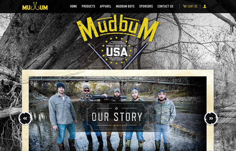
Mudbum
Interesting content with a good looking strong design to boost it up. I love how it tells their story so well and sets the tone with the visual brand at the same time. Makes me want to get out on the lake and catch some catfish man.
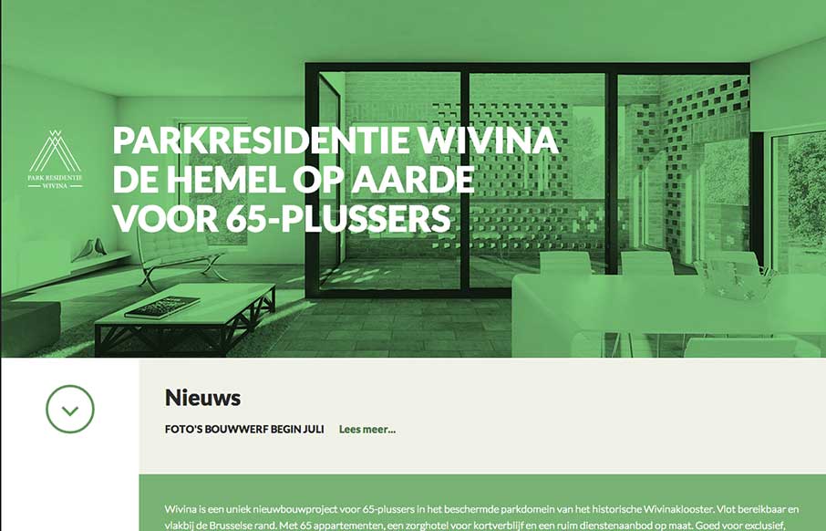
wivina.be
I like how the website feels like it slides into place over the big header "hero" image area, then looks like a standard style left column nav based design. That's a cool effect that's really just about positioning the page elements smartly.
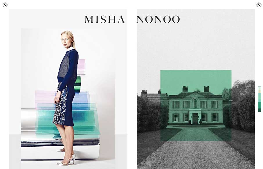
misha nonoo
This is a smart and beautiful site. It packs in all the elements of a slick magazine, but on one page. I'm not usually a fan of modals, but these work because of the "static" nature of the site.
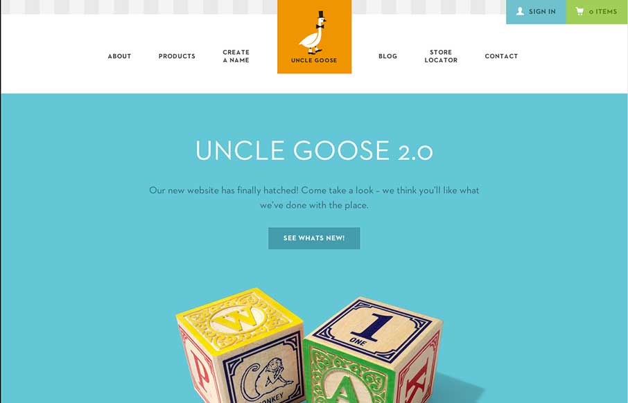
Uncle Goose
Old Mother Hubbard ain't got nothin' on Uncle Goose... I wanted to do some Andrew Dice Clay when I saw this site - but finally realized how inappropriate that might be... Now on to the site: What really sticks out is the attention to design - of the blocks, and the...
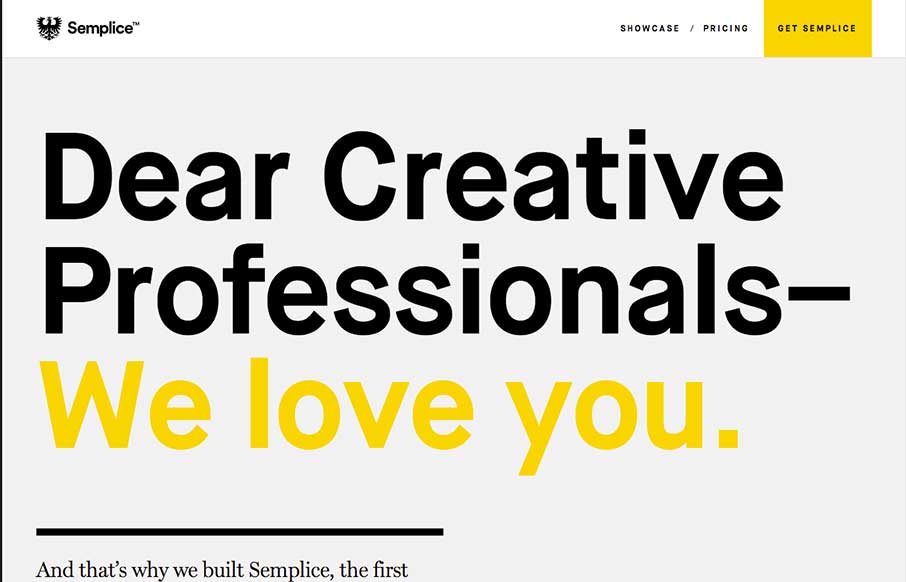
Semplice
Pretty cool looking page design for this WP plugin. I like the branding and the visual layout of the page too. Good stuff. Anyone tried the plugin?
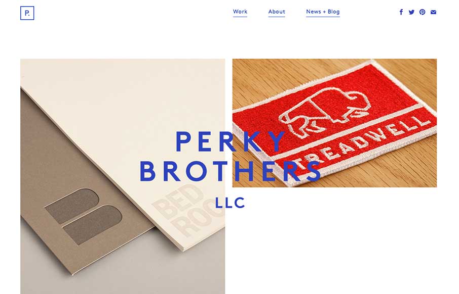
Perky Brothers
Nice minimal design for Perky Brothers. I love the name. I also really like the overlay of the words that sit on top of the images and stay put as you scroll down the page.
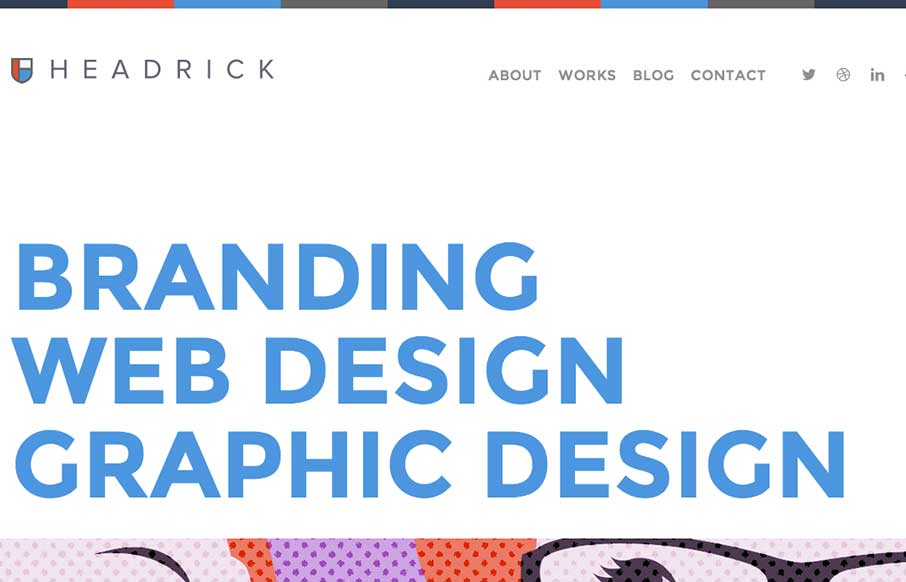
Tony Headrick
I like how the type and the line work in this layout are all big and bold yet the page feels soft at the same time. Really unique yet familiar feeling at the same time. Smart work. Submitted by: Tony Headrick @tonyheadrick Role: Designer & Developer
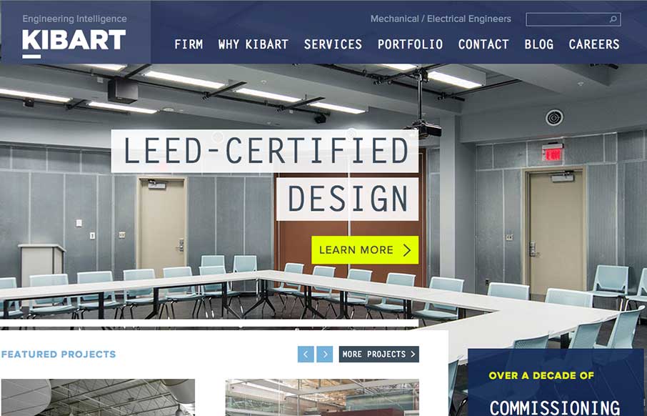
Kibart Engineering
I dig the look of this design. It's flat and clean and really feels like a engineering company to me. Only wish it was responsive, but otherwise a really smart looking layout. Steve Semanchik @vitaminisgood Role: Designer The Kibart home page showcases the firm’s best...
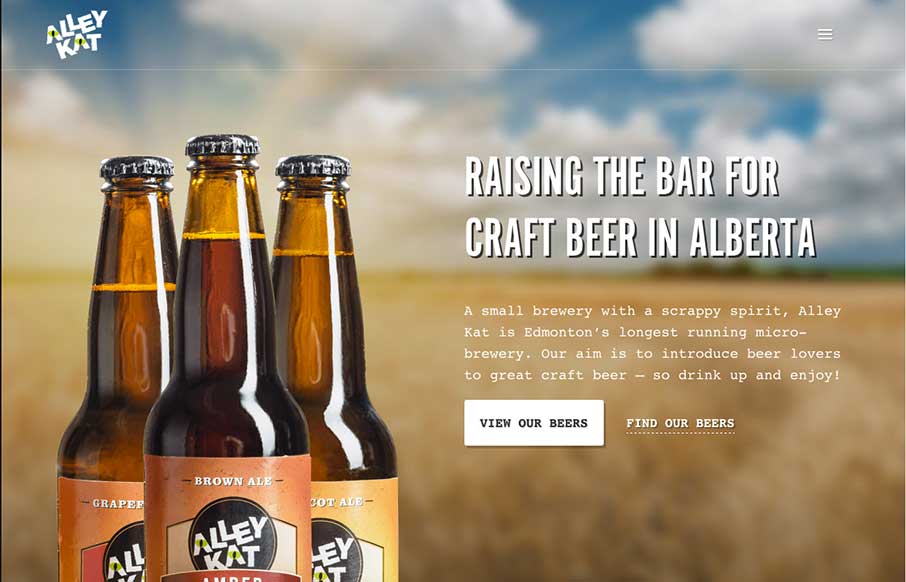
Alley Kat
Nice design that feels "crafted" with some hand made looking sections, the type plays into this nicely. The site utilizes a Full Screen Overlay style navigation pattern which seems to fit aesthetically but not functionally too well.
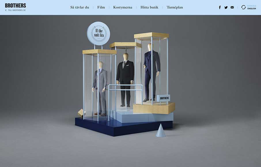
Brothers
Fun layout and sometimes weird details make this page pretty fantastic to me. Enjoy.
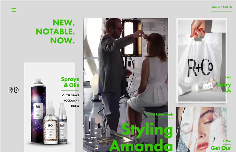
R+Co
Another full page overlay style navigation in use. I like how it's utilized here since you can largely get around the site without using the nav which is a good thing in this case. Otherwise the site is pretty out there visually, which I like 🙂
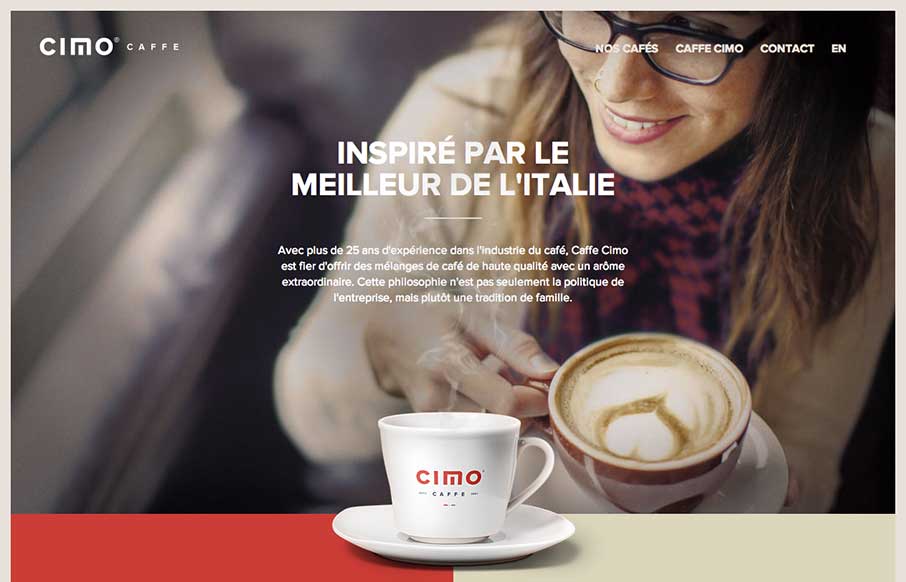
Cimo Coffee
Really nice use of contrast. I'm not just talking about colors, but the way they contrast the photos and real imagery of coffee bags with flat areas of color and blocky bold type and icons. Really gives this page a nice rich visual feel. Love it, now for some coffee.
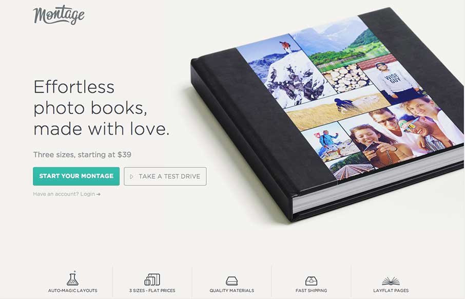
Montage
Man, I love just about every aspect of this design. I especially love the way the main nav slides up into the header and "becomes" a top anchored nav. Just go scroll the page around and then come back. See what I mean, cool right?
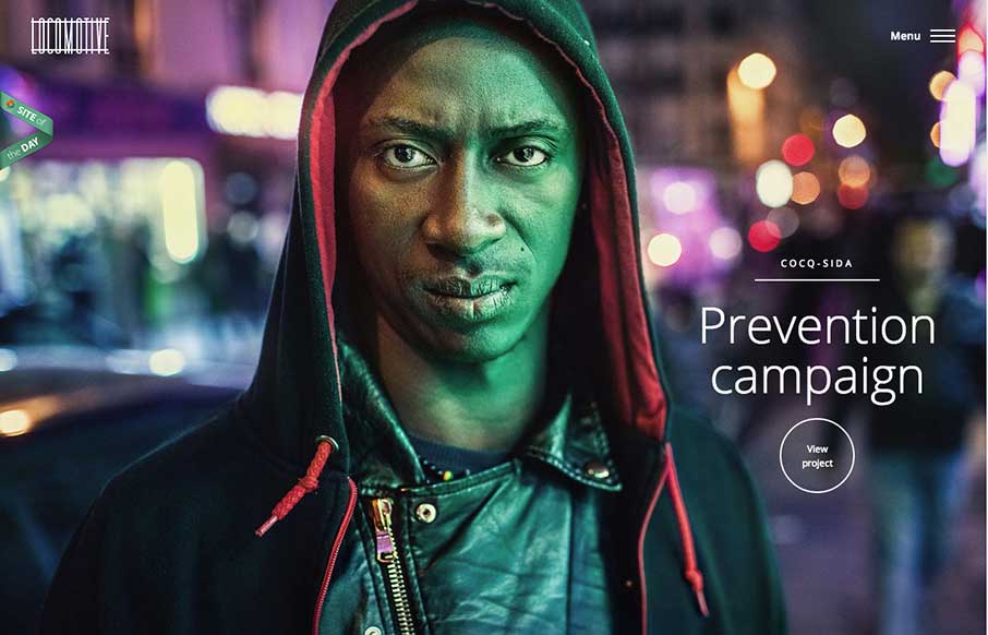
Locomotive
Pretty cool feel to this site. I like the colors and the blocky approach to the layout visually. Pretty fast movement and interaction speeds as well which lead to it feeling faster overall to use.
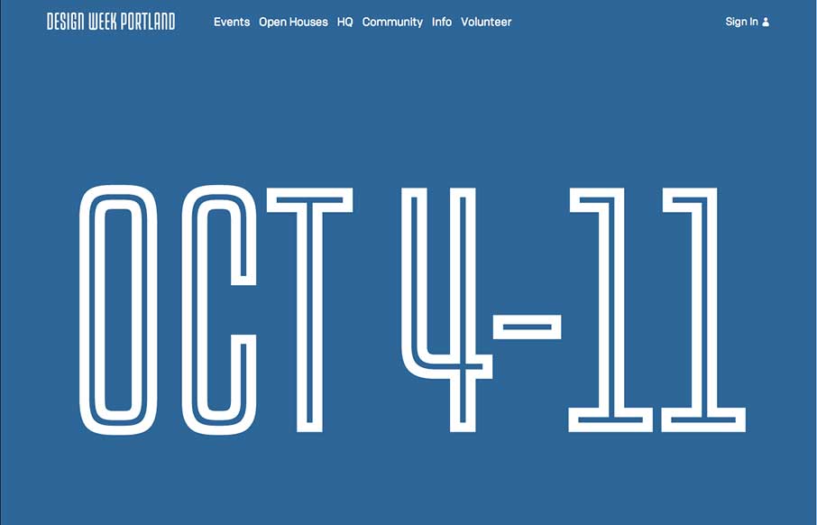
Design Week Portland
Simplicity and achieving marketing goals can indeed go hand in hand despite what your client will try to tell you (that's a joke...) The Design Week Portland is simple and beautiful and get's the job done while at the same time communicating something that is quite...
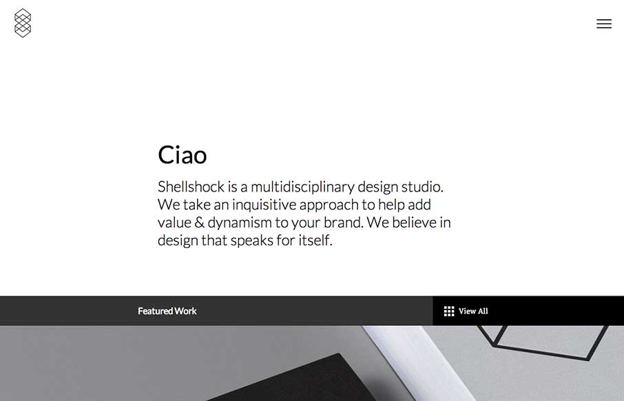
Shellshock
I really like all the little interactions and stuff designed into this minimal looking designed website. The load in animation on the main nav is pretty slick. I'm not wild about only having the hamburger icon alone on there, but otherwise the page is quite navigable...
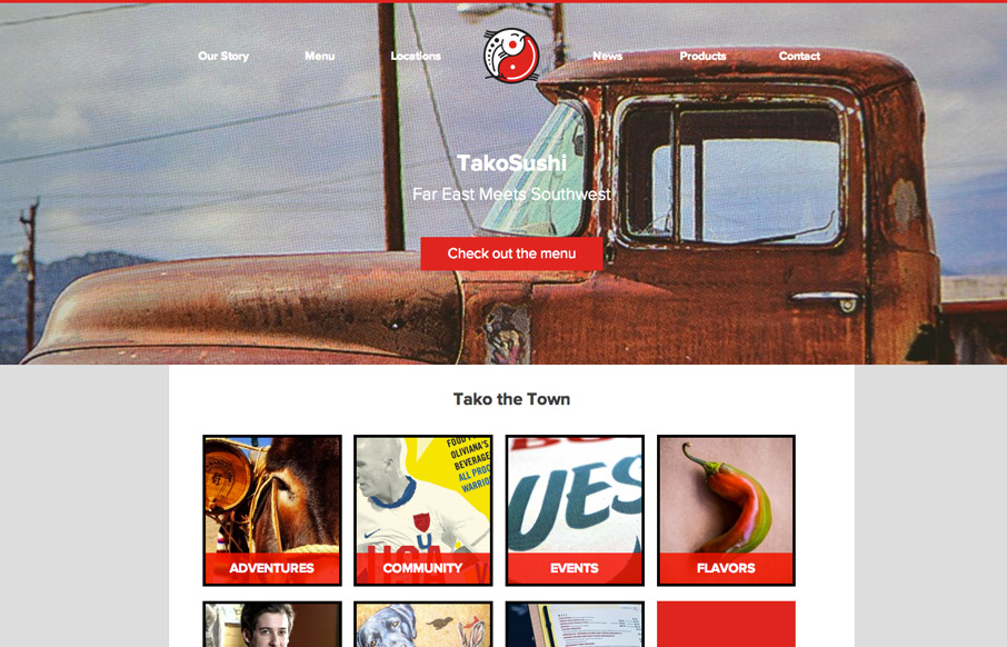
Tako Sushi
It's not often we come across a website for a restaurant in our home town of Columbia, SC that we love. We both love the food at this place and the website is pretty awesome looking too. It's simple and effective and has some pretty badass branding to go along with...
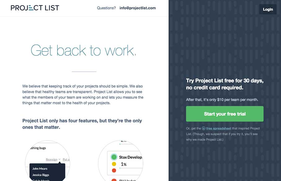
Project List
There is a lot to love about this website for Project List. I like the split screen design, I haven't seen something like this done very well, until today. I also really dig the interaction design on the sign up form process. That's some good UX. With a front page...
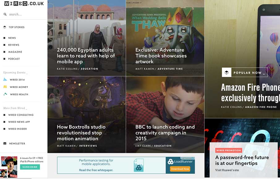
wired.co.uk
Man... usually infinite scroll on most sites isn't so infinite... I still haven't gotten to the end of Wired UK's collection of cool photos and stories on this vertical infinite scroll... still going... nope... Obviously the pictures on the home page make it an...
EMAIL NEWSLETTER
News & Articles
Brian Hoff on The NBSP Show
![]() This episode’s guest is Brian Hoff a graphic designer living in Brooklyn, New York. Episode hosted by Christopher Schmitt and Dave McFarland.
This episode’s guest is Brian Hoff a graphic designer living in Brooklyn, New York. Episode hosted by Christopher Schmitt and Dave McFarland.
Design and Thought – Psychology and User Experience
 Maria’s review of a talk on how we logically apply aesthetics, complexity, affordance, and focus to a design problem to create intuitive user experiences.
BizCraft Episode 1
 Episode 1 of the BizCraft podcast with Carl Smith and Gene Crawford. Recorded live on June 15th.

HARD WORK. CLEAN FUEL. NO EXCUSES
Use “WARRIOR2023″ for 10% off.