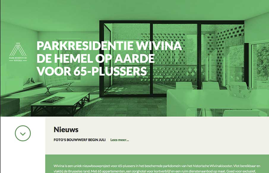
I like how the website feels like it slides into place over the big header “hero” image area, then looks like a standard style left column nav based design. That’s a cool effect that’s really just about positioning the page elements smartly.


The Call to Action, Revisited
The Call to Action hasn’t changed in a decade, but the bar has. A fresh look at prominence, copy, mobile tap targets, and accessibility, with lessons from three major design systems.


0 Comments