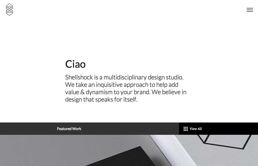
I really like all the little interactions and stuff designed into this minimal looking designed website. The load in animation on the main nav is pretty slick. I’m not wild about only having the hamburger icon alone on there, but otherwise the page is quite navigable without utilizing a nav, so that’s a win there. My favorite part is the “what we do” section on the page, the loading line that kicks off each section is smart. It made me sit there and watch all three load up.


The Call to Action, Revisited
The Call to Action hasn’t changed in a decade, but the bar has. A fresh look at prominence, copy, mobile tap targets, and accessibility, with lessons from three major design systems.


0 Comments