wired.co.uk

wired.co.uk

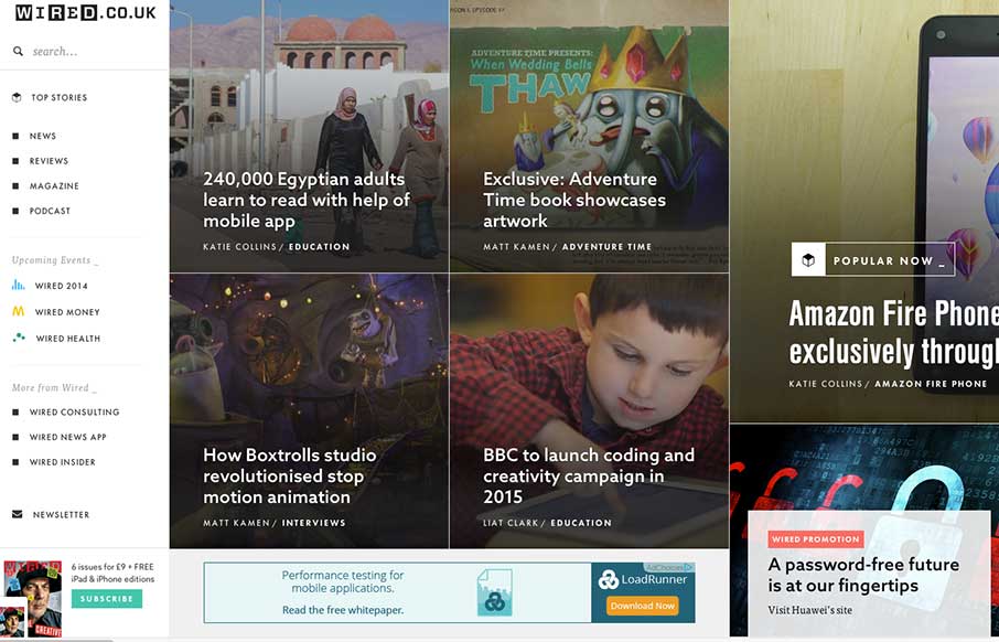
Man… usually infinite scroll on most sites isn’t so infinite… I still haven’t gotten to the end of Wired UK’s collection of cool photos and stories on this vertical infinite scroll… still going… nope… Obviously the pictures on the home page make it an enticing website, but when you get to the actual articles – the layout is inventive. The article itself is laid out fine and readable, ads aren’t intrusive, links are just bolded to allow easier reading (but then the hover over looks like yellow highlighter – nice touch for paper people), and on most of the articles, the images / video hang out on the right, but fly up as you scroll down (see this article – it’s not a kitten or puppy (ok, it’s a cockatoo), but representative: http://www.wired.co.uk/news/archive/2014-09/08/cockatools

Man… usually infinite scroll on most sites isn’t so infinite… I still haven’t gotten to the end of Wired UK’s collection of cool photos and stories on this vertical infinite scroll… still going… nope… Obviously the pictures on the home page make it an enticing website, but when you get to the actual articles – the layout is inventive. The article itself is laid out fine and readable, ads aren’t intrusive, links are just bolded to allow easier reading (but then the hover over looks like yellow highlighter – nice touch for paper people), and on most of the articles, the images / video hang out on the right, but fly up as you scroll down (see this article – it’s not a kitten or puppy (ok, it’s a cockatoo), but representative: http://www.wired.co.uk/news/archive/2014-09/08/cockatools

Kinsta

0 Comments

Submit a Comment

Your email address will not be published. Required fields are marked *

Time limit exceeded. Please complete the captcha once again.

News & Articles

The Call to Action, Revisited

The Call to Action, Revisited

The Call to Action hasn’t changed in a decade, but the bar has. A fresh look at prominence, copy, mobile tap targets, and accessibility, with lessons from three major design systems.

Brutalism: The Beauty of Breaking the Rules

Brutalism: The Beauty of Breaking the Rules

Brutalism in web design rejects perfection for authenticity. Stark grids, raw type, and honest structure create interfaces that feel human, intentional, and impossible to ignore. Break the rules, on purpose.

