
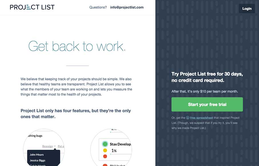
There is a lot to love about this website for Project List. I like the split screen design, I haven’t seen something like this done very well, until today. I also really dig the interaction design on the sign up form process. That’s some good UX. With a front page like this, I can only imagine what the app is like. Sign me up!


Fitts’s Law: Why the Easy Button Wins
Large, close targets are faster to hit than small, distant ones, that’s Fitts’s Law. A look at the 1954 rule behind buttons, prime and magic pixels, thumb zones, and dark patterns.


0 Comments