This website has a nice clean layout that displays its product quite well while replicating the design of the phone into the layout of the site.
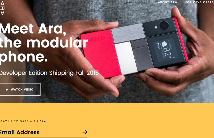
This website has a nice clean layout that displays its product quite well while replicating the design of the phone into the layout of the site.
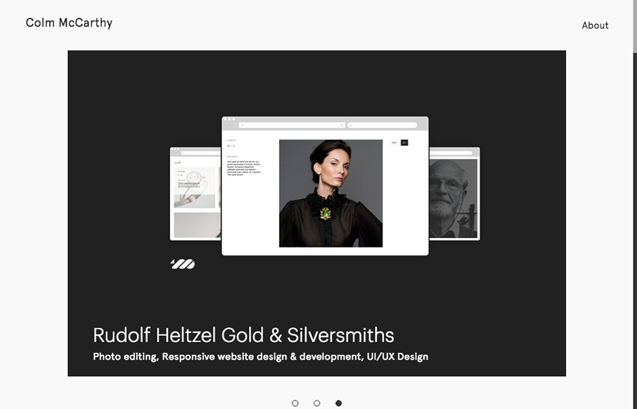
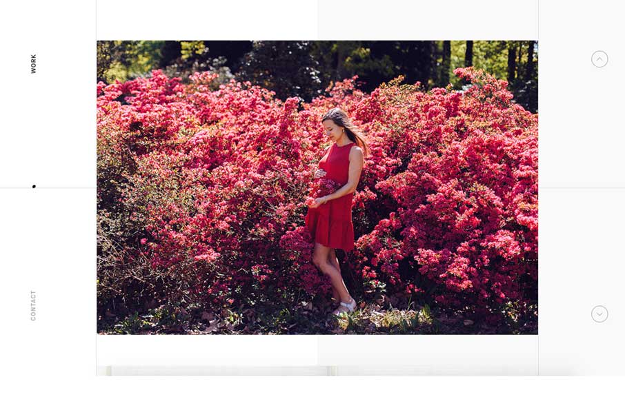
Nice, minimal portfolio site from Colm McCarthy out of Ireland. Like the use of the text over the main image on the work detail pages - interesting to see how it lands on different viewports.
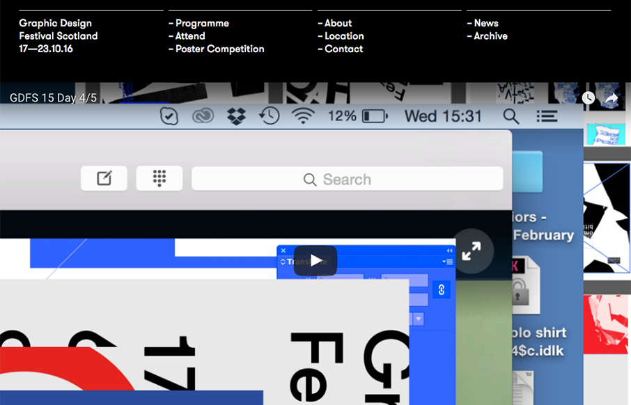
Love the smart use of the gridlines for the Graphic Design Festival in Glasgow, Scotland. Simple and clean - good stuff. From the Designer: Graphic Design Festival Scotland is an international organisation promoting creativity, innovation, collaboration and...
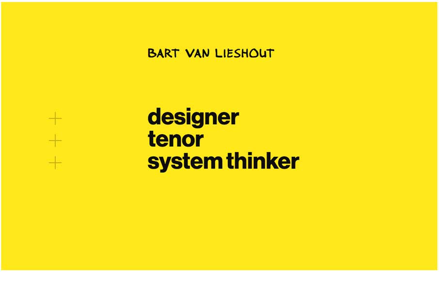
Bart van Lieshout is a designer and singer. And he occasionally writes blog post on design and futuristic topics. His personal website has a clean information architecture and simple interactions. It was designed to offer a pleasant reading experience on all platforms...
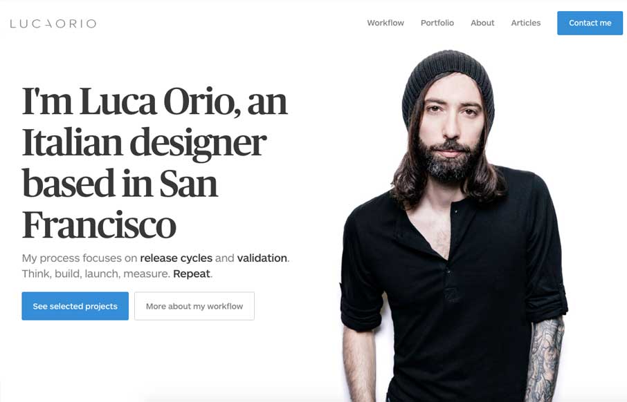
Pretty slick and straight forward portfolio site for Luca Orio. Style and class go a long way and this designer has those in large amounts. I love this site. From the Designer: Luca Orio is an Italian designer based in San Francisco. His process focuses on release...
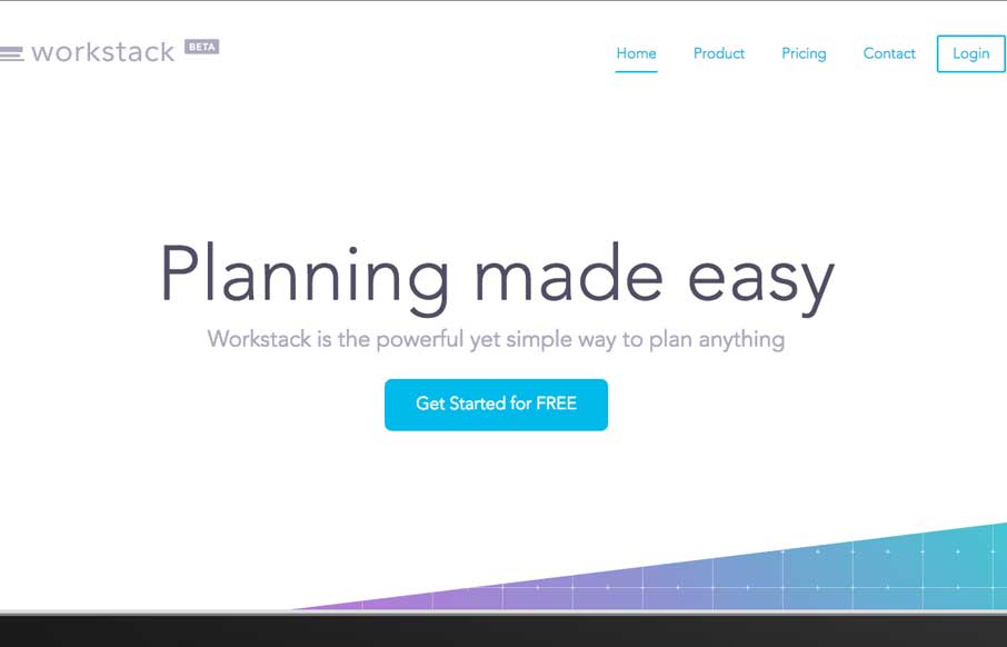
Lots of standard layout stuff for this web app product, but it's just. I don't know, nicer. I love the oversized image for the view of the product and the overall vibe is just nice. Clean simple design that focuses on showcasing the product by avoiding any unnecessary...
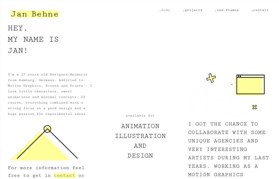
Pretty nifty change of direction for the Jan Behne portfolio site. I dig it, I love the way the three columns are used. Very print design like but totally digital in it's content and deliver. Smart work. Hey, I'm a Graphic Designer and Animator from Hamburg, Germany....
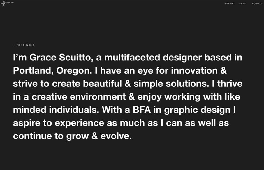
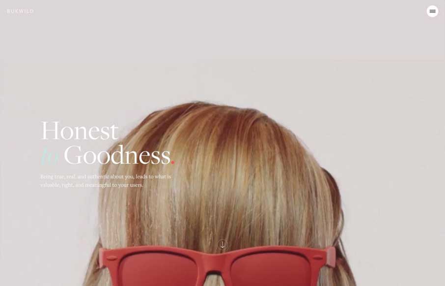
Really simple website design, we've seen stuff like this before, but I just dig this one. I love the 80's inspired script for the logo and the overall simplicity that the work is presented.
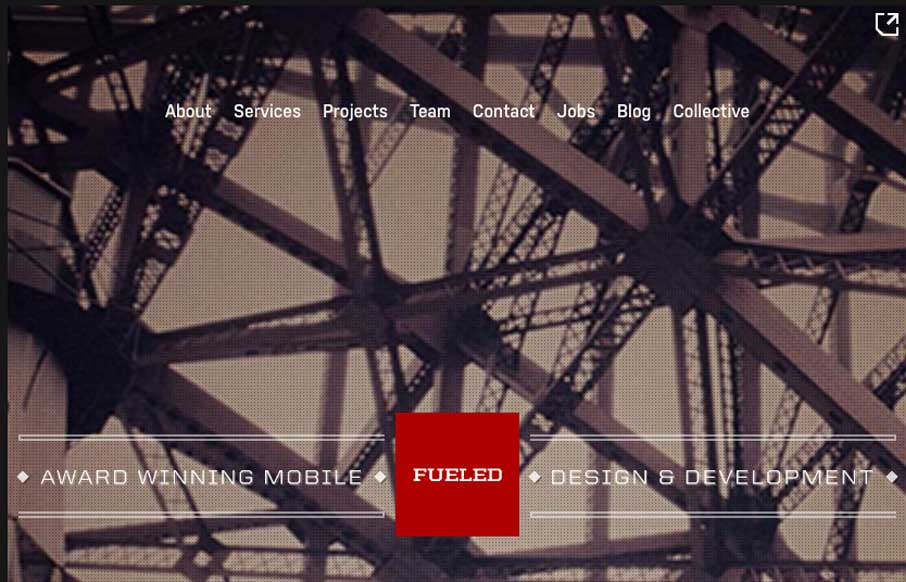
Pretty cool looking website for Fueled. I dig the background image and vibe it gives off. I really dig the way they show their work on the home page when you scroll, with the fixed position iPhone outline. The page transitions and sub pages are superb as well. Lots of...
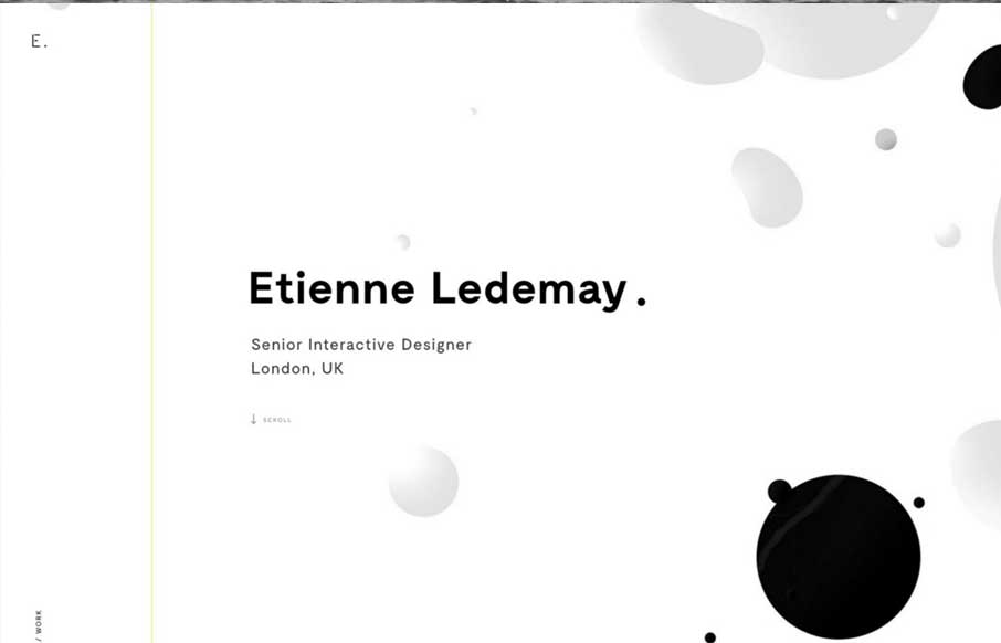
Gotta love great graphic design when you see it. Etienne Ledemay delivers. I love the simplicity that overlays the complexity of the typography and scrolling interactions here. That line also delivers you straight to the bottom of the site. Well done!
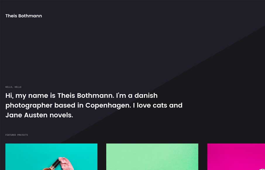
Simple portfolio site for Copenhagen-based photographer Theis Bothmann. Subtle parallax effects and smooth page transitions. Submitted by: Frederik Christensen Twitter: @frede Role: Designer Country: Denmark
Pretty cool starting section that leads to a more standard feeling layout. I dig this, this transition and the sub-sections too. They're very intuitive with the arrows and work smooth as you scroll. The footer section is also solid information design wise too. The...
Holy moly, the Waaark site is brilliantly designed, visually. I love all the transitions and detail work with the illustrations. It's very very unique and you get the vibe of a high end solutions firm here. That said, the transitions in some ways leave me feeling like...
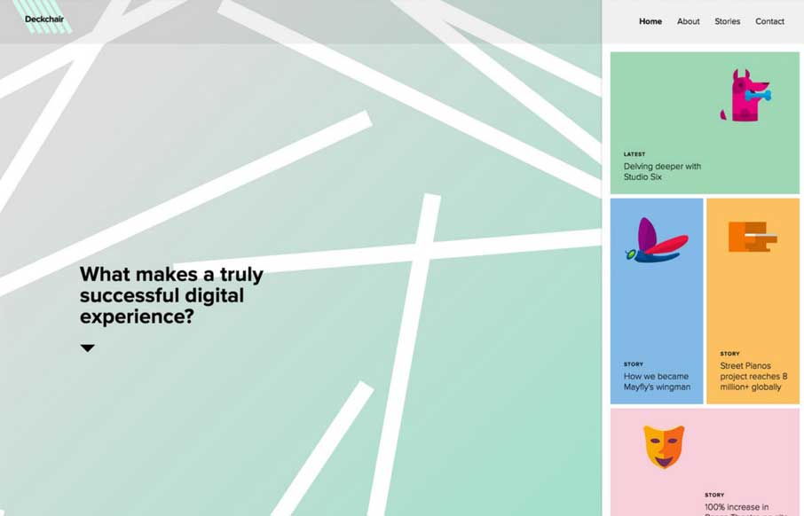
Oh my god. I love the Deckchair site so much. The stuff on the right hand side, the fixed nature of that plus the animated background really make me want to dig into how this thing was put together. The Material Design influence here is obvious too. Love. It. So. Much.
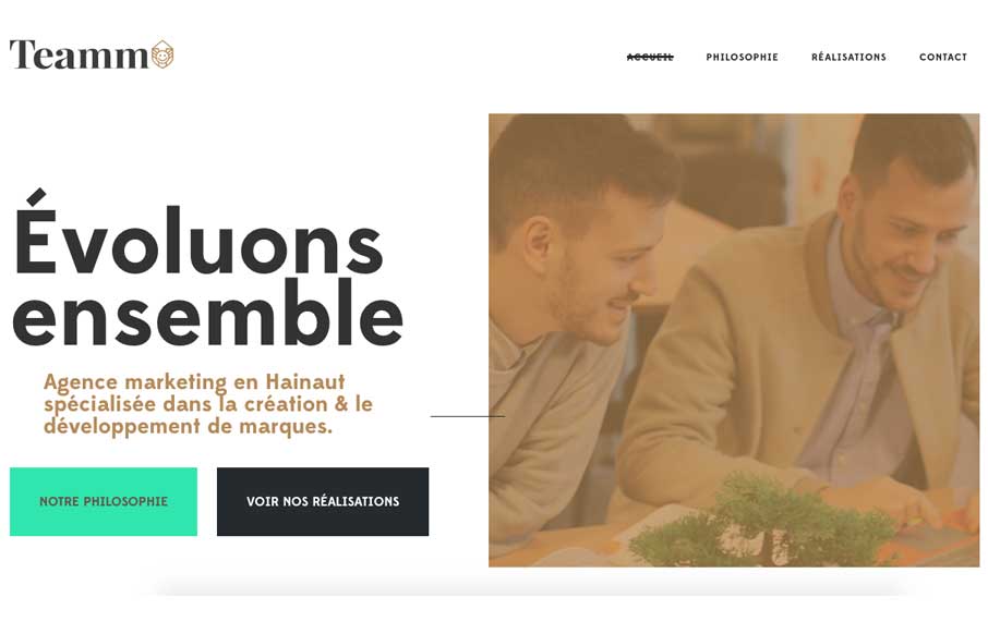
Pretty cool, clean and clearly designed website for Teamm. I like the staright forward-ness of the site design but then some neat typography mixed in for good measure. Simple usually wins, this site is no exception.
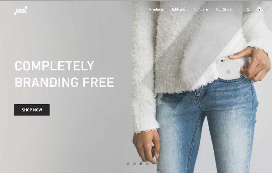
Pretty sleek and elegant looking e-commerce site for Peel cases here. I dig the oversized images and grid layout. Solid stuff. Submitted by: @digit Twitter: @digit Role: Designer Country: USA
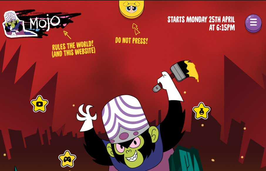
The new Powerpuff Girls website, running alongside the global TV series launch, starts with your average day in the City of Townsville and ends with the girls battling their horrible, mean archenemy Mojo Jojo as he tries desperately to take over the site! Submitted...
Pretty rad looking portfolio site. It's simple, just show the work. This site does that well. It's also unique feeling which is something you'd also look for in a portfolio. Cool. I also really love the small-screen width or "responsive" version of this site too....
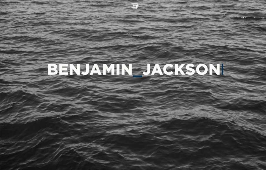
Large blocks of layout and some nice style touches make me really like the Benjamin Jackson portfolio website design. My favorite part is the way the logo stays in place as you scroll down, solid idea. I also love the strong grid and minimal footprint the site has...
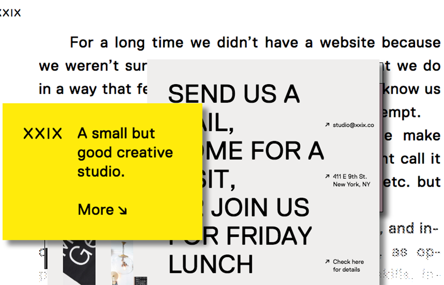
A good way to show you're a "new" type of interactive firm is to show it off in your work. Twenty Nine NYC doest that well here with their website. It's not the most highly functioning site in terms of pure usability but it's not that bad and it's creative at the same...
I love the large block of copy on that dark background and then *BANG* you get some animated work samples loaded up on you. Good stuff. That slow color change on the background is nice too, it changes the entire experience in just that little shift.
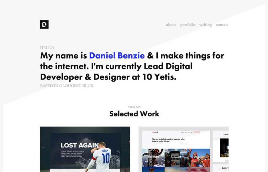
Simple layout and nice typography. The Daniel Benzie portfolio site is quite nice. The angle in the background image really helps drive your eyes down into and through that main tagline then on to the work.
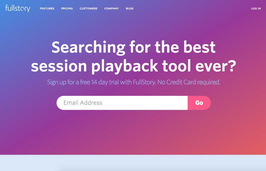
Post written by John Williams: This is one of my first projects since starting at FullStory in April. I joined the team because FullStory is such an unbelievably cool piece of tech. We wanted to make a landing page that would really hammer the core of what makes us...
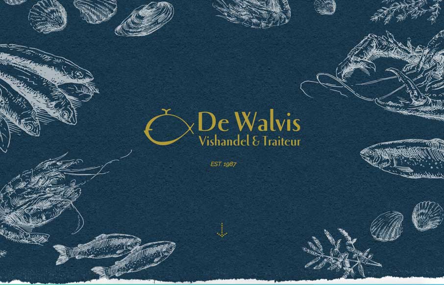
Very cool site design for an older well established brick and mortar business. I dig that it's fairly standardized as far as basic layout and navigation go but it's just got some beautiful colors, imagery and details. Good work! We made this website for a very old,...
Pretty great visual vibe here. I love the rhythm the page gives you as you scroll down, you feel like you're getting the vibe of the company. I love the detail work, it's straight up and simple, but really layout focused detail work. Bravo.
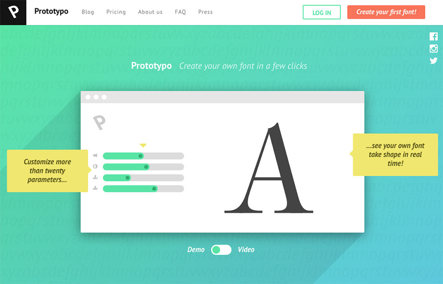
Very cool App, but also very cool design. As product websites go I dig this one a great deal. The demo to video toggle is just awesome. I've never seen that before and it's so clever. It's a very simple layout but the home runs are in the illustrations and clean and...
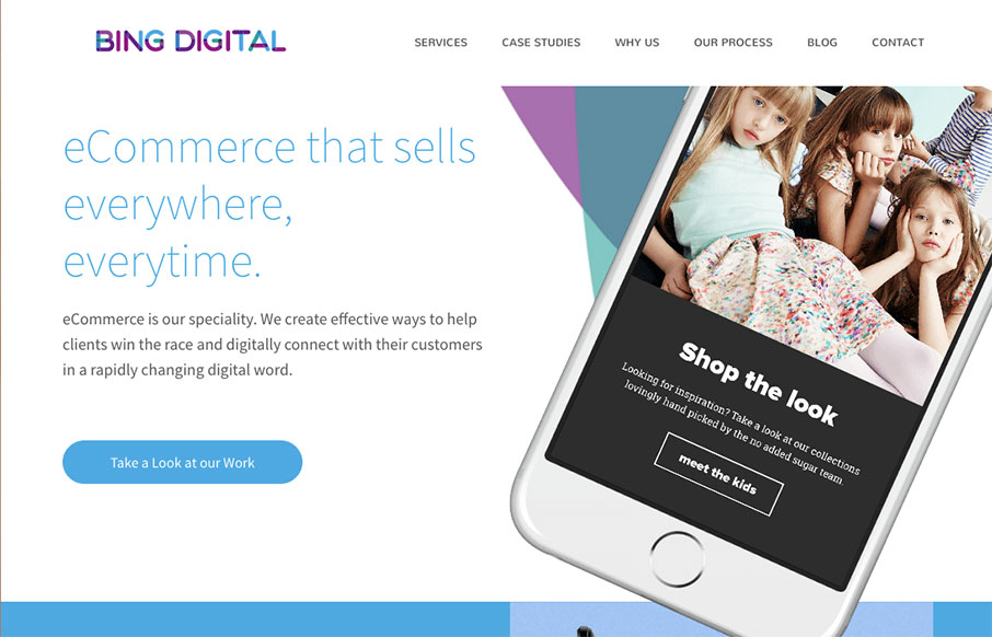
Nice dynamic looking layout for Bing Digital. I love the soft colors and the imagery that helps sell the idea that they know what's up. The thing I like most is how they list out all the stuff they do in the footer area. So clever and simple, yet most never do just...
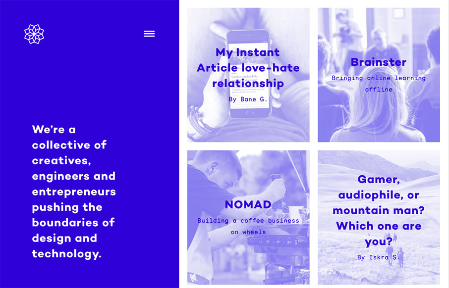
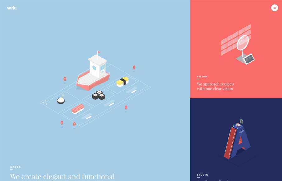
One of my new favorite websites. I love the fixed left side and the block imagery on the right. Also check how the hamburger icon kind of twinkles a little to let you know it's there. From the Designer: We’re a collective of creatives, engineers and entrepreneurs...
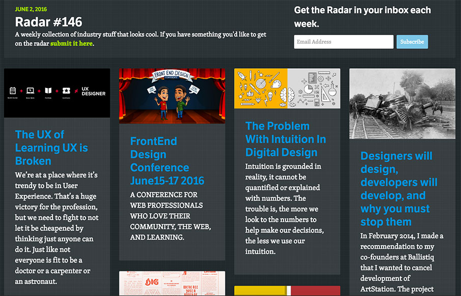
Each week, we do a round up of curated "stuff from the interwebs" that we call Radar. In this week's 146th Radar: The UX of Learning UX is Broken We’re at a place where it’s trendy to be in User Experience. That’s a huge victory for the profession, but we need to...
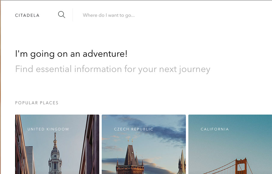
Super simple and probably as minimal as it can get for a site like this. I love the simple placement of the location images and how you can just keep sliding to the right to see more. The search design is pretty sweet too.
