Made by Akhil

http://madebyakhil.com/

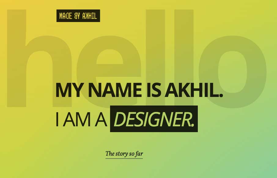
Pretty cool starting section that leads to a more standard feeling layout. I dig this, this transition and the sub-sections too. They’re very intuitive with the arrows and work smooth as you scroll. The footer section is also solid information design wise too.

The main goal of the site was to showcase my projects. Along with the project results, I wanted to show the process and what went behind the scenes, so that potential clients could see my approach to projects.

As each project has its own quirks and traits, I wanted to avoid a template feel and let those characteristics mold each pages. There are some extra playful stuff going on too, like the changing gradients based on the time etc.

Submitted by: Akhil G
Twitter: @akhilg
Role: Designer & Developer
Country: India

0 Comments

Submit a Comment

Your email address will not be published. Required fields are marked *

News & Articles

Sign-Up: Enhancing Conversions through good UX

Sign-Up: Enhancing Conversions through good UX

Optimize your website’s sign-up process by focusing on clarity, ease, and user mindset. Clearly explain the purpose, benefits, and steps, and use social proof to build trust and drive conversions.

The Essential Guide to Getting Started on Freelance Writing

The Essential Guide to Getting Started on Freelance Writing

Explore the lucrative and fulfilling world of freelance writing with our essential guide. Learn about specialties like blogging, social media, article, and technical writing. Build a portfolio, find work, set up your business, and discover the potential earnings. Embrace the freedom of working from home and follow tips for success in your dream career.