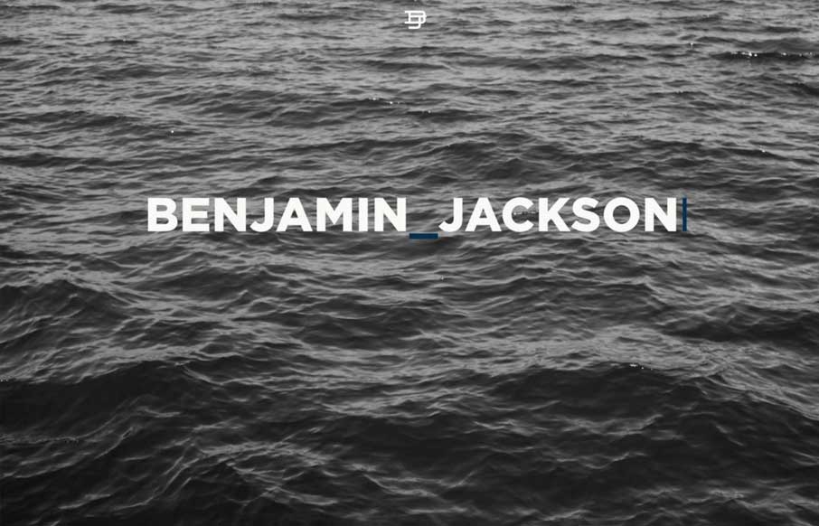
Large blocks of layout and some nice style touches make me really like the Benjamin Jackson portfolio website design. My favorite part is the way the logo stays in place as you scroll down, solid idea. I also love the strong grid and minimal footprint the site has visually.
Glassmorphism: The Transparent Design Trend That Refuses to Fade
Glassmorphism brings transparency, depth, and light back into modern UI. Learn how this “frosted glass” design trend enhances hierarchy, focus, and atmosphere, plus how to implement it in CSS responsibly.


0 Comments