Pantaloon Press

Pantaloon Press

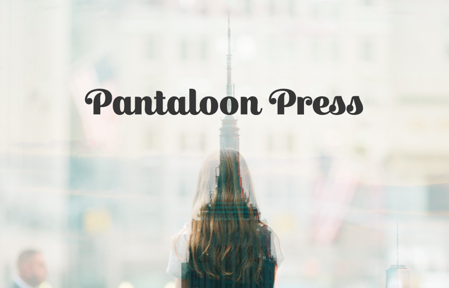
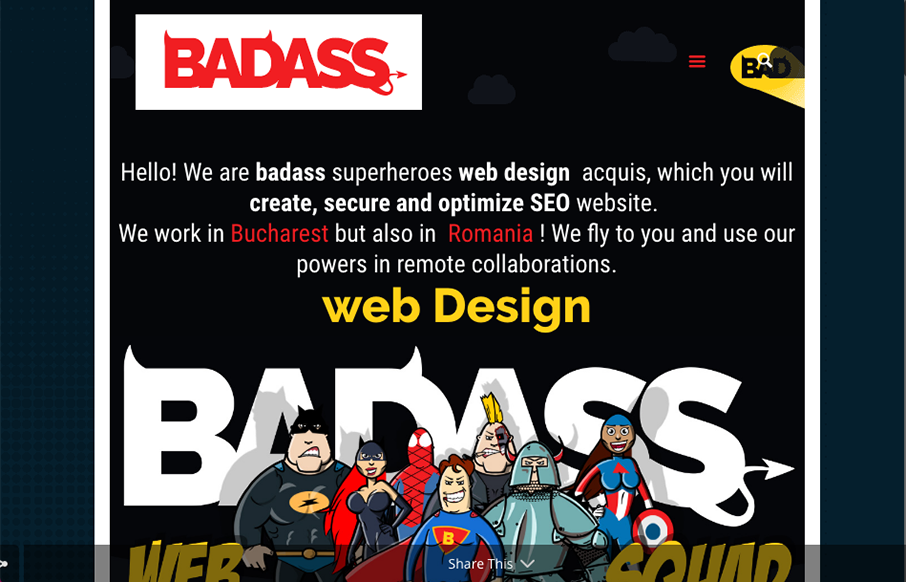
Unique in that it's really just a single page layout for this business. You don't see that too often. It's beautifully simple too, which is always going to win in my book. Pantaloon Press publishes email newsletters distinguished by original writing, elegant design,...

Howdy This

Howdy This

Man, I just love the site for Howdy This, so clever. I love the layout and the limited color palette. The typography is solid from top to bottom. Beautifully done and quite unique looking to me. From the Designer: We tried to enhance every section with some small...

Studio.Zeldman

Studio.Zeldman

Pretty cool. Zeldman is hitting the agency world again it looks like. So what do you do when you're Zeldman and you need to inform people of the things you've done. Just put it up there for everyone to remind them. Quite the resume man. Love this. Now, get to work...

Matt Welch

Matt Welch

I love this portfolio site for Matt Welch. "Most complex problems come with an NDA", amen brother. I love that he just puts that up front for you to know. It's the truth, if you do any sort of high-level work your public portfolio is going to be limited. He puts in...

Bruk

Bruk

Real simple design for Bruk but it also has some really nifty UI details. The left vs. right look is pretty cool and the "X" that stays visible when you check out some of the work is pretty clever too.

SimpleBits

SimpleBits

I'm not entirely sure how old or new this version of SimpleBits is. But it's simply beautiful. Simple, straight forward and editorial based design. The perfect blog look. Mmmm hmmmm.

Full Story

Full Story

Really nice product based website. Honestly it's really straight forward and in many ways set's the "standard" for how one could approach a product site design. Plenty of straight up product details and minimal but well done interactions.

Mossio

Mossio

Really cool website that shows what this company does. The atmospheric surreal backtrack makes it feel like coming to this website is an experience along with the homepage animatic.

Persona

Persona

Pretty cool site design for Persona. I dig the image treatment and the simple approach. The "backstage" fly-out nav is cool and a neat way to subtly get you into some more depth with the content produced behind the sites in the network.

Olderbrother

Olderbrother

Based in Portland and LA, Olderbrother is focused on creating gender-neutral luxury clothing items from locally crafted materials and eco-conscious fabrics and dyes. Olderbrother is a playful relief from the stark-seriousness of contemporary society. Their products...

Google Fonts

Google Fonts

The Google Fonts site has needed a facelift for a while now. Well, it got one. Pretty damn slick too. You can type directly on top of the sample text and sorting is quite easy. Beautiful website let alone the type sampling work done. Solid.

Robin Bierens

Robin Bierens

Nice three.js implementation and clean design for Robin Bierens' portfolio site. I dig the little details and simple type based approach. Just enough movement/stuff to keep you engaged and just enough simple to make it design review worthy.

Kultar Singh Kalsi

Kultar Singh Kalsi

Very slick yet simple layout. I really love the grid-ness of the design. There is also just enough slight movement as you scroll or interact to make it a bit memorable too. Bright colors and strong headlines help a lot too.

BADASS

BADASS

I love the strong graphic work, the illustrations the logo all have a good spirit to them. That's enough most of the time to get clients into what you're doing. Love this stuff.

Seedlip

Seedlip

This is just a beautiful website. I love the muted colors except for the product shots. The image treatments and the smaller screen design changes are well done. Lovely website and it's a nice classic look.

Charlie Rose

Charlie Rose

I'm digging the Charlie Rose website. There is a lot of pretty solid UX to study here. From the grid layout and display of episodes to the search form. Tip top design here.

An Interesting Day

An Interesting Day

Pretty crazy illustrations are the core of this website's awesomeness. Now, normally, we wouldn't post a splash or coming soon page but this one is just so weird and exciting looking. Lurve this kind of thing.

Flock Knitwear

Flock Knitwear

Really cool grid work here. I love the blocky line based layout a lot on this site for Flock Knitwear. The colors some of the subtle off-set-ness. Beautifully done.

NYC Pride

NYC Pride

Really unique website experience here for the NYC Pride site. I really really love how it's a wholly different experience for desktop vs. mobile. Literally different styles of interaction. I dig the monochromatic color palette a great deal too. The overlay nav design...

Andrea Mata

Andrea Mata

Very cool asymetrical layout for Andrea's portfolio site. I love the limited color palette and the off kilter typography. Not a huge fan of the mobile size/design, but overall love the look and feel.

Indian Type Foundry

Indian Type Foundry

Super cool, at first glance, standard looking website design. As you scroll around and start checking things out, you get hit with some pretty cool little interactions. Like the mouse overs and then those fly-out nav items on the cart and login. Super cool way to...

Maison Deux

Maison Deux

I like the grid-ness of this layout. That, paired with the simple thick line details around the logo and then elsewhere to help pull it all together visually. It's subtle but works really well and obviously. Good work.

MSDS Studio

MSDS Studio

Pretty cool, non-standard typography here. Mix that in with that neat thing they're doing on the site, where when you scroll down and back up it changes the site considerably. Pretty cool and unique work.

MN Uniform

MN Uniform

Pretty cool angle on some now-standard design patterns. I love how the header has that line and everything perfectly scroll-folds up into it. Then the menu is cool, all the lines and blockiness of it make it feel really fresh to me.

Papazian

Papazian

Beautifully done website. I love the subtle and fragile looking lines and the way the photography supports it. The News & Updates section of the layout on the home page is wonderful as you get down to it. Really nice website here.

Jolien Roos

Jolien Roos

Love this photo portfolio site for Jolien Roos out of Belgium - looks to by @studiosiebe. Very unique intro/navigation, five circles that turn into your "hamburger" as you move through the site. For photography sites - the images sell it - and the full width / full...

Ugmonk

Ugmonk

So our friend Jeff Sheldon at Ugmonk has a new site and logo. (Jeff spoke a ConvergeSE a couple of years ago) Very cool to read where the changes in business and design come from as your company grows, and grows up. Great article here from Jeff about all of it. Here's...

ARA Modular Phone

ARA Modular Phone

This website has a nice clean layout that displays its product quite well while replicating the design of the phone into the layout of the site.

Colm McCarthy

Colm McCarthy

Nice, minimal portfolio site from Colm McCarthy out of Ireland. Like the use of the text over the main image on the work detail pages - interesting to see how it lands on different viewports.

Graphic Design Festival

Graphic Design Festival

Love the smart use of the gridlines for the Graphic Design Festival in Glasgow, Scotland. Simple and clean - good stuff. From the Designer: Graphic Design Festival Scotland is an international organisation promoting creativity, innovation, collaboration and...