
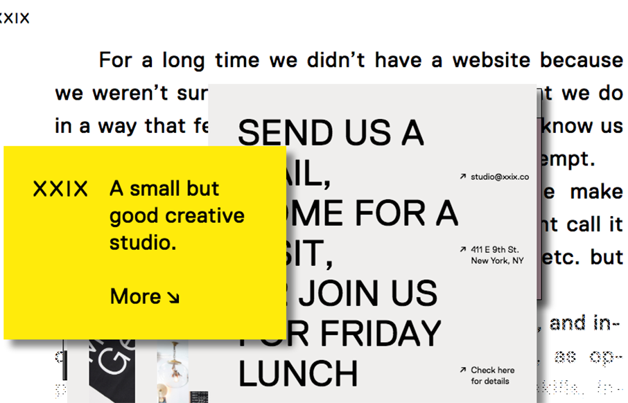
A good way to show you’re a “new” type of interactive firm is to show it off in your work. Twenty Nine NYC doest that well here with their website. It’s not the most highly functioning site in terms of pure usability but it’s not that bad and it’s creative at the same time. It goes well with their mission and what they are all about.


Fitts’s Law: Why the Easy Button Wins
Large, close targets are faster to hit than small, distant ones, that’s Fitts’s Law. A look at the 1954 rule behind buttons, prime and magic pixels, thumb zones, and dark patterns.


0 Comments