Walvis

http://www.walvis.be

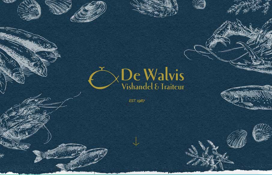
Very cool site design for an older well established brick and mortar business. I dig that it’s fairly standardized as far as basic layout and navigation go but it’s just got some beautiful colors, imagery and details. Good work!

We made this website for a very old, famous fish store that is based in the heart of Leuven, Belgium. This store stands for quality products and the the people who work there know everything there is to know about fish. I think the design of the website really shows all the class and know-how this store stands for.

Submitted by: Tim Vanhalewyck
Twitter: @konnu_web
Role: Designer & Developer
Country: Belgium

1 Comment

  1. Konnu

    Thanks Gene!

    Reply

Submit a Comment

Your email address will not be published. Required fields are marked *

News & Articles

Sign-Up: Enhancing Conversions through good UX

Sign-Up: Enhancing Conversions through good UX

Optimize your website’s sign-up process by focusing on clarity, ease, and user mindset. Clearly explain the purpose, benefits, and steps, and use social proof to build trust and drive conversions.

The Essential Guide to Getting Started on Freelance Writing

The Essential Guide to Getting Started on Freelance Writing

Explore the lucrative and fulfilling world of freelance writing with our essential guide. Learn about specialties like blogging, social media, article, and technical writing. Build a portfolio, find work, set up your business, and discover the potential earnings. Embrace the freedom of working from home and follow tips for success in your dream career.