
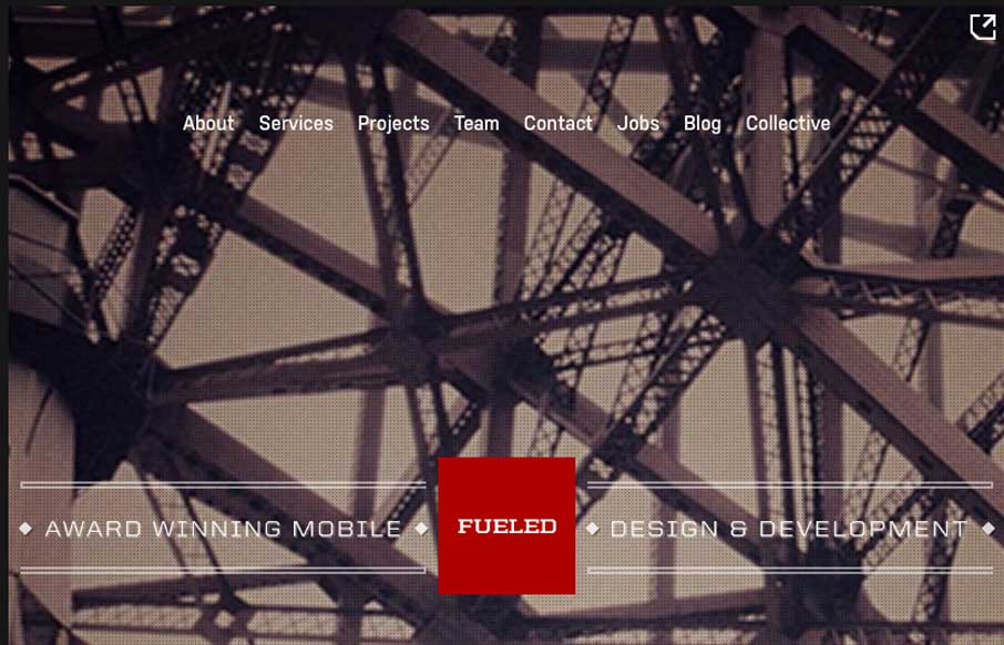
Pretty cool looking website for Fueled. I dig the background image and vibe it gives off. I really dig the way they show their work on the home page when you scroll, with the fixed position iPhone outline. The page transitions and sub pages are superb as well. Lots of love and detail given everywhere on this site design.


Fitts’s Law: Why the Easy Button Wins
Large, close targets are faster to hit than small, distant ones, that’s Fitts’s Law. A look at the 1954 rule behind buttons, prime and magic pixels, thumb zones, and dark patterns.


0 Comments