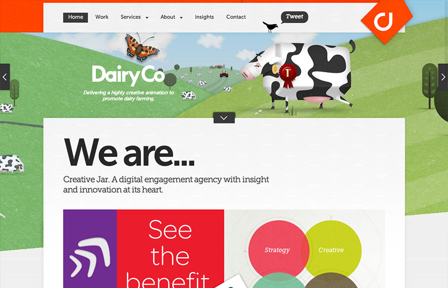
by Giovanni DiFeterici | Aug 20, 2013 | Gallery
Dern. This site has a lot going on at once. I really like to see designs that push conventions into new territory and creativejar have done that in a few ways. The layout of the homepage content is modular, but only loosely structured. This is interesting, but if...
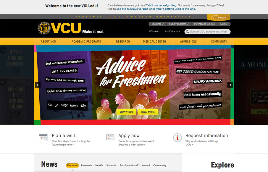
by Maria | Aug 19, 2013 | Education, Gallery
The new VCU site (specifically the home page) is chock full of info that’s nicely organized and presented. Despite all that’s going on here, I feel like they struck a good balance between practical and promotional elements. Even more impressive is the...
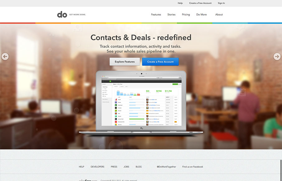
by Gene Crawford | Aug 14, 2013 | Gallery
I really love the simplicity of the Do site design. It’s boiled down to just what’s needed. The overall palette is muted, but not really which is a clever understatement to work into the design. I also dig the Features page, I like how it goes from just...

by Gene Crawford | Aug 13, 2013 | Gallery
The new Uber site design is slick and upscale. Nice use of the slideshow IMHO, the images are something out of vogue and adds to the visual branding that they’re rolling with. The site is a stark black and white design with a hint of of the blue/green color used...
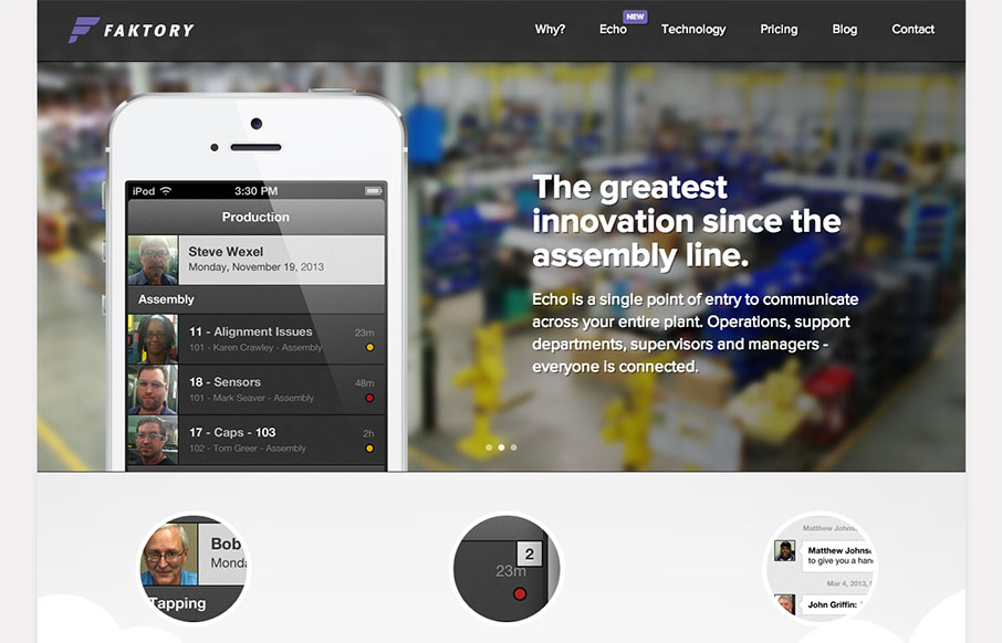
by Gene Crawford | Aug 12, 2013 | Gallery
I really dig the smooth nature of this layout. It looks visually complete as you scroll down and/or click through different sections of the page. I do think it lacks in content, for example I want more on the pricing section. I get that they need to consult with you a...