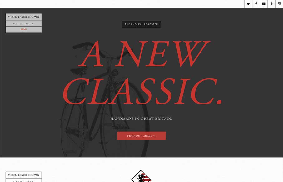
by Giovanni DiFeterici | Jul 18, 2013 | Gallery, Sports/Recreation
The Vickers Bicycles site is a small one that has one clear purpose: promote and sell the English Roadster Bike – a beautiful machine, if I do say so – and does so wonderfully. The simple, open layout has a slightly mechanical feel that doesn’t feel...
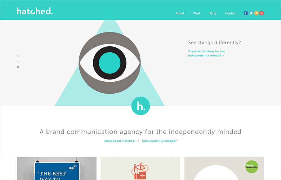
by Giovanni DiFeterici | Jul 17, 2013 | Gallery
The Hatched London website is a simple, elegant site. It’s flat, minimal and strongly graphic. Everything you’d expect from a great design house.

by Gene Crawford | Jul 8, 2013 | Food and Beverage, Gallery
What a great website design. It’s clean and precise and keeps a level of corporate appeal while still having a nice craft vibe. It pulls out all the trends in its detail work for sure and they’re all done very well, from the parallax(ish) section to the...
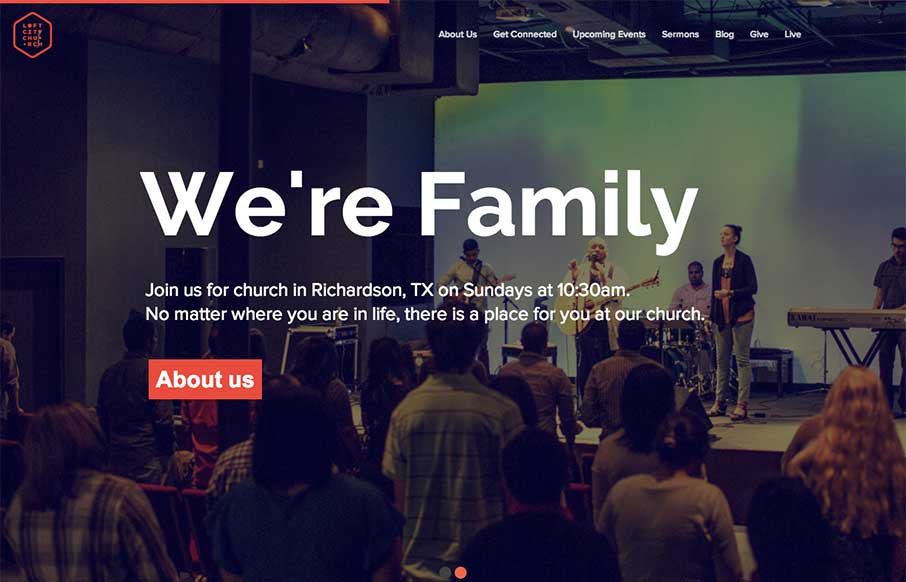
by Giovanni DiFeterici | Jun 24, 2013 | Gallery, Nonprofit
The loftcitychurch site strikes a wonderful balace between it’s use of images, typography and color. At large screen sizes the site feels big and open, which is perfect for a church, and at mobile sizes everything feels compact but not cramped. The use of fixed...
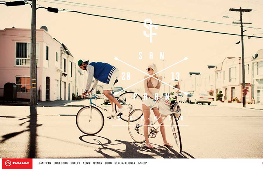
by Giovanni DiFeterici | Jun 20, 2013 | Gallery
House is strongly structured, albe it a little noisy design. The strong use of bold red and imposing lines is wonderfully graphic and paires well with the style of photography. The site is adaptive, which seems to work well enough in this case. Dig it.