
by Gene Crawford | Jun 18, 2015 | Gallery, Product, Shopping
I just love it when a nice brand has a minimal approach to it’s website. Casper is a great example of what a minimal approach can do for you. The messaging is crystal clear and simple and there are still some really great interaction sections on the site to...
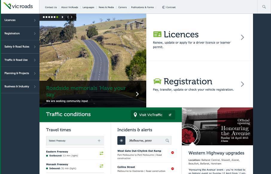
by Aaron Griswold | Jun 4, 2015 | Gallery, Government
So I’ve looked at reviewing the Vic Roads site, out of Australia, a couple of times since it’s been in our queue and it took me a little while to come to peace with it. I think my initial problem was that it is very text heavy, so we don’t often look...
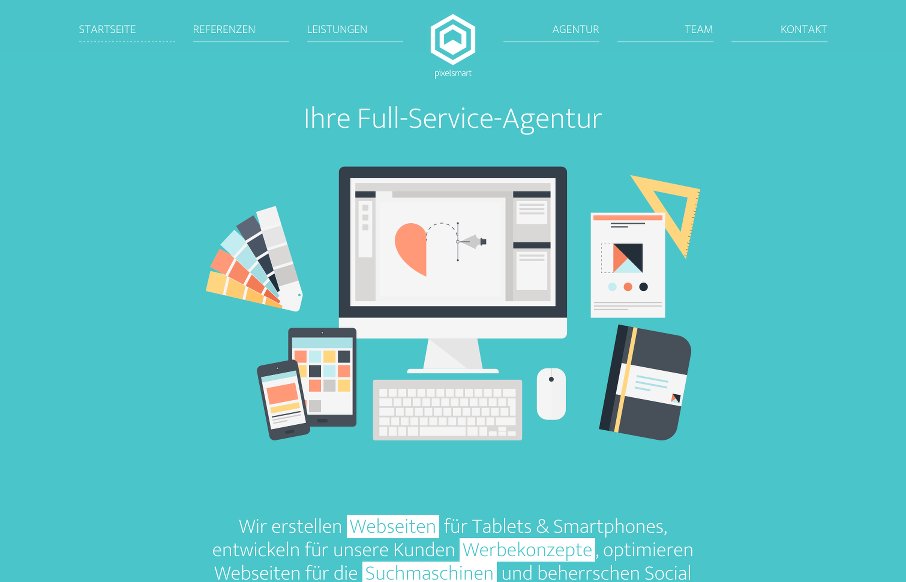
by Aaron Griswold | Apr 22, 2015 | Gallery
What I like about the pixelsmart agency site out of Germany is that they stick to a theme throughout the site – honey comb or angled view of a cube and turn it into a flat icon, you get a hexagon which shape is utilized heavily in their content design. It looks...
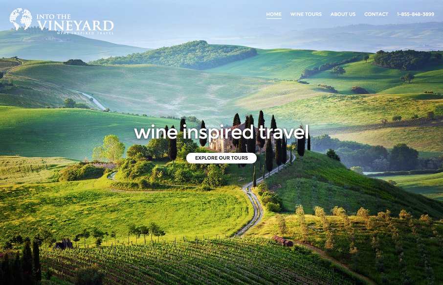
by Aaron Griswold | Apr 20, 2015 | Gallery, Travel
After putting on ConvergeSE last week, needed a decent site to ease into gallery reviews for UMS – Into The Vineyard out of Vancouver did that for me. My wife and I love wine and travel – so good combo. I like the flow and imagery of the site. And I know...
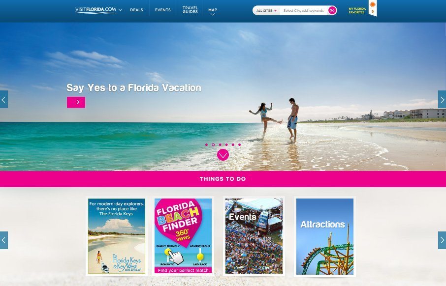
by John David Hunt | Apr 13, 2015 | Gallery, Travel
John has been helping us work on posts for UMS, and left me some comments that I figured were more relevant for the Visit Florida site than what I would have written – so here’s his first post: Heavy on the card design and utilizing images works well for...