by John David Hunt | Aug 25, 2015 | Food and Beverage, Gallery, Shopping
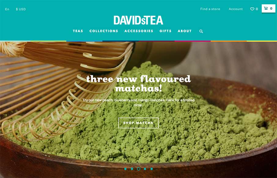
This is a bright and lively site from David’s Tea out of Quebec. It’s incredibly detailed throughout the shopping part of the site – it looks like hundreds of items on the site – and all are beautifully done. My wife is a huge fan of Rooibos...

by John David Hunt | Jul 15, 2015 | Gallery
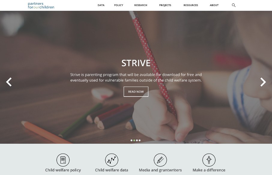
Partners for Our Children is one of those sites that has great purpose, yet may not be seen as ‘cool’. Being in public service or government related areas sometimes makes organizations think they are alleviated from the ‘burden’ of good design,...

by John David Hunt | Jul 9, 2015 | Food and Beverage, Gallery
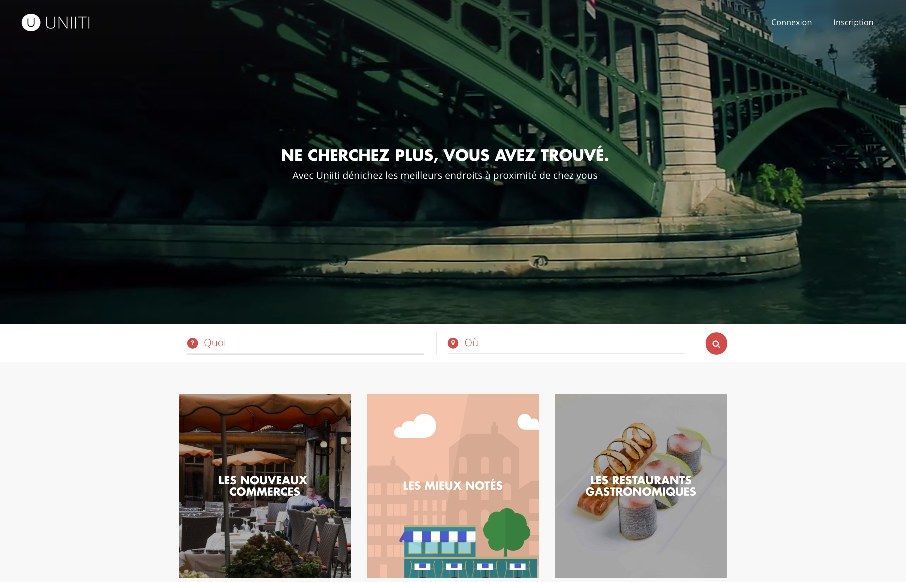
We’ve reviewed Uniiti’s work out of France before – this looks like their recommendation app for restaurants and other services. Apparently the footer landscape image changed. Last night it was a dark sky with a rocket ship and this morning...

by John David Hunt | Jun 26, 2015 | Gallery, Portfolio
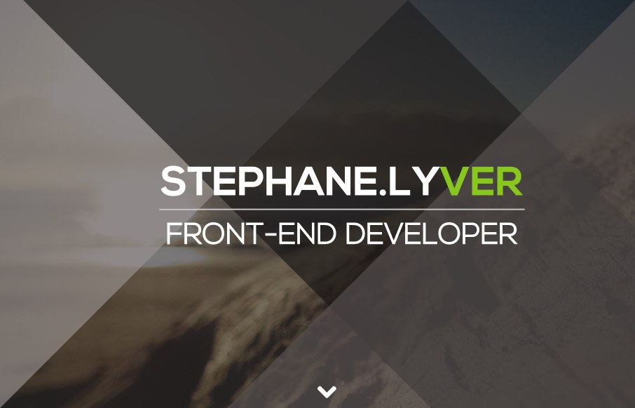
I love this simple and colorful site for Stephane Lyver. It seems to have minimal design, but the colorful sections draw my attention. I love his black and white ending portrait shot, and I really dig the simple effects of the angled :before and :after css elements....

by John David Hunt | Jun 23, 2015 | Gallery
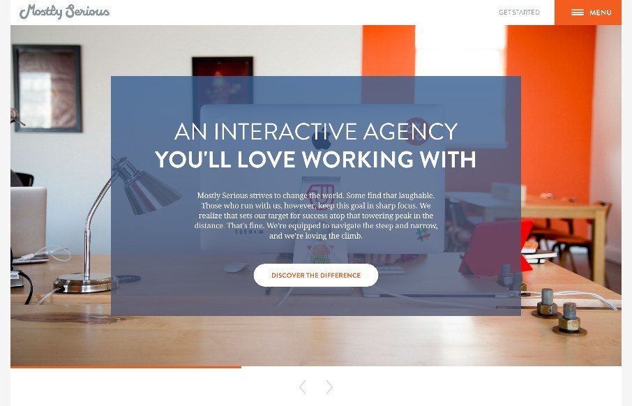
Many agency sites use large photos to bring out the human nature of their company and give us a glimpse to their habits and personalities. Others showcase their skills heavily and give no hint of who or how their work is done and practiced and whether there are humans...
