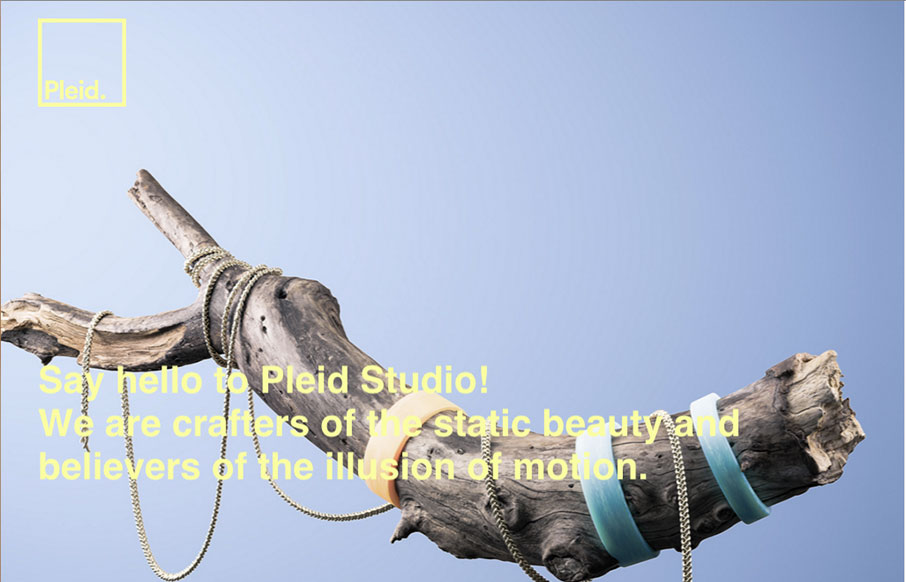
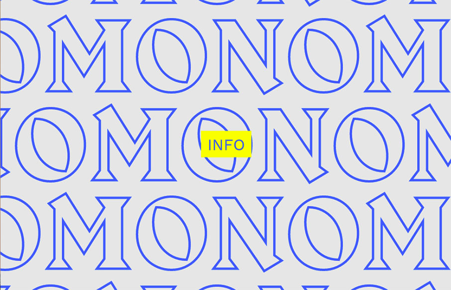
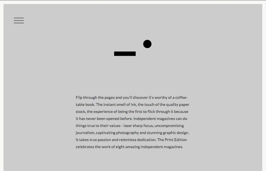
Suuuuper simple layout for the portfolio website of Phillip Nessen. But man, it has some real badass typography and illustration work going on. Love this stuff.
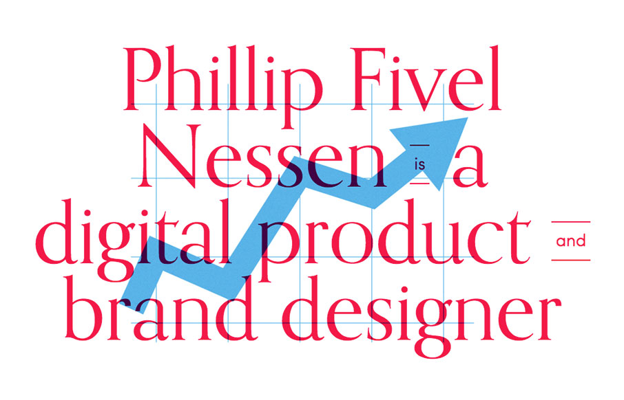
Suuuuper simple layout for the portfolio website of Phillip Nessen. But man, it has some real badass typography and illustration work going on. Love this stuff.
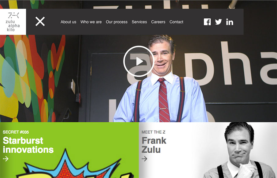
Yeah it's a parody agency site, but it's actually not that bad of a design. Fun stuff, but it works pretty well.
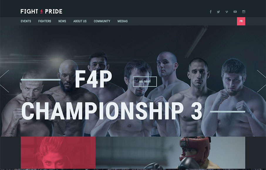
Great looking site for Fight 4 Pride out of Quebec, created by Phoenix. Excellent coloring and font work. Really like the Fighters landing and detail pages too - laid out very well.
Pretty cool aesthetic to this site. I feels like it perfectly matches what they do in it's visual vibe. It's also kind of interesting with the scrolling and the main links in the top right and left like that. Simple and effective. Love it.
Very interesting site design here. I love the colors, the soft pallet and then the usage of the photos in the grid like that, clever work.
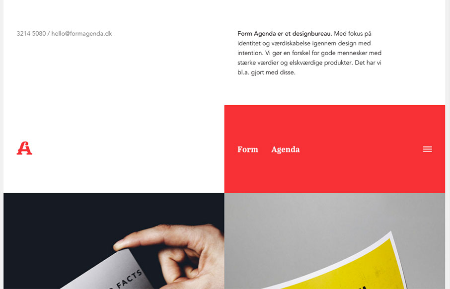
Super non-traditional looking layout for the Form Agenda website. It does everything right IMHO. I like the contact info in the top left - instead of a logo. Very clever. Then the rest of the grid is very active and keeps it fresh feeling as you scroll down the page....
Yeah, yeah, scroll-jacking and all that. I know i've complained about it myself too. But this is a fairly beautifully designed website. I like a ton of the details in play here. Solid design on top of a bad paradigm, I still find it enjoyable.
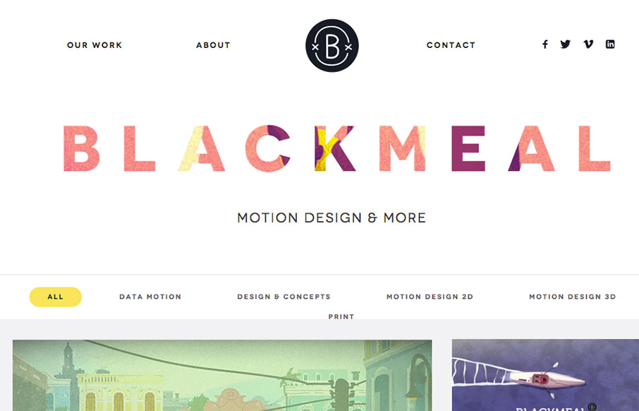
I freaking love the grid layout here for Blackmeal. It's very dynamic and transitions between screen widths quite well. My favorite part however is the transformative design aspect to the header, as you scroll down, it's mesmerizing to me. It's simple but boy is it...
Kind of a crazy ass website. I'm enjoying it tremendously even though it largely goes against most of my gut telling me the UX is bad. What do you all think?
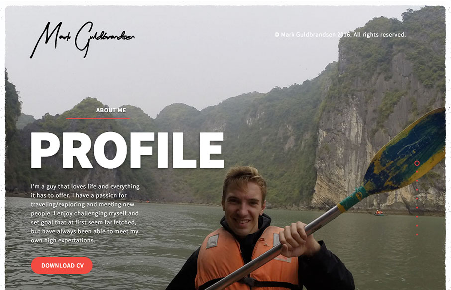
Nice portfolio website. It functions almost like a power point would, with big screens you move between. In that aspect I like the simplicity of the approach. What do you guys think? Does that work for you here?
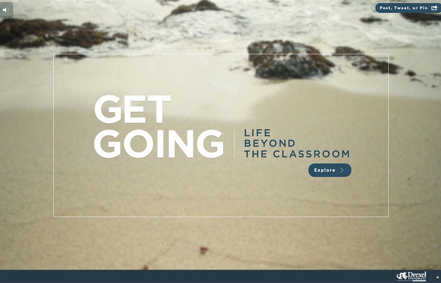
Great use of multiple video backgrounds (and a slider) to tell stories for Drexel University's Sacramento campus through the site "Get Going Today". It's a cool way to navigate through a site, and just explore.
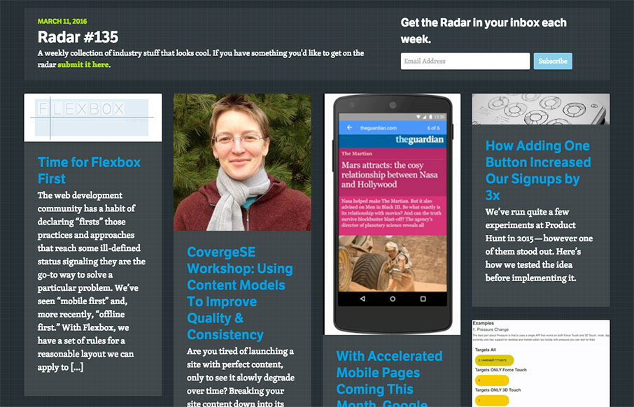
Each week, we do a round up of curated "stuff from the interwebs" that we call Radar. In this week's 135th Radar: Time for Flexbox First The web development community has a habit of declaring "firsts" those practices and approaches that reach some ill-defined status...
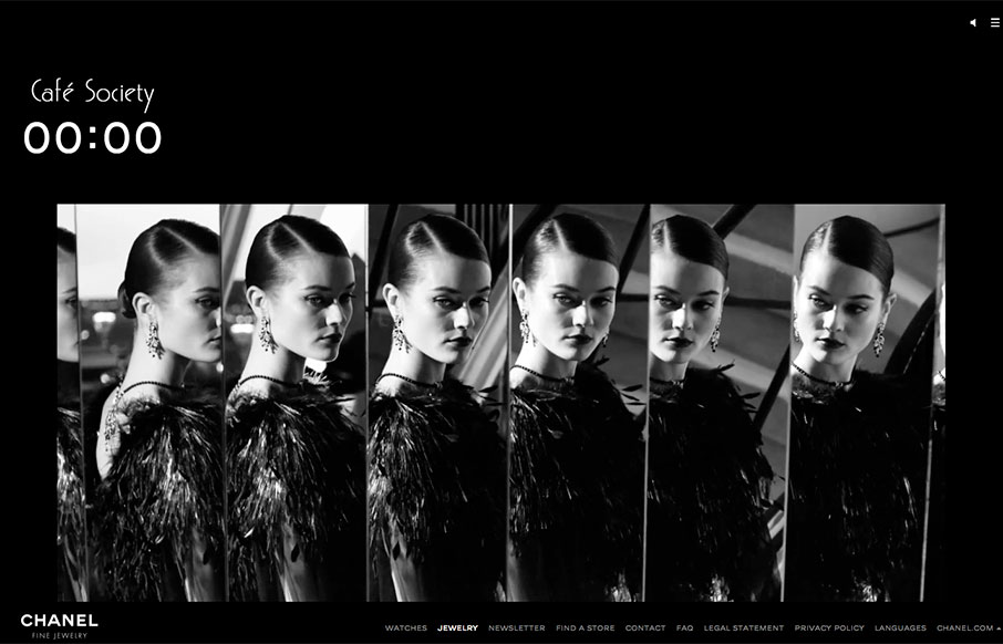
Cool design for Chanel's Cafe Society one-pager. Especially like the work with the video background work as you scroll through the page.
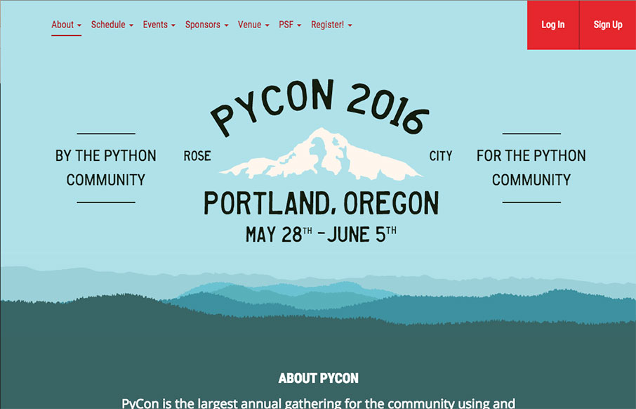
Good looking home page for PYCON 2016, happening in Portland, Oregon this year. I love the blends of the coloring with the svg work to make the page look really good in any responsive state. It looks to be designed by the Caktus Group out of Baltimore.
Pretty read animation/interactions as you scroll down the page. If you can get over the scroll hijacking here you'll dig it. The colors are spot on and the overall feel/vibe is very welcoming and soothing.
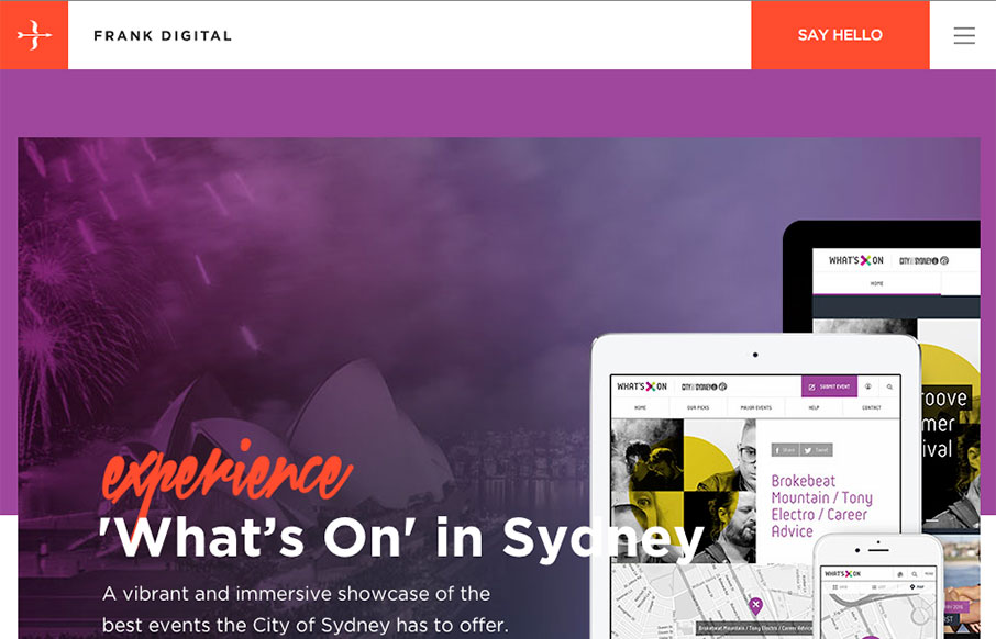
Really good vertical rhythm for the Frank Digital site. I love the top section and how it feeds into the second, third and footer areas. That blog/news section is very nice as well. I love the asymmetry to it all, but at the same time it all comes off quite balanced..
Kind of a parallax type approach, but really just targeted scrolling with some really badass inter-section animations. I love those section transitions. Solid.
Really simple approach but very effective. I dig the simple links and the way all the sections are tied together with simple colors and then interactions. Straight forward works for me!
I'm in love with the way this website does sectional targeting. You start off with sort of a splash page (we can discuss that later) then get siphoned off into a couple different directions depending on your food choices. Then there's a solid landing page for each one...
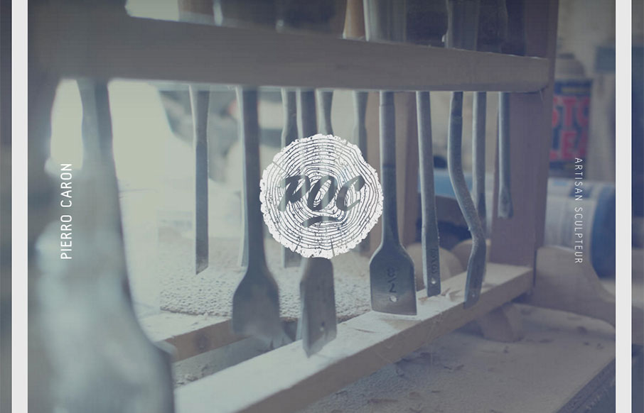
I LOVE the vibe of this site design for POC Sculpture. It feels soft and wispy with strong lines and edges. Kinda like sculpture 🙂 There are some really nice little interaction details here as well, like the slight movement as you scroll and then check the "back to...
Pretty cool minimal design for Anekdote. I really dig the gray field where you can see the edges of it like they have it. It's just simple and works. That's good design to me, when the actions become almost invisible but say present.
Pretty cool visual vibe with this design. I like the oversized spaces and blocks of color and even the angled screen shots - they all give it a dynamic feel even though the overall execution is fairly simple and straight forward. Bold colors and typography also lend...
Another really great minimal design. I really love the logo mark and the way it's so simply placed and then the portfolio work just feeds into view.
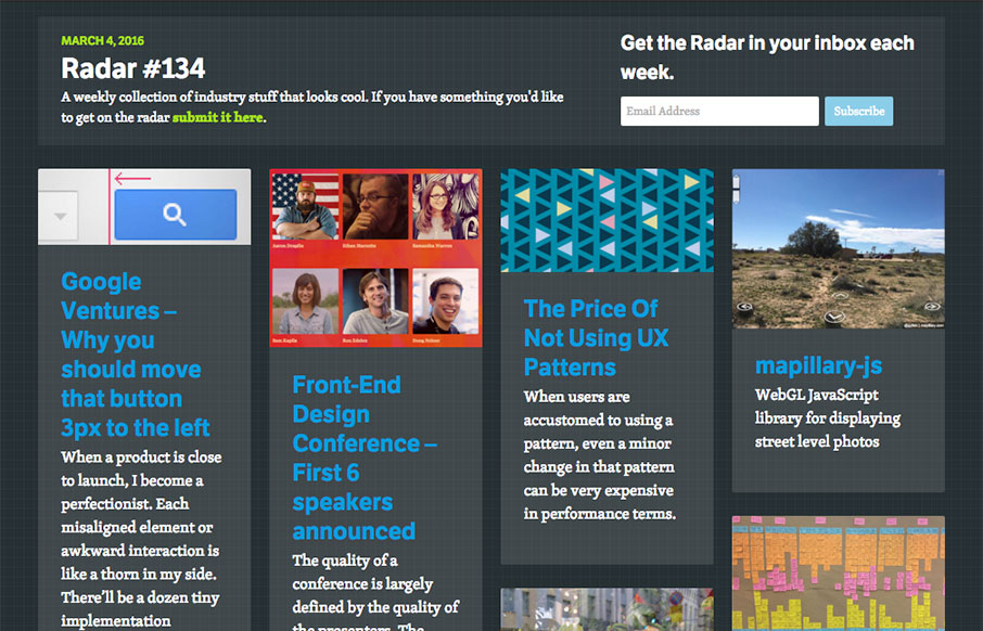
Each week, we do a round up of curated "stuff from the interwebs" that we call Radar. In this week's 134th Radar: Google Ventures – Why you should move that button 3px to the left When a product is close to launch, I become a perfectionist. Each misaligned element or...
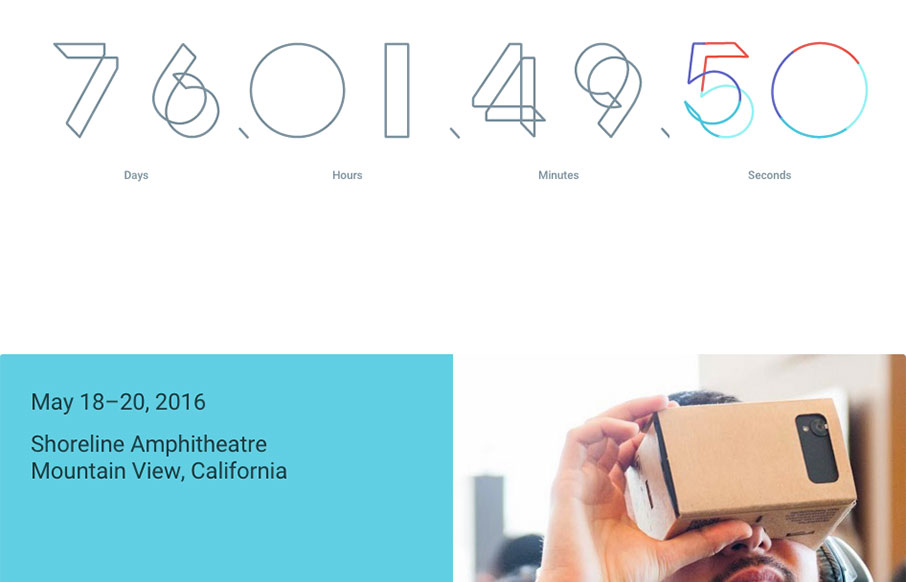
Google i/0 2016 site is up. I love the main countdown numbers and the way the sub sections kind of box in under it. It's kind of a coming soon page, so maybe not fair to review it just yet. But it is pretty cool.
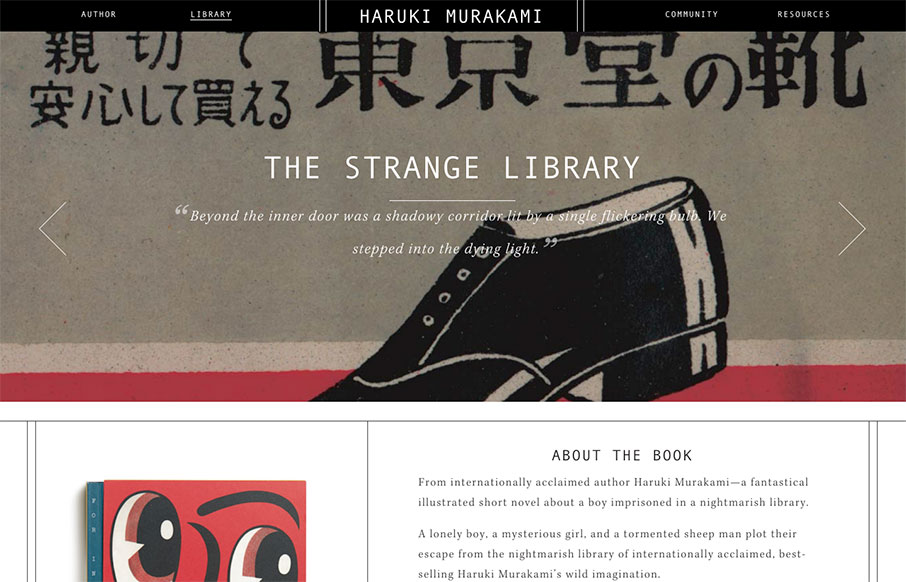
I haven't seen too many author sites (a form of a portfolio site) - however, this one for Haruki Marakami is pretty special. The Library, and specifically the detail work on the book pages - it's cool and smart.
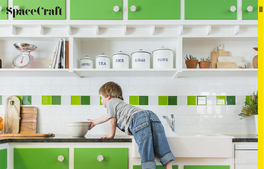
Two things about the Spacecraft site out of Australia I like are the vertical hamburger (because it is technically different than all the others) - and I like the simplicity of the mouse-over / overlays on the block design - it's just a label and change in opaqueness...
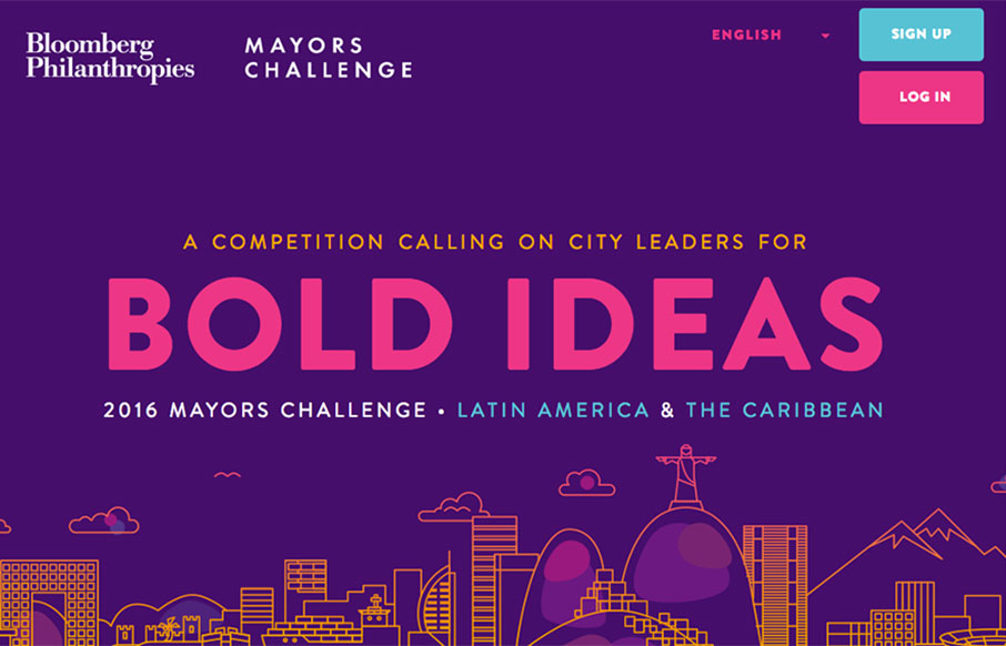
Great looking site from Bloomberg Phianthropies - promoting a great initiative called The Mayors Challenge to help solve urban challenges and improve city life (2016 in Latin America). Some sweet flat illustrations and icon work - coupled with bold coloring and photos...
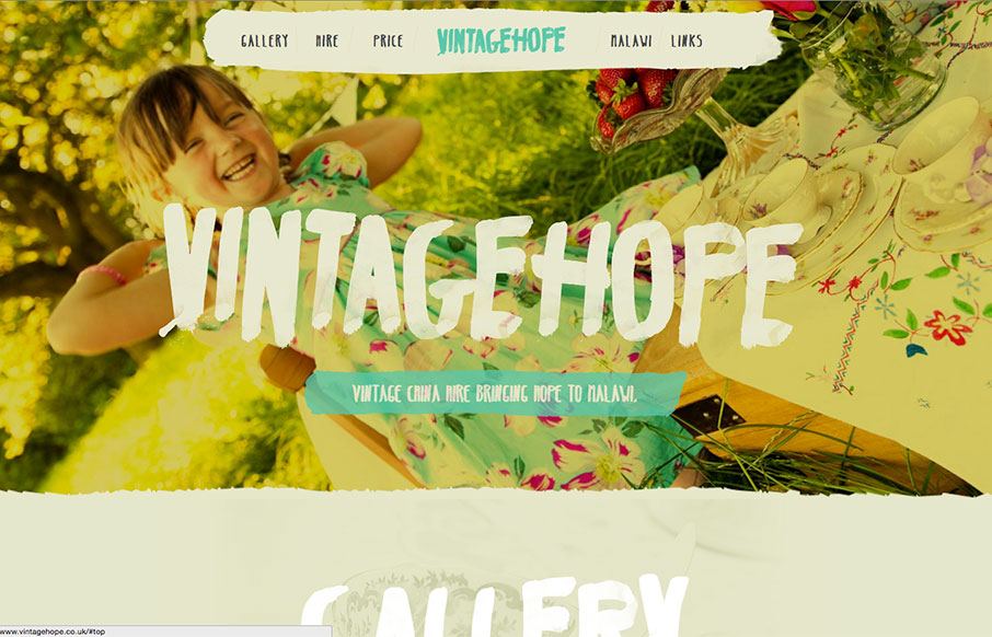
Great typography work on the Vintage Hope site out of the UK. Looks like you rent fine china for different events, and the money goes to a children's home in Malawi - good social entrepreneurial concept - and a nice looking site.
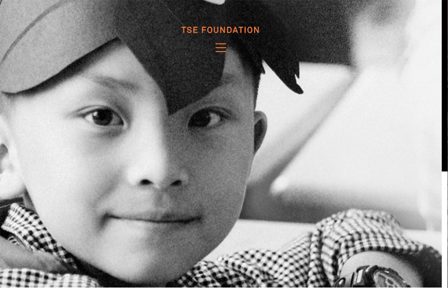
Very simple color palette, and good typography from the TSE Foundation out of Hong Kong. I first saw it in a smaller screen - but it really opens up on a desktop and looks great, because it's simple.
