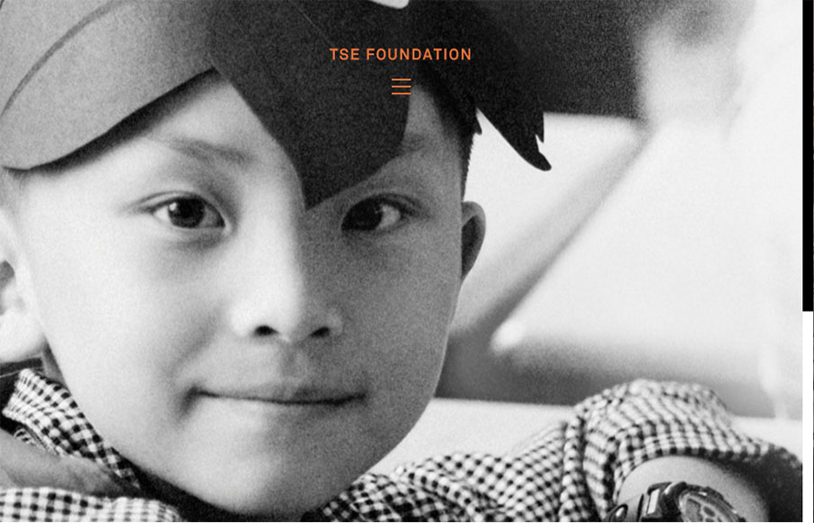
Very simple color palette, and good typography from the TSE Foundation out of Hong Kong. I first saw it in a smaller screen – but it really opens up on a desktop and looks great, because it’s simple.


The Call to Action, Revisited
The Call to Action hasn’t changed in a decade, but the bar has. A fresh look at prominence, copy, mobile tap targets, and accessibility, with lessons from three major design systems.


0 Comments