
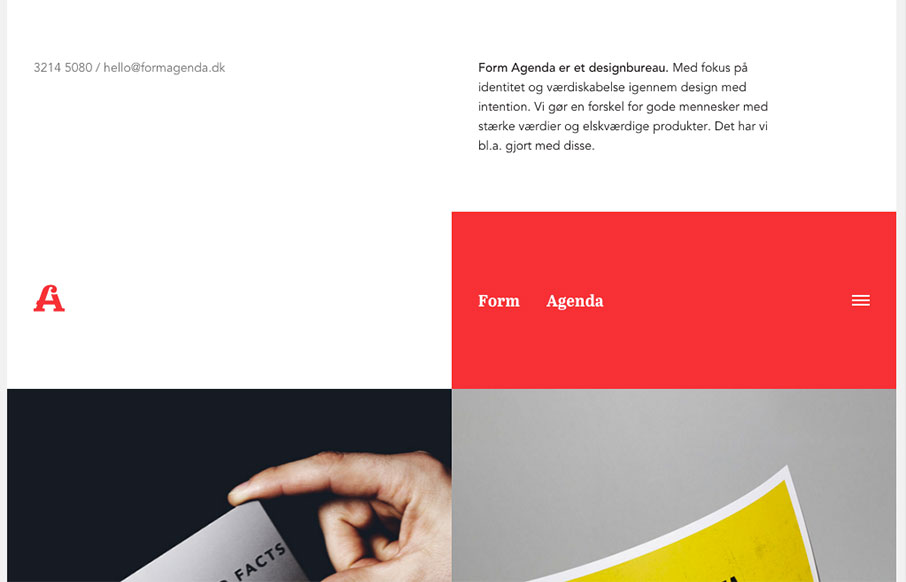
Super non-traditional looking layout for the Form Agenda website. It does everything right IMHO. I like the contact info in the top left – instead of a logo. Very clever. Then the rest of the grid is very active and keeps it fresh feeling as you scroll down the page. Bravo.


Fitts’s Law: Why the Easy Button Wins
Large, close targets are faster to hit than small, distant ones, that’s Fitts’s Law. A look at the 1954 rule behind buttons, prime and magic pixels, thumb zones, and dark patterns.


0 Comments