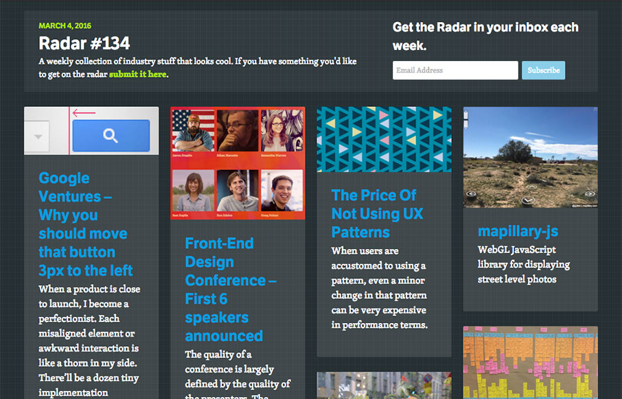
Each week, we do a round up of curated “stuff from the interwebs” that we call Radar.
Google Ventures – Why you should move that button 3px to the left
When a product is close to launch, I become a perfectionist. Each misaligned element or awkward interaction is like a thorn in my side. There’ll be a dozen tiny implementation mistakes that taunt me each time I run into them. Everything seems so broken.
Front-End Design Conference – First 6 speakers announced
The quality of a conference is largely defined by the quality of the presenters. The Front-End Design Conference has always worked hard to find a truly engaging and thoughtful lineup and this year is no different. Aaron Draplin – Ethan Marcotte – Samantha Warren – Sam Kapila – Ron Edelen – Doug Neiner
The Price Of Not Using UX Patterns
When users are accustomed to using a pattern, even a minor change in that pattern can be very expensive in performance terms.
mapillary-js
WebGL JavaScript library for displaying street level photos
How to build an experience map
An experience map shows the journey a customer has while experiencing a product or service. It also shows what competitors and your business are doing relative to this journey.
A new agenda connecting people and business
Knowledge of your abilities, interests, strengths and weaknesses is essential to becoming response-able in choosing and changing your career.
DevTools Author
If you use DevTools as your frontend development environment, DevTools Author provides a small set of options to enhance your authoring experience.
MediumEditor
The dead simple inline editor toolbar.
Maintainable Responsive Web Design with Sass
Building maintainable, responsive layouts often feels like a huge undertaking. A lot of people tend to revert to frameworks that end up having way more juice than they need. In this tutorial, we take a deep dive into some of Sass’ most useful features, and leverage them to build maintainable stylesheets. We’ll round it off […]
The State Of Airline Websites 2015: Lessons Learned
With this article, we start exploring various industries and study the current state of front-end, UX and performance of relatively complex websites. First up are airline websites.
If you want to add something to next week’s Radar – submit it here.
Here’s the link to this week’s batch of goodness: Radar #134.


0 Comments