
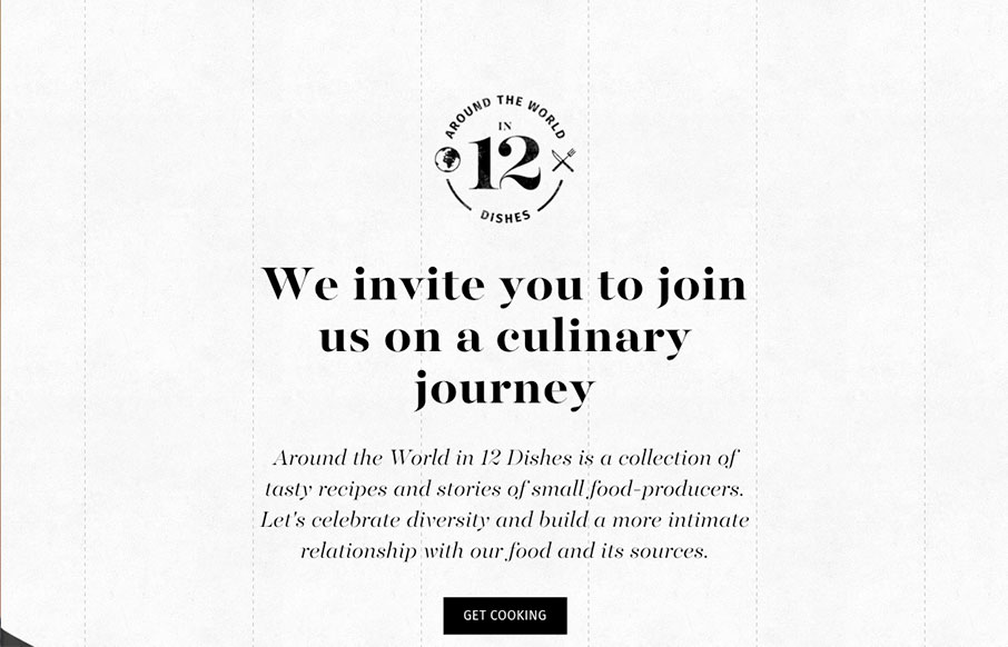
I’m in love with the way this website does sectional targeting. You start off with sort of a splash page (we can discuss that later) then get siphoned off into a couple different directions depending on your food choices. Then there’s a solid landing page for each one that keeps you interested with it’s content and interaction design. Solid work here for 12 Dishes.


Fitts’s Law: Why the Easy Button Wins
Large, close targets are faster to hit than small, distant ones, that’s Fitts’s Law. A look at the 1954 rule behind buttons, prime and magic pixels, thumb zones, and dark patterns.


0 Comments