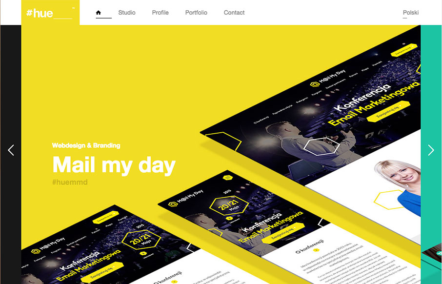
Pretty cool visual vibe with this design. I like the oversized spaces and blocks of color and even the angled screen shots – they all give it a dynamic feel even though the overall execution is fairly simple and straight forward. Bold colors and typography also lend itself to making this website feel strong.
Glassmorphism: The Transparent Design Trend That Refuses to Fade
Glassmorphism brings transparency, depth, and light back into modern UI. Learn how this “frosted glass” design trend enhances hierarchy, focus, and atmosphere, plus how to implement it in CSS responsibly.


0 Comments