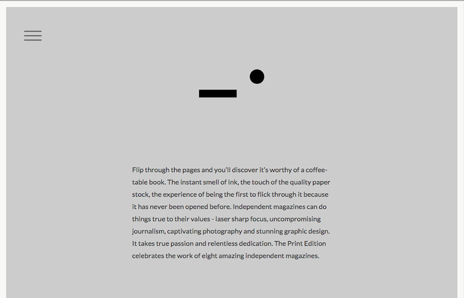
Pretty cool minimal design for Anekdote. I really dig the gray field where you can see the edges of it like they have it. It’s just simple and works. That’s good design to me, when the actions become almost invisible but say present.
Glassmorphism: The Transparent Design Trend That Refuses to Fade
Glassmorphism brings transparency, depth, and light back into modern UI. Learn how this “frosted glass” design trend enhances hierarchy, focus, and atmosphere, plus how to implement it in CSS responsibly.


0 Comments