Real nifty layout with fun details. I like the movement as I scroll and the overall vibe here. I really love that red, contact, section - the moment you see it as you scroll is solid.
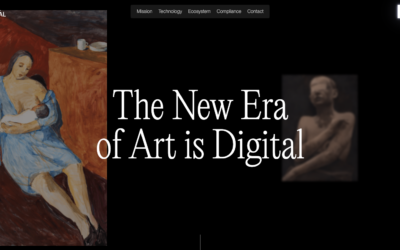
Digital Original
Overall this is a fun experience on the first viewing of the website. I really like the dark background and layout details. I feel like the dark background reinforces the brand so it really feels purposeful. I will say that on 3rd or 4th viewing it was tedious in that...
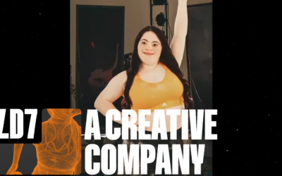
Fold 7
A great marriage of video/movement and bold, solid design. I like the little surprise details here and there, like the logo mouseover and the drawings that pop out here and there. I enjoyed viewing this website for the gallery.
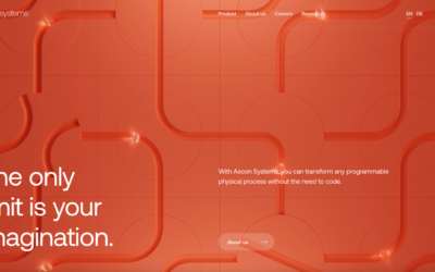
Ascon Systems
Very clean design. It just oozes engineering - I love it when a visual brand really conveys the essence of what the company does in a website. I love the color and simplified palette too. Small interactions that aren't over the top but solid in execution.
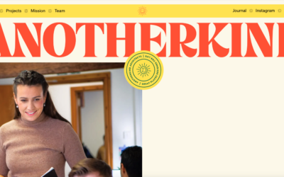
Anotherkind
I love the color palette of their brand and the simplicity in the design approach. The screen transition from one page to the other is a nice detail. Solid, simply layout and bold typography. It feels old-school without being old-school. I dig it.
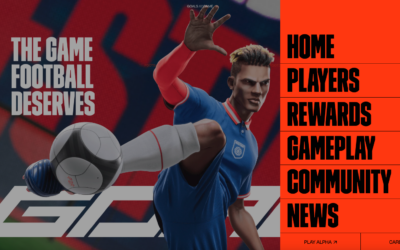
Goals
Neat promo website for Goals the game. Fairly straight-forward layout but I love the interplay of the video with the static elements. I also really dig that navigation and how the little hamburger box follows you down the page.
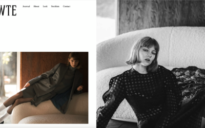
Bowte
Nice layout, it feels really modern and architectural. I like the pseudo parallax on the images, it makes for a strong look on interaction for it.
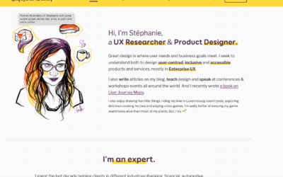
Stephanie Walter
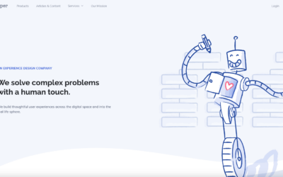
Clean and straightforward website design. As expected from a UX pro 🙂 I really dig the illustration and little floating parts of it. Such great content here as well. Enjoy!
Pencil & Paper
This has a kind of "template" vibe to me in some areas, but man do I love illustrations. In this case they're using them to tell the story of what they do, also utilizing some lazy loading to make the down scroll feel fun. It's also really keeping the strong content...
Eduardo Nunes
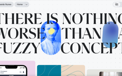
I really like the interactions on this website. The main navigation is pretty interesting, it's smooth. I'm never a big fan of taking over the computer's OS interface elements but it kinda works here better than you'd think. I also LOVE the layout changer selection...
Pepper Square
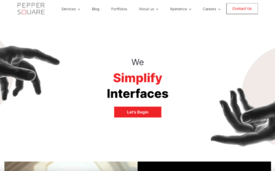
I like what they are doing here with this website. It's smart and clean and uses strong typography to do what they say they do; simplify. That's not easy to do - I write about that a lot and it's truth.
Goat
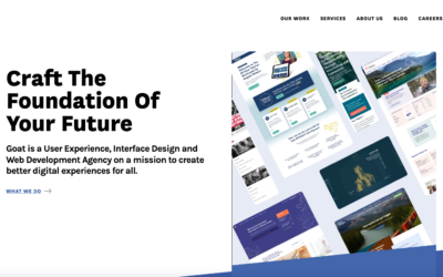
I always love a simple & straight forward design. Especially when it's an agency. Don't get me wrong I like to be wowed too, but I also like to review something simple that works great. You've got to work hard at keeping things simple AND affective at the same...
Pixelflakes
Man, that page load "screen" is a solid piece of interaction. The video for it is chosen perfectly and it's just a small detail that I love. I also love the grid and the way the type has such solid interplay with the layout. The colors feel classic yet somehow it's...
Push 10
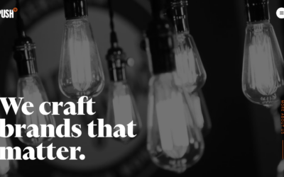
Very solid agency styled website design. I LOVE the use of large imagery and video like they've done here, much like Apple does with their stuff. The scroll interaction timing is well done and man, you just can't go wrong with strong/clean typography! Great work!
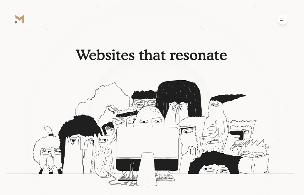
Magnet Co Web Agency – Websites that resonate
Magnet Co is a full-service digital agency with a human-centric approach to design and development.
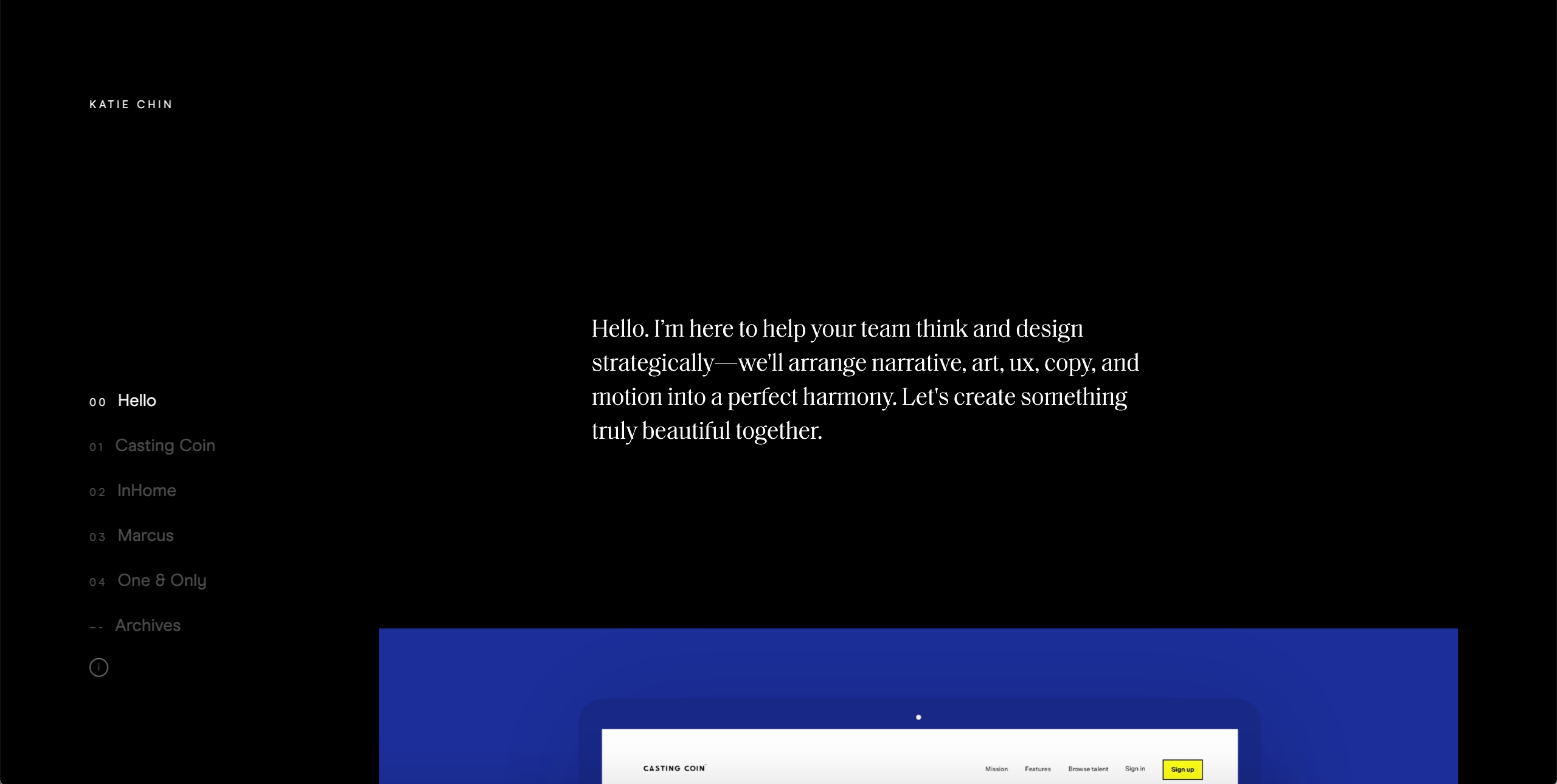
Katie Chin
This is a custom portfolio designed and built to make the viewing experience of work effortless and immersive. Each project scrolls right into the next for busy hiring managers who have limited bandwidth. The full-width photos and themed sections helps us focus on the...
Spring/Summer
I just LOVE the tight layout and grid that's paired with such distinct differences in typographical choices. So solid. Different colors for each page/section just reinforces the thoroughness feeling behind the brand. Great work.
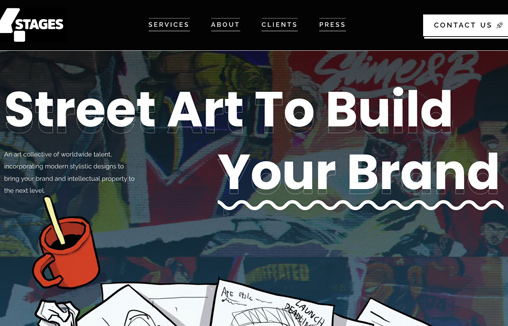
4-Stages
An art collective of worldwide talent, incorporating modern stylistic designs. Based in Malaysia and Singapore.
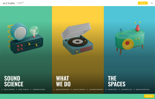
Altaura
A full service sound agency that provides music curation services and background music for businesses and brands. Based in London, UK and Santa Monica, US they create playlists and songs that increase revenue.
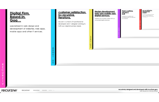
Recurziv
Interesting design study for this website. The main layout IS the navigation. I can't say how well this would work in a purely UX review but from a gallery/design perspective it's worth the time and study.
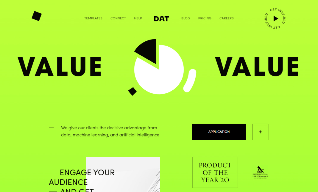
Survey analytics
“Survey analytics” helps businesses take maximum advantage from modern technology. Automating data analysis with artificial intelligence means leaving the rivals far behind. AI’s potential is not discovered completely so that is just a beginning of the story.
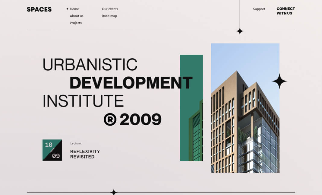
Spaces Urbanistic
I don't really care that this is webflow - it's nice. You can study it as a template if you like. I love the scrolling interaction/animation. So clean and timed perfectly.
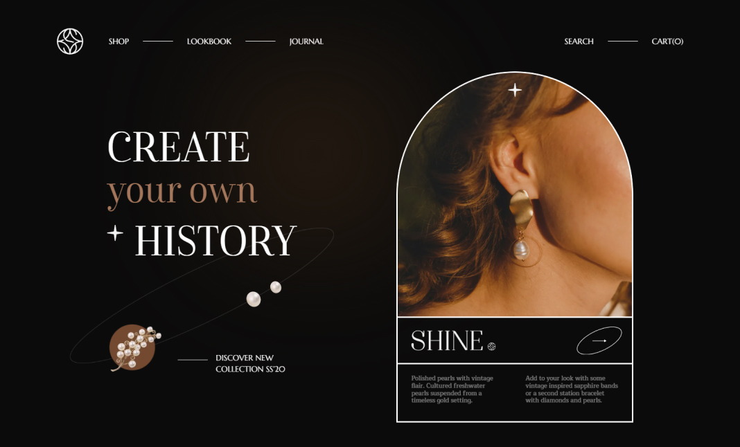
Shine Shop
I present this design into the gallery because it occurs to me just how close to "Flash" websites we've gotten now. I mean this site is decent, it works, it's Responsive. It just reminds me like 100% of a "Flash" site. Not sure how i'm feeling about this...
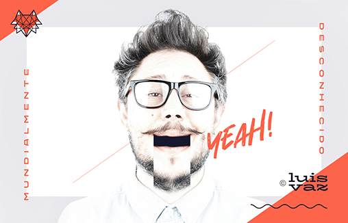
LUIS VAZ designer
Designer, Freelancer, Branding, Logo Design, Naming, Portugal, Lisboa
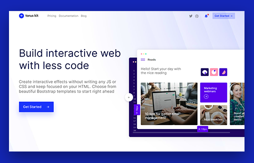
Torus Kit – Interactions made effortless
Create interactive effects, animations, and transitions without writing any JS or CSS, and keep focused on your HTML.
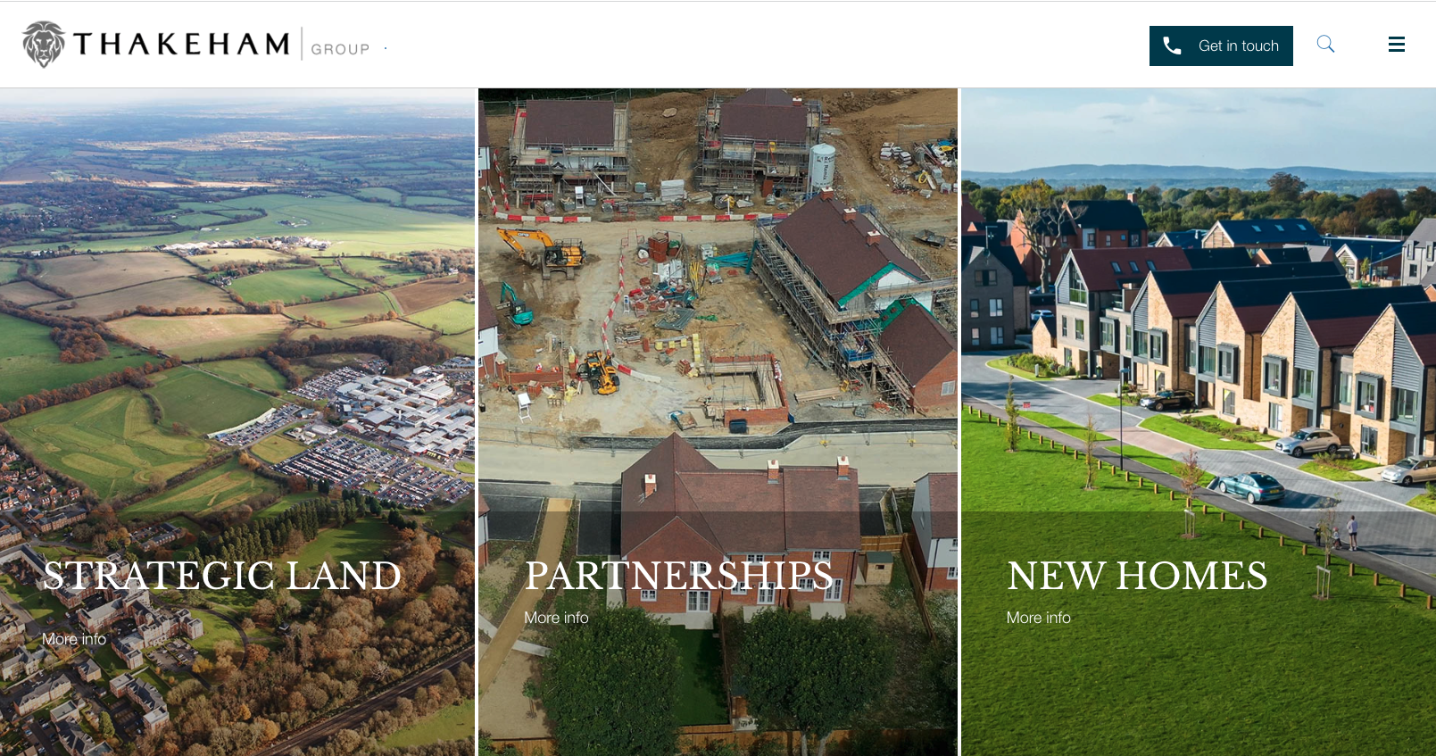
Thakeham
Thakeham is one of the South East’s leading developers. A team of industry experts, we deliver to consistently high standards in residential development, contract build and land promotion opportunities.
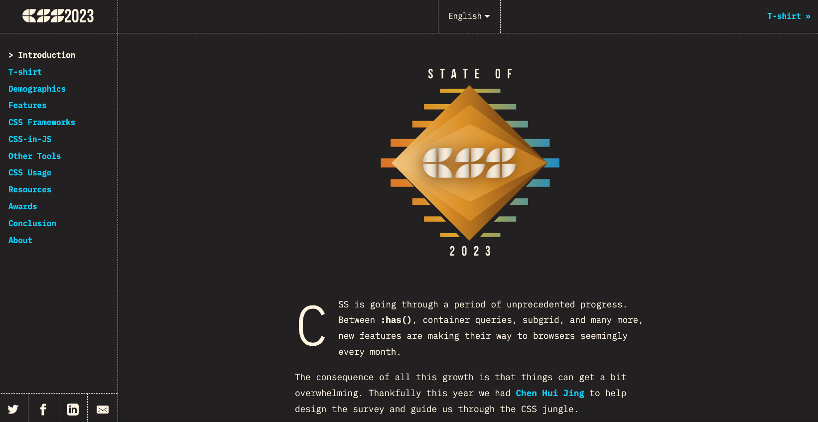
State of CSS 2023
Cool project and also the website itself is pretty nifty. A cool little loading logo illustration and line work. It's not going to win any design awards but I think it's worth checking out not only for the content but check out it's tricks.
Website Design Auckland NZ
A clean, sophisticated black and white website design with a sharp font and subtle animations that bring the website design to life. We've used minimal, custom-designed icons for the menu navigation and large, hero images to showcase the portfolio. Large hero images...
Aime Chen
I LOVE minimalism... It's the most singularly difficult thing to pull off in a website design. It's not just about being 'simple' or 'clean' you have to do simplicity while still communicating properly.
lullabot
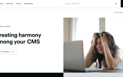
Been a fan of Lullabot for a long time. Recently checked out their website and it made me so happy. Very nice clean and crisp solid layout with snappy load times and responsive views. Love it.

