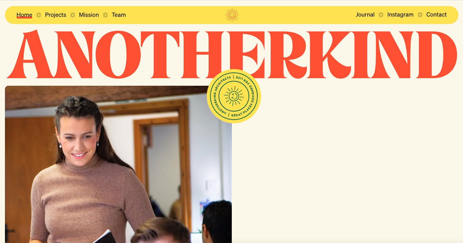
I love the color palette of their brand and the simplicity in the design approach. The screen transition from one page to the other is a nice detail. Solid, simply layout and bold typography. It feels old-school without being old-school. I dig it.


The Call to Action, Revisited
The Call to Action hasn’t changed in a decade, but the bar has. A fresh look at prominence, copy, mobile tap targets, and accessibility, with lessons from three major design systems.


0 Comments