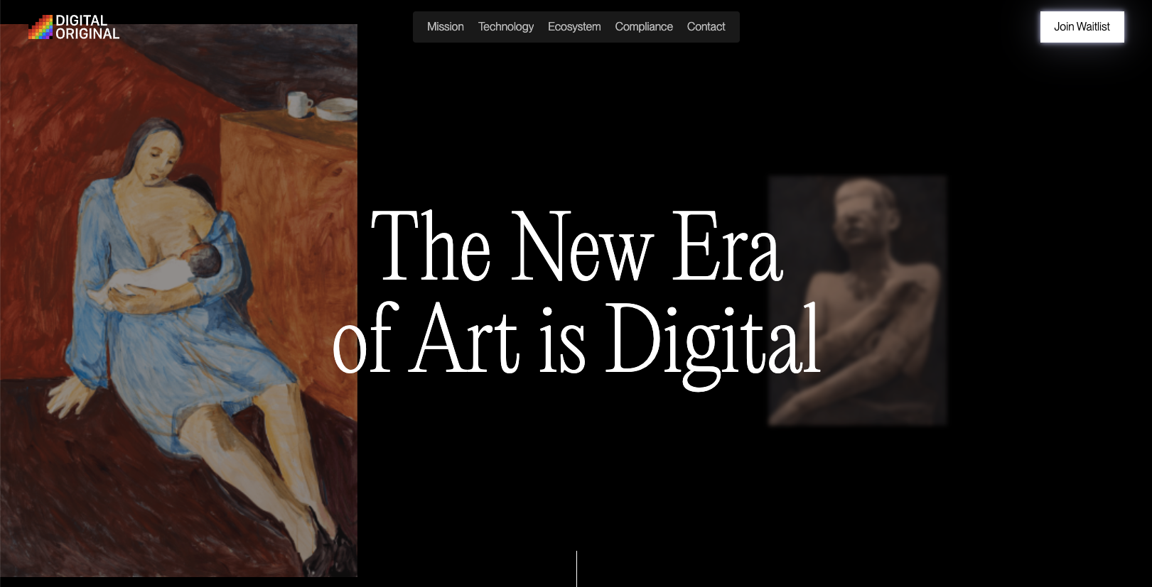
Overall this is a fun experience on the first viewing of the website. I really like the dark background and layout details. I feel like the dark background reinforces the brand so it really feels purposeful. I will say that on 3rd or 4th viewing it was tedious in that it was a single page with long scrolls to get to the deeper content – guess that’s just how single page layouts go though.
Glassmorphism: The Transparent Design Trend That Refuses to Fade
Glassmorphism brings transparency, depth, and light back into modern UI. Learn how this “frosted glass” design trend enhances hierarchy, focus, and atmosphere, plus how to implement it in CSS responsibly.


0 Comments