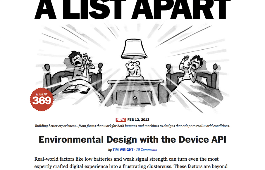
A very strong redesign by the fine folks at A List Apart. I love the focus on the articles, putting that front and center just brings home all the strategy they've been putting forth in the conferences and books. The minimal color palette works so well and helps the...
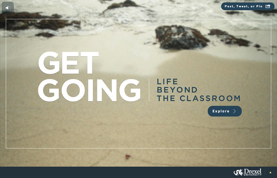
getgoingtoday.org
Sensory parfait. The layers of sounds, texture, and motion are only the beginning. I love the parallel, whether intended or not, of the site having a Choose Your Own Adventure feel. Metaphorically, it works so well on a site for getting a higher education degree. I...
The Pixel Bureau
Submitted by: Alex Berry @iluvrobots Role: Designer & Developer The Pixel Bureau site is a nice clean dark background site design. Nice illustration work to help pump it up and make it fun visually. I like the green and orange(ish) colors used here too. Good...
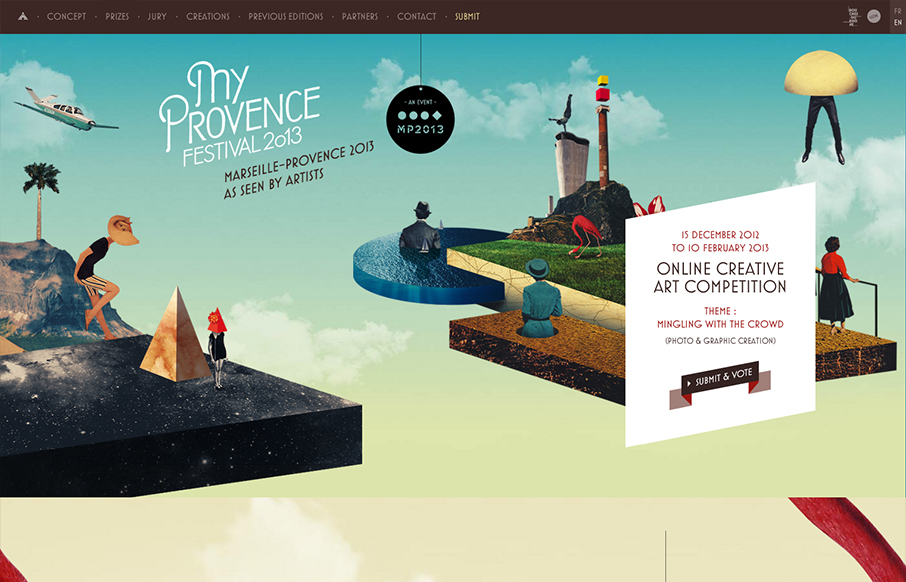
My Provence
Submitted by: Florian Monfrini @AgenceUzik Role: Project Manager My Provence Festival is an online creative art competition, open to all, and run by Bouches-du-Rhône Tourisme (France) between December 15, 2012 and February 10, 2013. This year the theme of the...
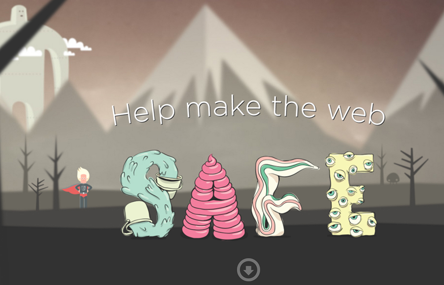
Browser Awareness Day
Submitted by: Ryan Ryan Role: Designer & Developer Saving the Internet, one browser update at a time. Pretty fun design. I like the illustrations very much, they feel like the Adventure Time cartoon.
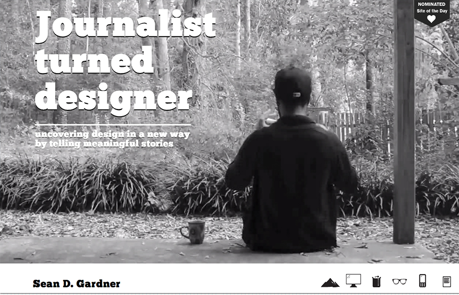
Sean Gardner
I love the freshness in this design. The soul of this website feels like exploration, from the video background to the navigation design using icons like it does, it just feels fun.
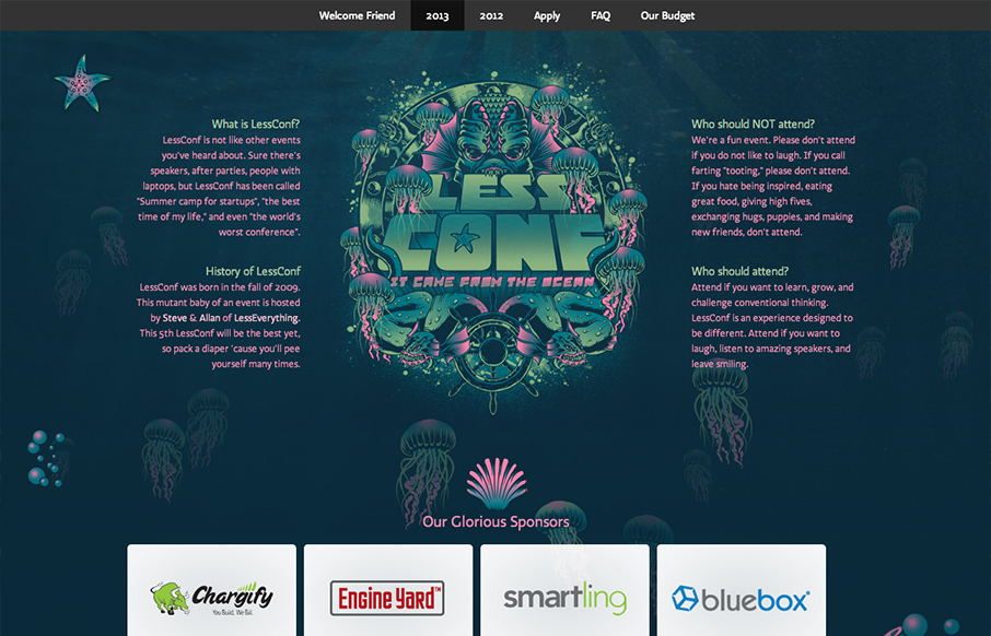
LessConf 2013
I love the LessConf guys, Alan and Steve. They put on a great conference (if you can call it that) and each year they utilize pretty fun and far out illustrations. It's almost theme like, but generally just fun. This year it's an animated under sea adventure/monster...
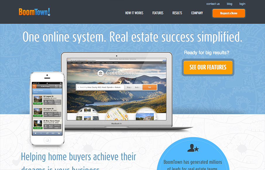
BoomTown!
had a blast working with the talented team over @boomtownroi on our recent launch. really proud of this one. boomtownroi.com— {e} house studio (@ehousestudio) January 16, 2013 Nice soft colors with a strong call-to-action makes this site look like a...
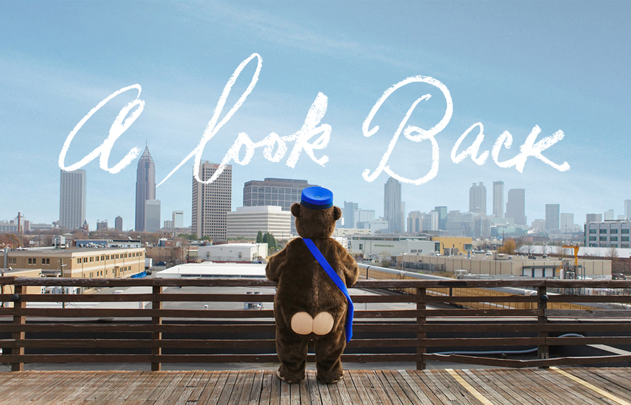
Mailchimp 2012 Annual Report
Nice work @seriousron and @aarron at @mailchimp mailchimp.com/2012/— Matthew Smith (@whale) January 16, 2013 Beautiful Annual Report website from Mailchimp. It is full of the humor and love that they put into everything they do. Damn, I just love these guys so...
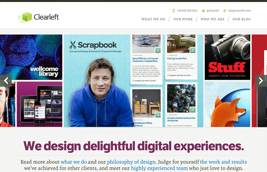
Clearleft
What a great re-launch of one of the companies I've watched for several years help lead our industry. The new Clearleft site is a thing of beauty. It's simplified yet not too much, it has some complex(ish) interactions with the slideshow and detailed links in it, but...
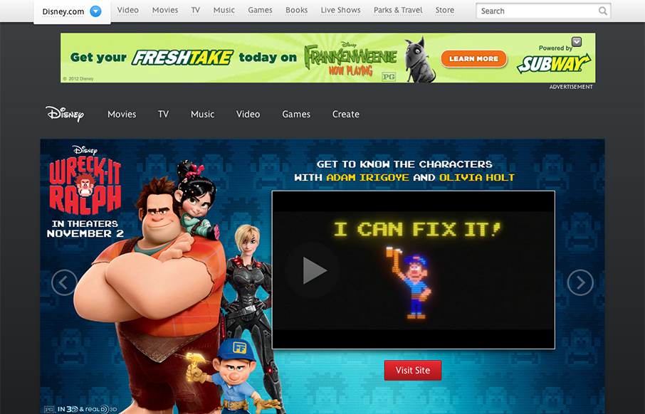
Disney
Congratulations to @dromano, @fillup, and the whole team on the slick new design for disney.com that launched today! (finally!)— Jesse James Garrett (@jjg) October 1, 2012 The new Disney.com site rolled out late in 2012. There's been a lot of linking and posts...
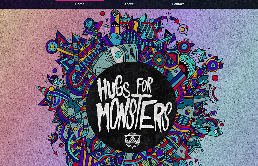
Hugs For Monsters
The latest update for Hugs For Monsters, the website of Joe Lifrieri @hugsformonsters, has me all smiles. From the initial loading/animation of the main art on the home page to the about page's illustration and content. Joe is always down to earth and real to me when...
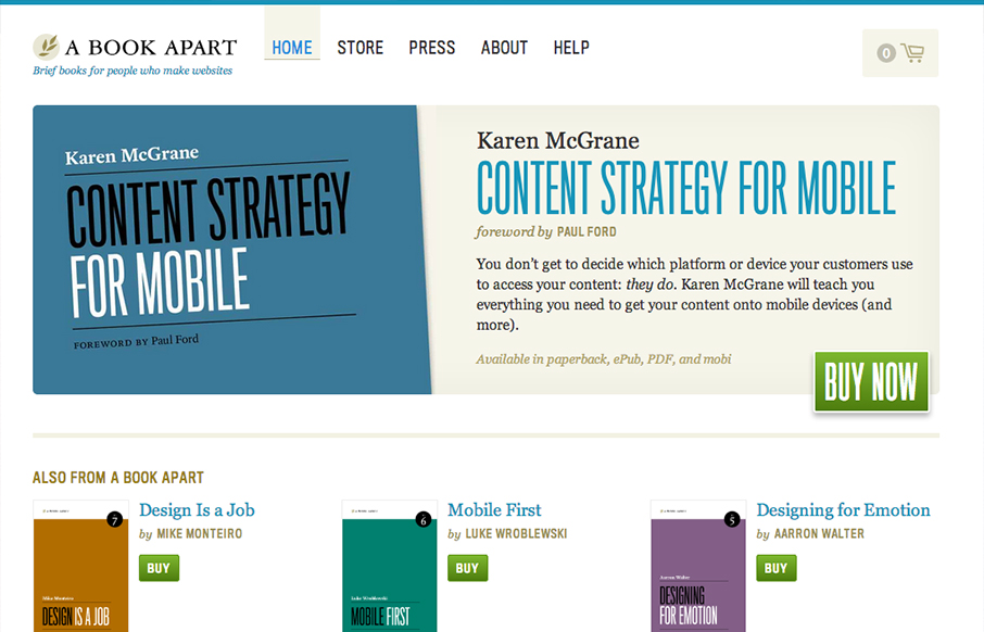
A Book Apart
I've long thought the A Book Apart site was well done but it felt a little too plain, just my gut feeling. With this re-work and it's not a total redesign, but just enough to tweak it and make it responsive it's truly a nice minimal(ish) execution of just the right...
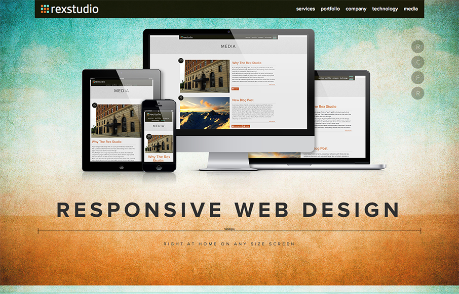
rexstudio
Nice responsive and parallax execution here. I like the side nav that takes you to the page's anchor points. Very cleverly done indeed. Nice colors and visual experience too.
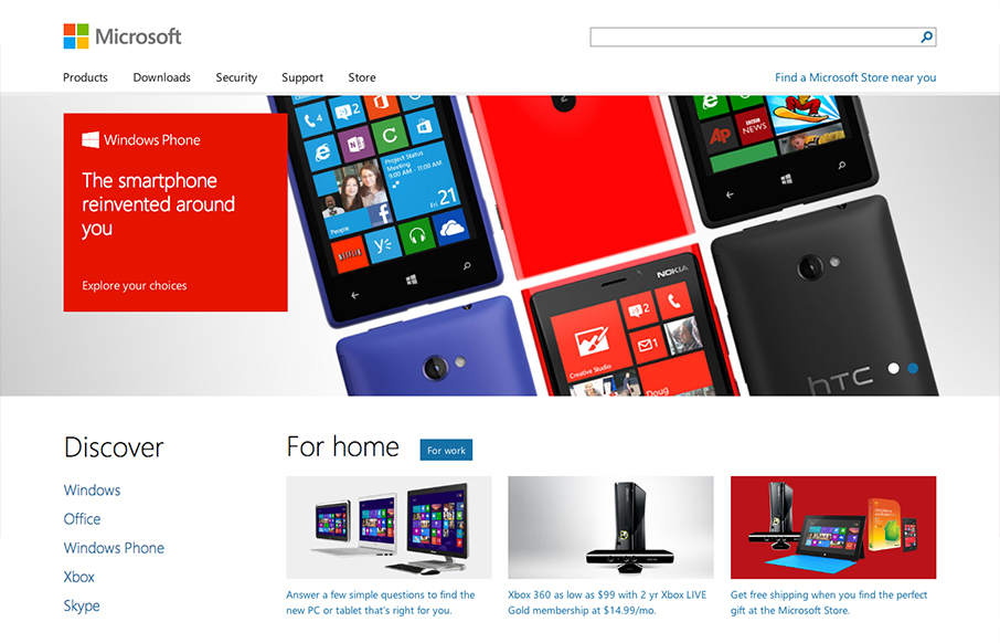
Microsoft
I'm remiss in not including the Microsoft site before the end of 2012. It's one of the best redesigns rolled out last year IMHO. Today I get to tell you that @paravelinc has been working with @microsoft to help build their new responsive homepage: microsoft.com —...
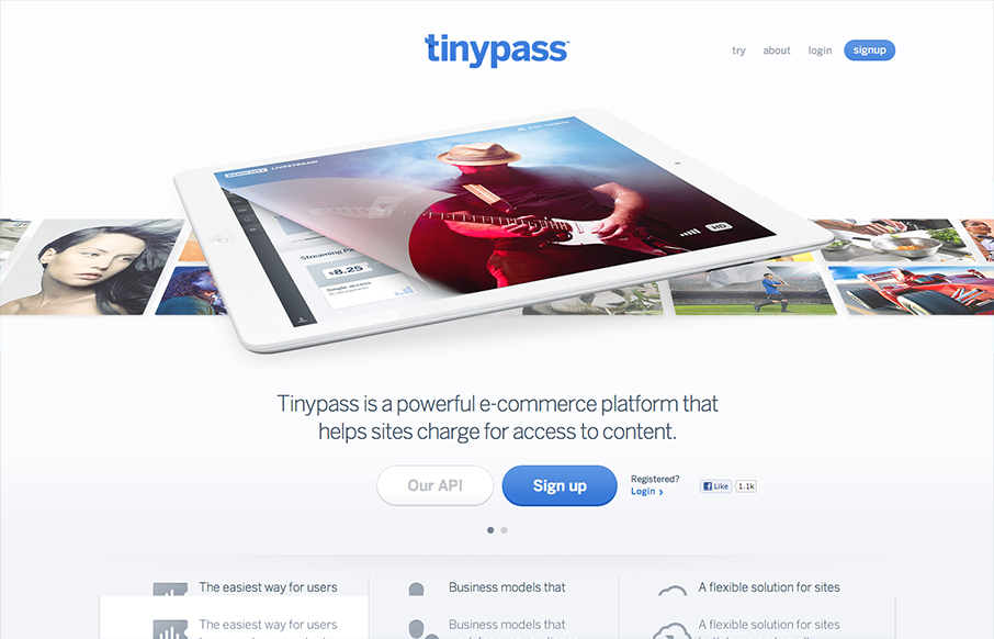
TinyPass
Really like the design of this site, tinypass: d.pr/mZeq— Noah Stokes (@motherfuton) January 4, 2013 TinyPass is a really great site. I like that its got that Apple vibe but also has its own heart too. The slideshow is well done and feels fresh with the way...
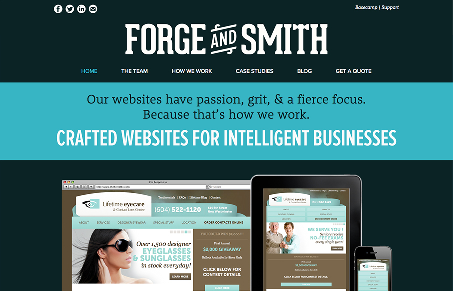
Forge and Smith
Really great straight forward site design for the web design firm Forge and Smith. Clean type and great visual balance make this site very easy on the eyes. I like the focus on clean and crisp execution and less fanciness. Love this site.
Inky
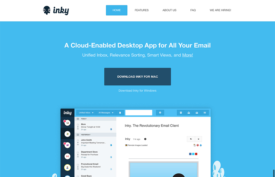
Pretty cool looking email app. Aside from that, the site design is a nice example of putting the full narrative from screenshot down to FAQ type content. I like how it flows both copy and visually.
Tedx GUC
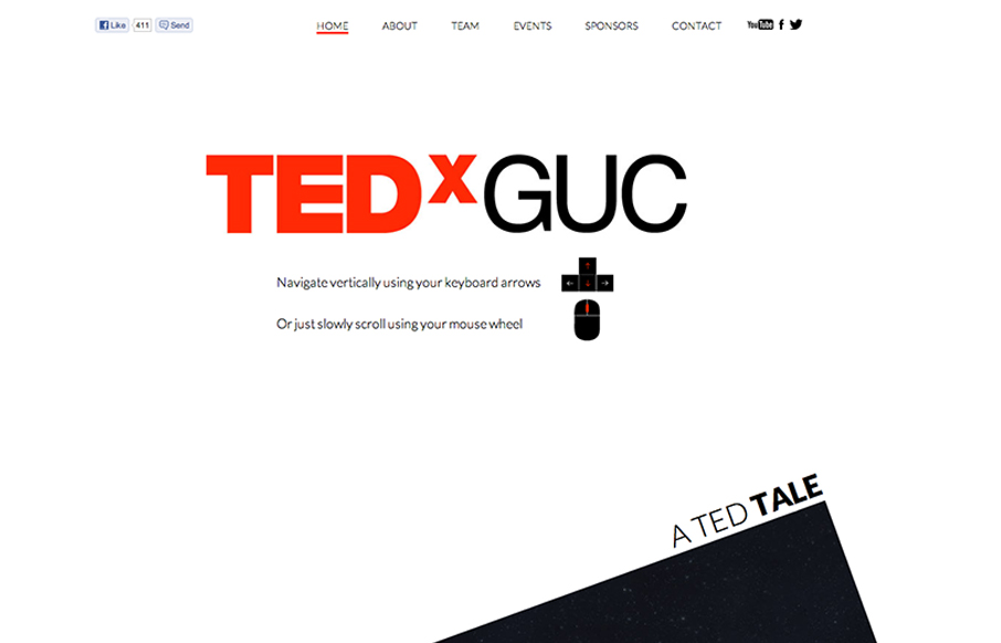
Amazingly entertaining home page scrolling layout. They've kept it super creative and full of wonderful illustrations and in the stark black & red coloring of the Tedx sites. The other pages are as charismatic as the home too. I love this Tedx site.
Epic Body Designs
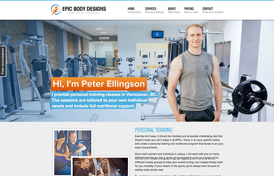
I love when I see a non-designer website that's as good looking as a web designer's portfolio design. Like the site here for Epic Body Designs. It employs a lot of the typical design solution stuff we see on other designer's portfolio sites or web app product sites...
1:Face Watch
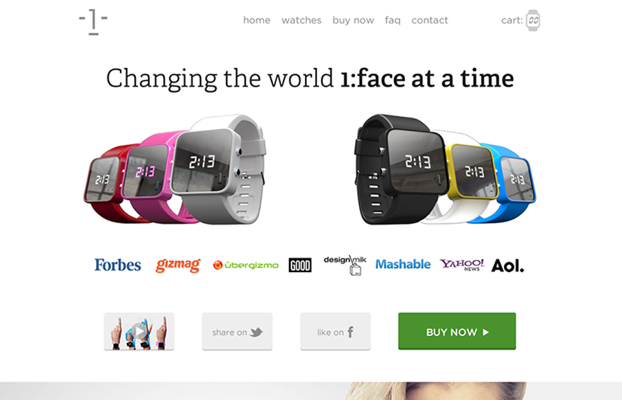
I dig the long scrolling page approach of the 1:Face Watch website. The photography is inspired IMHO and the other smart move was putting a "purchase" call to action next to every section of the page.
Made By Few
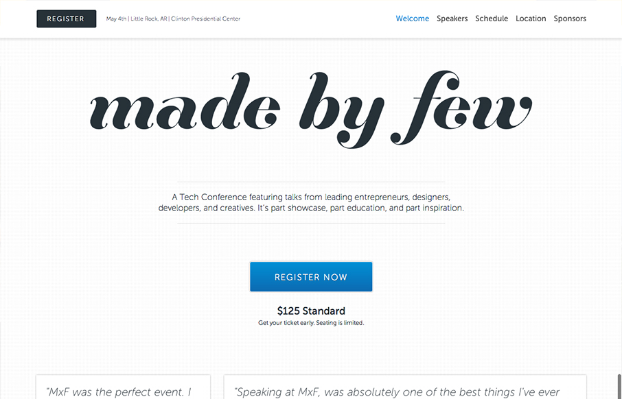
The Made By Few site employs a nice fairly minimal design. I like the blue for the call to action and the other black, white and grey helps to make other details like the speakers images really stand out. I like the progressive loading as you scroll too. Capped off...
delval.edu
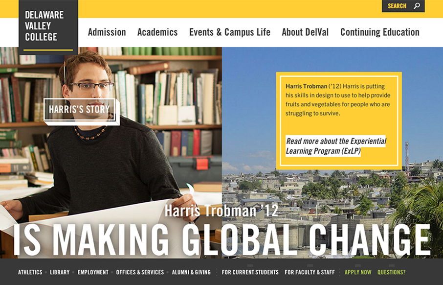
The @happycog-designed responsive redesign of delval.edu is seriously stunning. Love. /via @zeldman— Responsive Design (@RWD) December 19, 2012 I love the visual style of this site. It's blocky and squared off and generally feels very graphic. I dig the fixed...
BuySellAds Pro
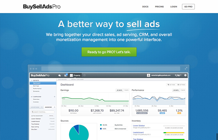
Beautiful design from a great company.pro.buysellads.com— allan branch (@allanbranch) December 20, 2012 Like Allan said, this design is beautiful. I like the vertical spacing of the elements, the clean color palette, the clear narrative of what BySellAds Pro is...
Hunie
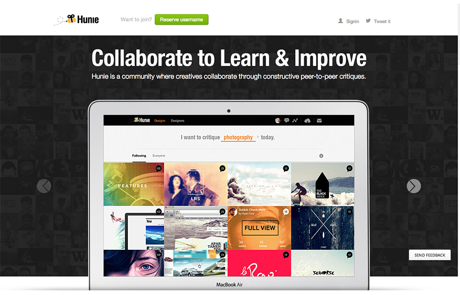
It's a pretty standard design, big hero image, slider, long scrolling page. But what this design does well is rhythm, from the top nav bar down to the footer it just sings to me visually. I like how it goes from heavy dark background to light, do clean icons from big...
Snowbird
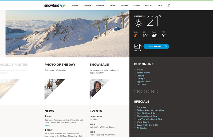
Well that's a nice looking' site. snowbird.com via @alliwagner— Chris Coyier (@chriscoyier) December 11, 2012 Agreed, it's an amazing experience as you use it. The interactions are spot on and even more it's fun to use. That's what's going to win business in the...
Grateful Dead Archive
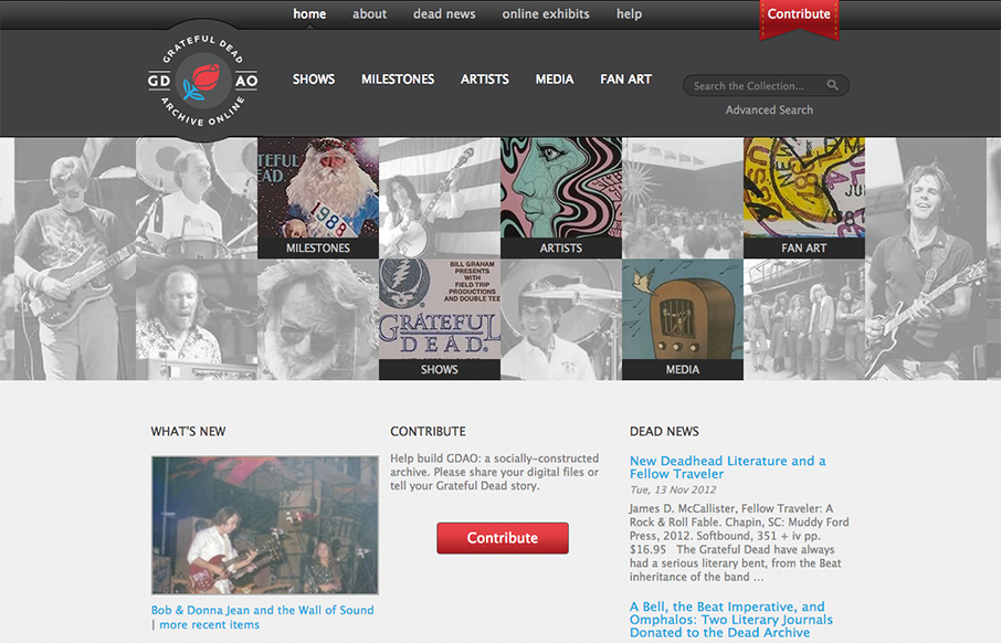
Went to gdao.org & time got away from me. What a wonderfully done site. One of my favorites.— Samantha Warren (@SamanthaToy) January 1, 2013 The thing I most like about this site is it's information design. There's a ton of stuff here to slog through and the...
Riot
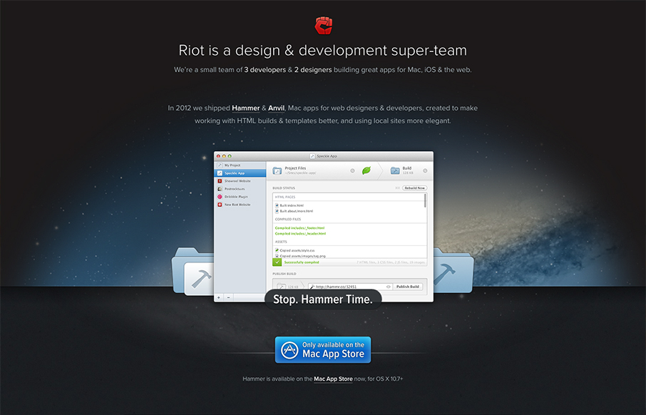
The crispness of this design just makes me smile. Then the subtle execution of the visual elements from the perfectly chosen color blue for the call to action, to the team display down to the faded map in the footer. There's so much here visually it's amazing that it...
Monocle
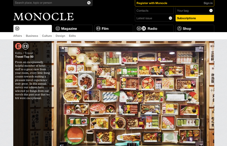
The new Monocle design is smart and sleekly crisp. I really love the header interaction design. It goes from full height to small and sticky very fluidly. Then the asymmetrical feel to the broken up grid of story blocks as you make your way scrolling down the home...
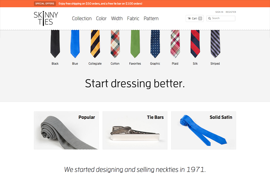
Skinny Ties
There's so much to like with this site design! The layout is nice and clean and so well organized. Then the interactions steal the day with the little bobbing the ties do and the drop down design on the main nav. Then, it's a responsive design to boot! Study this...

