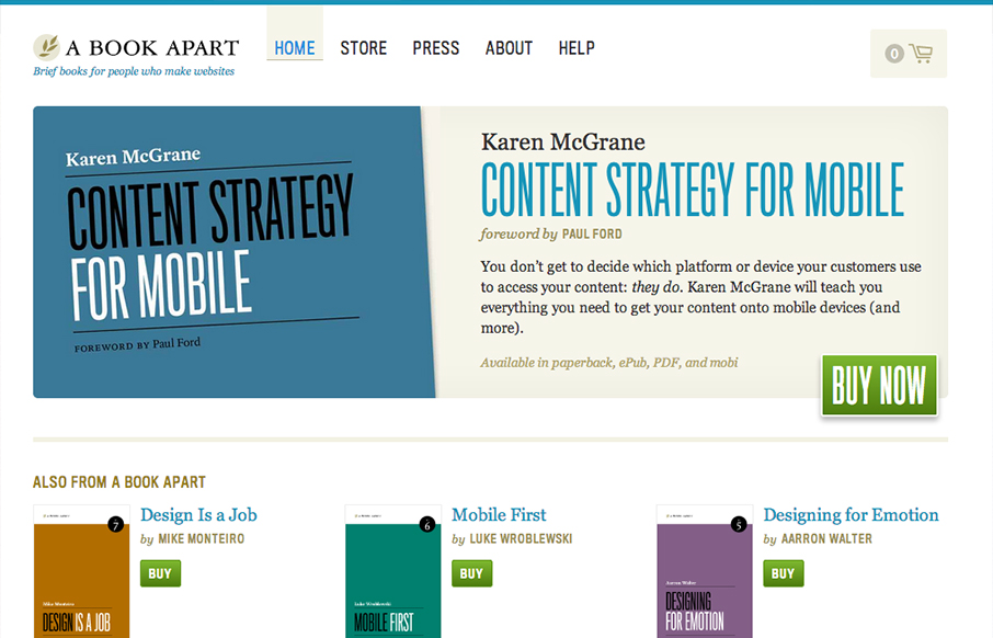
I’ve long thought the A Book Apart site was well done but it felt a little too plain, just my gut feeling. With this re-work and it’s not a total redesign, but just enough to tweak it and make it responsive it’s truly a nice minimal(ish) execution of just the right things the site needs. I love the “buy now” call to action, it’s green which makes it stand out well and it’s also offset from the main “hero” area which also makes it really stand out. The slight animation on the featured book image as you scale the browser down is also well placed and I smiled when I saw it, I felt like it was put there just for us web designers. Great update to a good site.


The Call to Action, Revisited
The Call to Action hasn’t changed in a decade, but the bar has. A fresh look at prominence, copy, mobile tap targets, and accessibility, with lessons from three major design systems.


0 Comments