
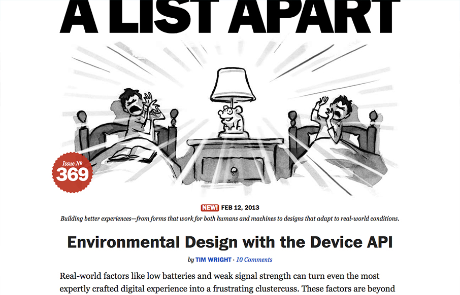
A very strong redesign by the fine folks at A List Apart. I love the focus on the articles, putting that front and center just brings home all the strategy they’ve been putting forth in the conferences and books. The minimal color palette works so well and helps the small spots of color really jump out at you when they need to use it. The other thing I really like is the gradation from big header, illustration and main story to a much busier and filled out grid layout with more content and links. Beautiful work.


Fitts’s Law: Why the Easy Button Wins
Large, close targets are faster to hit than small, distant ones, that’s Fitts’s Law. A look at the 1954 rule behind buttons, prime and magic pixels, thumb zones, and dark patterns.


0 Comments