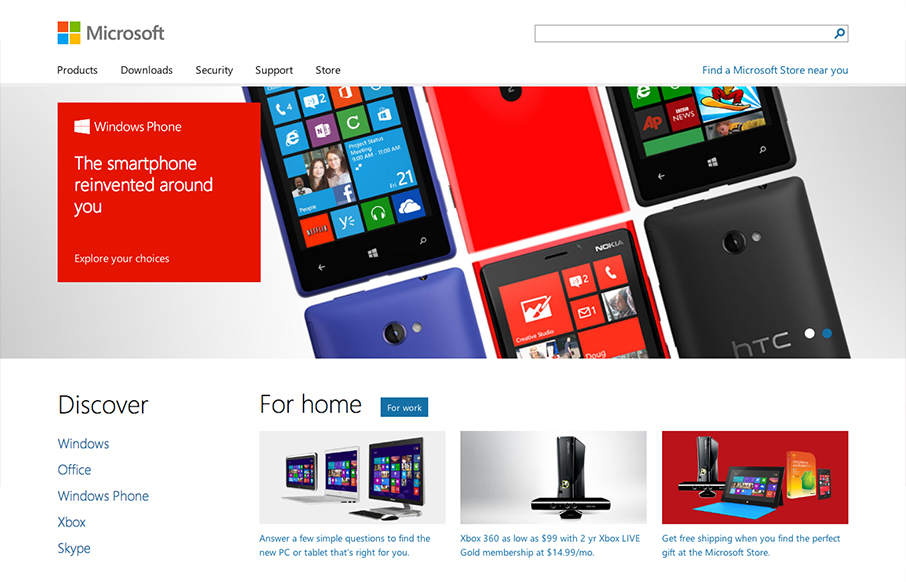
I’m remiss in not including the Microsoft site before the end of 2012. It’s one of the best redesigns rolled out last year IMHO.
Today I get to tell you that @paravelinc has been working with @microsoft to help build their new responsive homepage: microsoft.com
— Trent Walton (@TrentWalton) October 2, 2012
Microsoft.com is a wonderfully simple site with a very modern aesthetic and a wide open layout. The wonder kids at Paravel have done a great job of distilling Microsoft’s new look into an elegant homepage.
Trent has provided a brief but great post about the rollout. I particularly love this sentence:
We began fleshing out photoshop comps for 2-3 arbitrary widths (narrow, middle, and full-width). There was a lot of iteration, and we found that this phase was just as much about conversation as it was about the actual design.
I think maybe as an industry we suffer from a lack of conversing about the differences in what we do for each screen and a lot of times just shoot from the hip. I understand an site the scope of something like Microsoft would take a lot more planning and discussions, but there’s a lesson here for us all I think.
Great, great work on this site!


0 Comments