
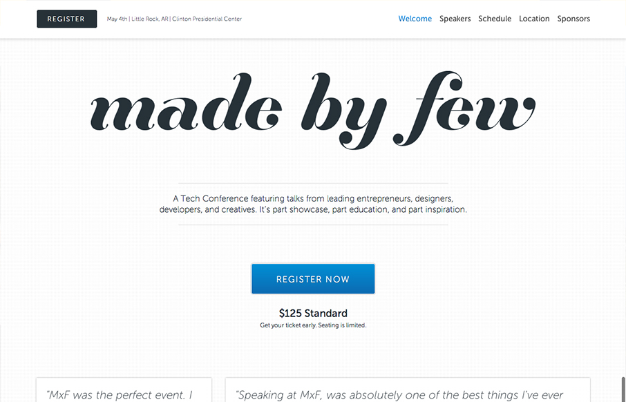
The Made By Few site employs a nice fairly minimal design. I like the blue for the call to action and the other black, white and grey helps to make other details like the speakers images really stand out. I like the progressive loading as you scroll too. Capped off with a nice responsive solution, the site is well done.


Fitts’s Law: Why the Easy Button Wins
Large, close targets are faster to hit than small, distant ones, that’s Fitts’s Law. A look at the 1954 rule behind buttons, prime and magic pixels, thumb zones, and dark patterns.


Sexy! Great job, Artlon!