
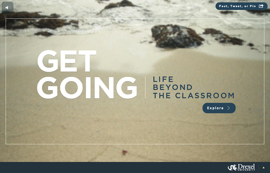
Sensory parfait. The layers of sounds, texture, and motion are only the beginning. I love the parallel, whether intended or not, of the site having a Choose Your Own Adventure feel. Metaphorically, it works so well on a site for getting a higher education degree. I thought the controls were intuitive and appreciated the difference in details for the cursor. They did a really good job about making it easy to share any one point in this visual journey. And kudos for weaving real life testimonies in with the inspiring statements. It makes a really smart way to add practicality to something that otherwise would just be fun to explore.


Fitts’s Law: Why the Easy Button Wins
Large, close targets are faster to hit than small, distant ones, that’s Fitts’s Law. A look at the 1954 rule behind buttons, prime and magic pixels, thumb zones, and dark patterns.


0 Comments