Web Design Inspiration Curated
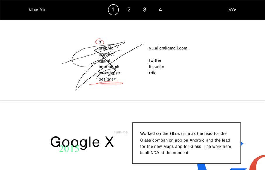
Allen Yu
I've read a lot of praise and criticism for this portfolio site by Allen Yu out of New York. This is one of those times where I'm going to let the work speak for itself, with the overtone of: art is open to interpretation. What's your interpretation? Tweet us:...
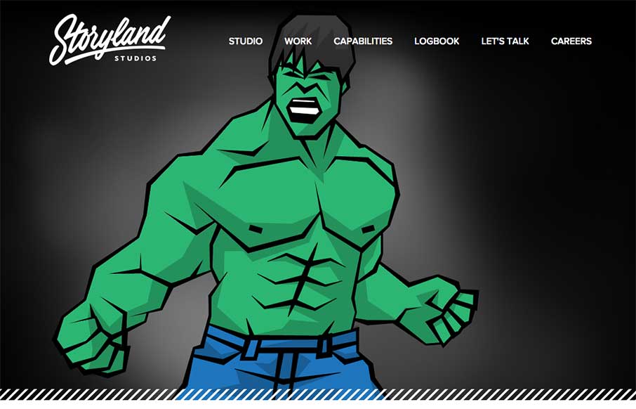
Storyland Studios
So John that works with us here at Unmatchedstyle sent me this yesterday - Storyland Studios near LA - made by Sputnik Studios in Austin. John's quote on it was: "the content is of course what excites me the most but the site is well made I think (How could you go...
Isaac Paavola
To say Isaac Paavola has moxie is kind of an understatement based on his portfolio here. It's intro is unexpected, and then there is good fading of sections as you scroll down. The movement of the portfolio banner is a sweet idea, and like how it's used again as...

Website Store
I admit, at first I was taken aback on the Website Store UK website out of the UK.. (wait, what did I write there?) - mainly because of the name and the image of the iPhone and iMac site mock ups in front of the full width and height images. Pressing on, found the...
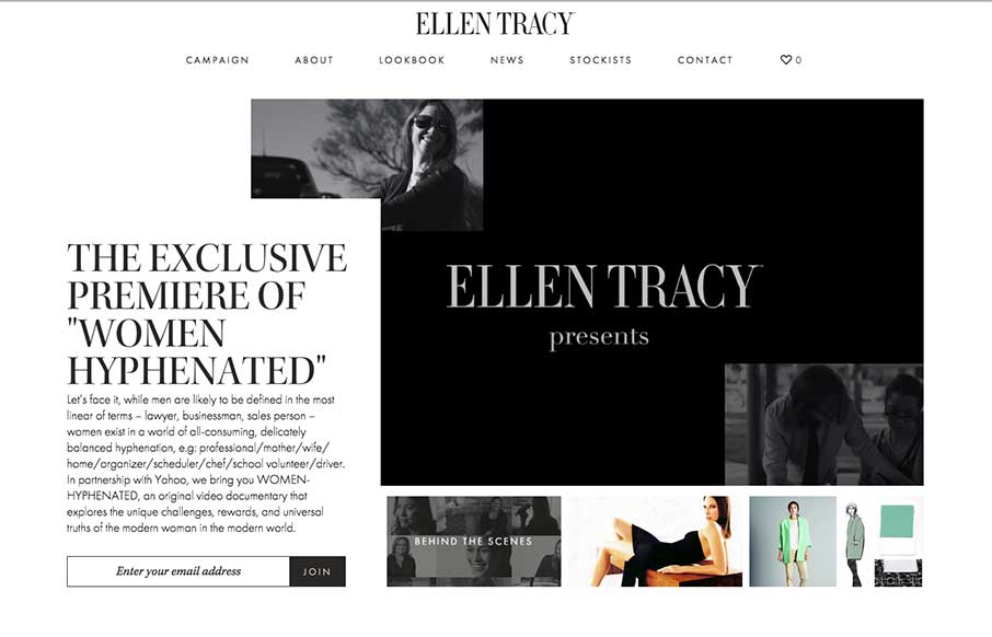
Ellen Tracy
High fashion is followed by slick design in this site for Ellen Tracy, done by The Charles NYC. I already like the work that The Charles does (like the Bloomberg Media site we reviewed a little while back) - so when they submitted this site, I was looking forward to...
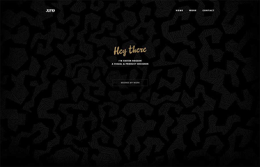
Xavier Roggen
Xavier Roggen's portfolio site out of Brussels is minimal, but there are some cool takeaways from it (we try to get those in each site we look at). I like the full width image slider background and the filtered images he uses. Sometimes style is a matter of content...

BigOmaha.co
tl;dr - Details are the details - Built with Polymer ( I think ) - It's really fast - page to page transition - good color palette - it's really really fast - builds upon start up conference tropes - photo of a chemex on the homepage, really? - super sexy responsive...
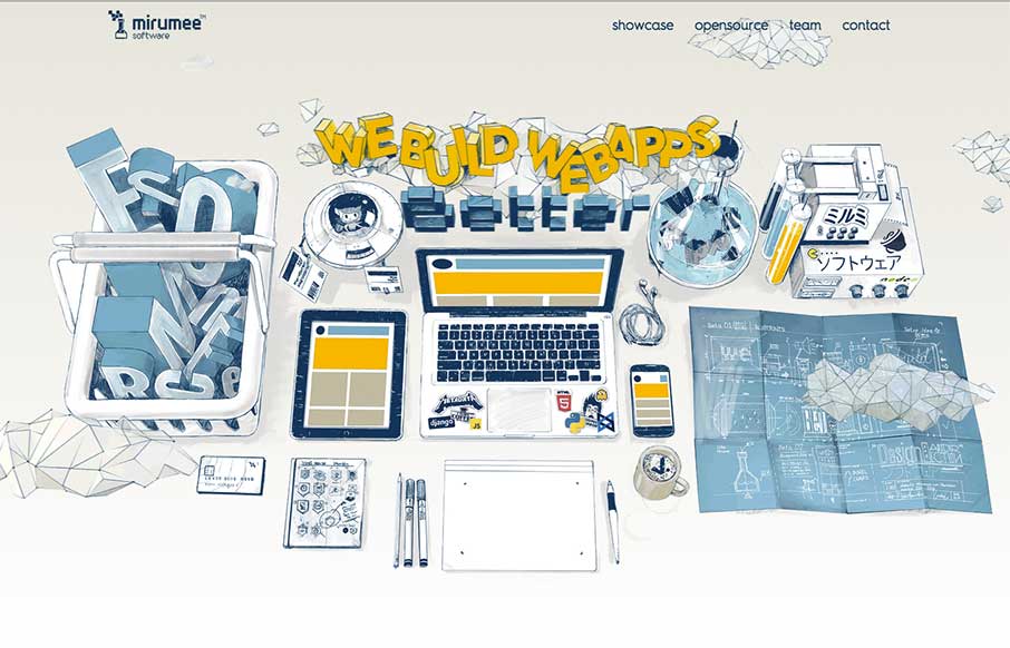
Mirumee Software
Now this is a fun agency site from Mirumee Software out of Poland. Cool illustrations, some subtle parallax animation, and good coloring makes this one pager vibrant and inviting.
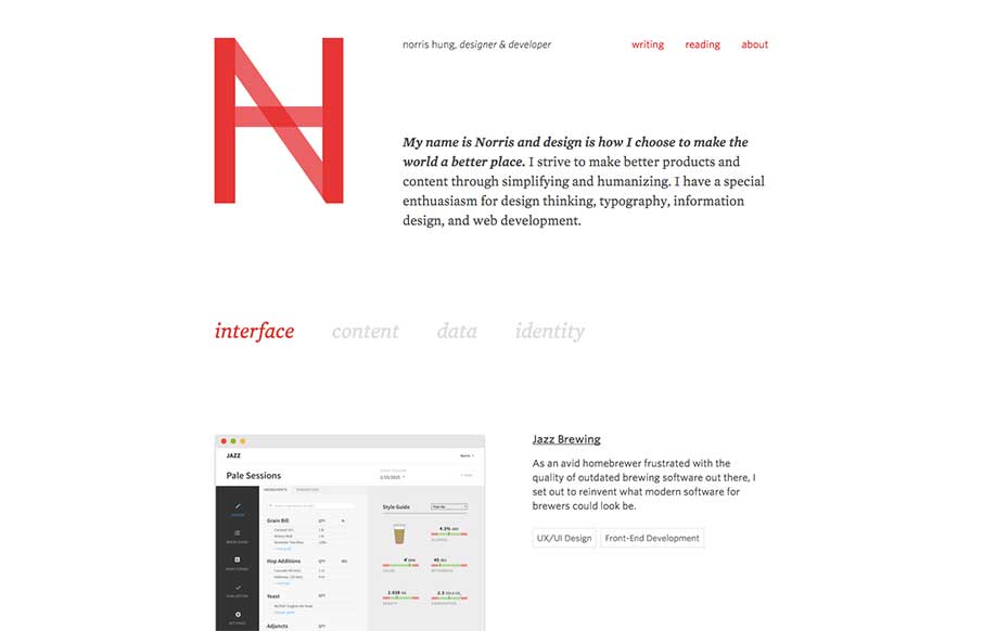
Norris Hung
Portfolio site from Norris Hung out of San Francisco. Like the minimalist design. Also like when designers let you know what stack they use - this one built with Bourbon / Neat and Jekyll. Would like to see either links to the portfolio work itself, or allow for...
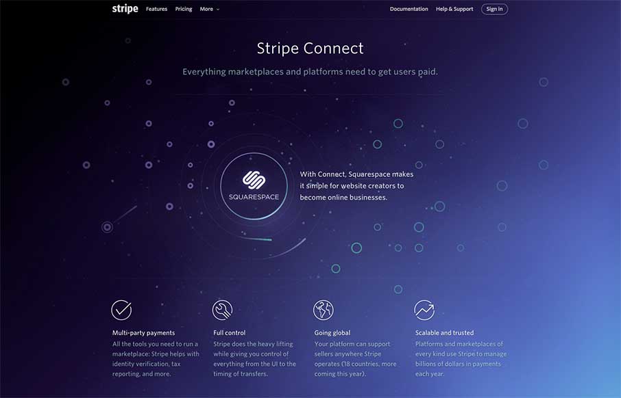
Stripe Connect
So... I've been sitting here for a couple of minutes, trying to figure out how random or not the paths of the meteors are that get pulled into the Stripe Connect orbit, and out.. and figured I should start typing before tomorrow comes... Then I used the "Inspect...
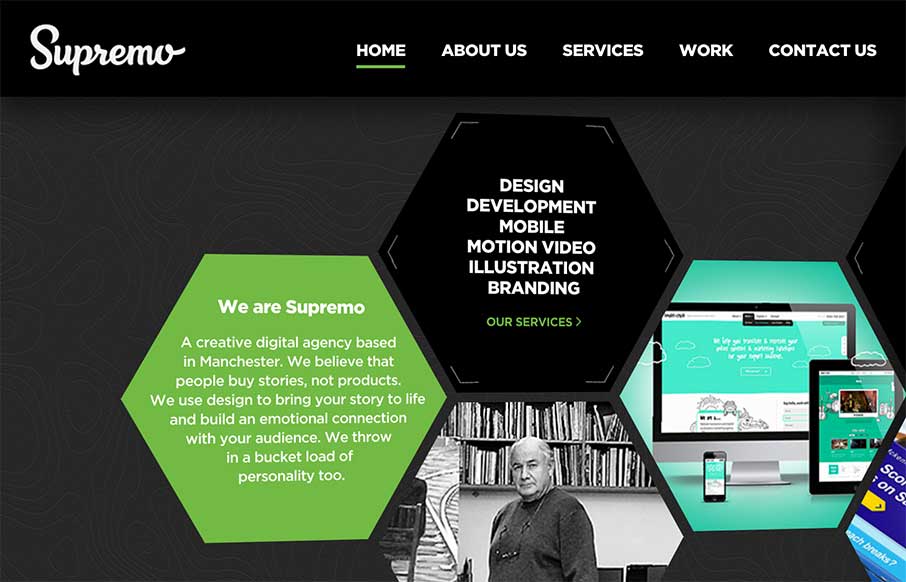
Supremo
Good start to the week with Supremo's site, out of England. The home page is a different take on interactive navigation, which sets it apart from other agency sites. The Work (portfolio / case studies) area is strong and well thought out. Cheers! From the Designer:...
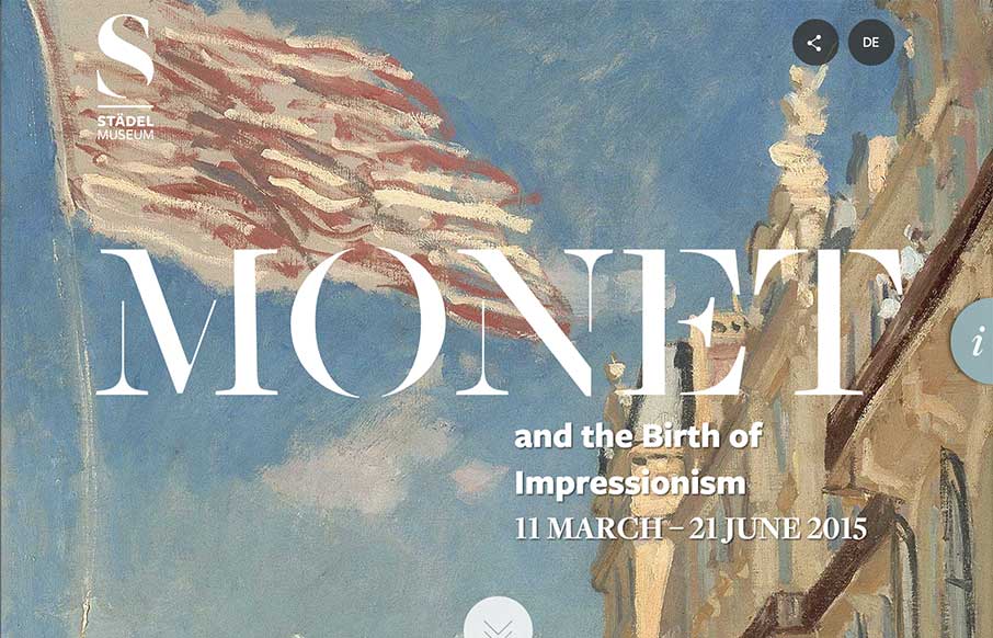
Monet at the Stadel Museum
I became a Monet fan only a few years ago. Here's why: Ok, not a great verbal explanation - but that's the point. I really do get a sense of calm when I'm looking at Monet's prints / paintings that I don't get when looking at other art. And that's hard to quantify and...
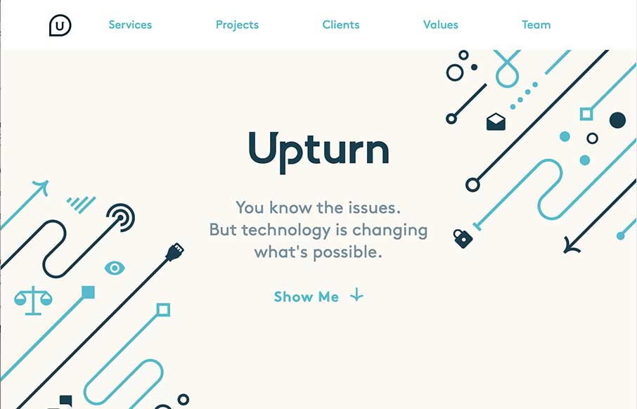
Upturn
Nice work for good causes. Love the design and the simple art work on the Upturn site out of Washington DC. Great SVG work and animation, but still a simple and clean site. I would suggest to change the underlined words to bold or something else so they don't look...

Mukesh Suthar
Cool, quick portfolio one pager from Mukesh Suthar out of India. Of course love the Rubik's Cube preloader - good movement through the rest of the site between the sliders and skill counters. Like the way he has the faceted search on the Work section too - it seems...
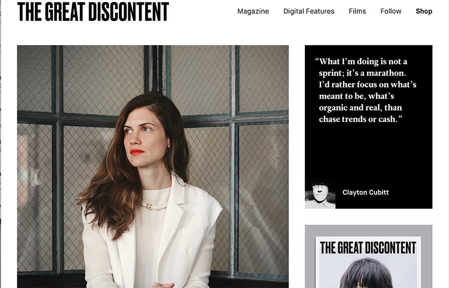
The Great Discontent
Simple, robust and impactful. Since 2011, this is how I've described The Great Discontent, both in its design and its quality long form articles. Every year or so they push out an [almost] invisible update to their site that seems to improve upon an experience that...

Acara Partners
I like how Acara Partners, out of Connecticut, uses their home page image background to be a secondary navigation - cutting straight to what they do. The site is text heavy and icon rich - and that works more for a biz strat / marketing company (their two first areas...

Lounge Lizard
I'm glad Lounge Lizard out of NY and LA submitted their website to us. There's a little bit of Don Draper in all of us (hopefully the good parts) - and that's projected in LL's website, along with good modern design. Like the block design in the subpages and the...
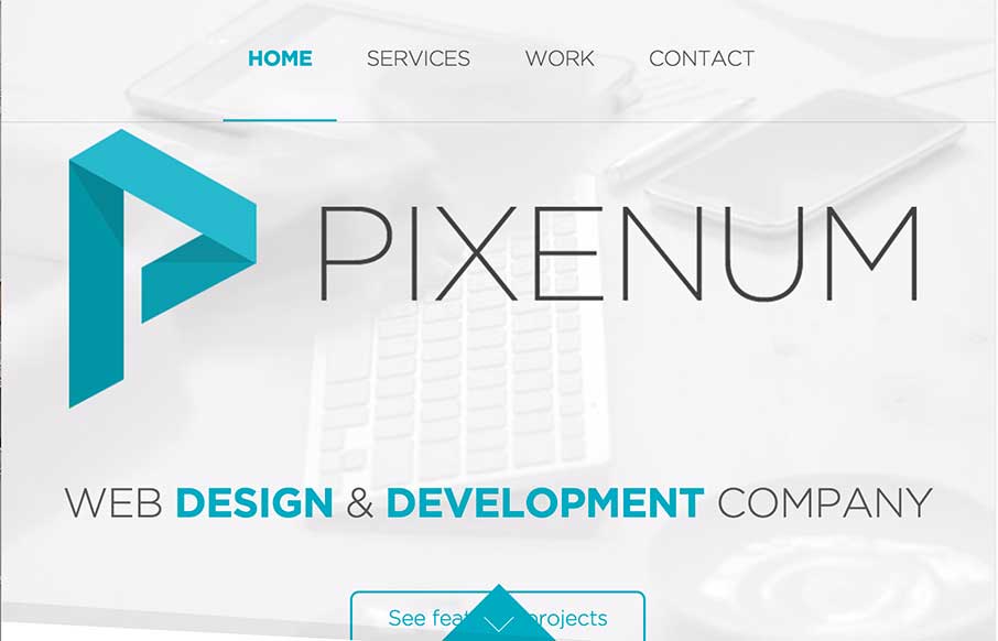
Pixenum
We're starting to see more and more one pagers - especially from start up agencies / freelancers. Pixenum out of Croatia is one of these sites, and it's a good one. Good web design is not only about the look and feel - it should also be about getting your user to do...

Pedro Landaverde
Cool animated SVG portfolio site from Pedro Landaverde out of Mexico. It looks like a simple one pager - but there are literally a lot of moving parts. Not crazy about how the Project photos clash a little with the rest of the site (maybe add a filter?) - but like how...

Greek Tour Guide
The Greek Tour Guide of Ancient Olympus is a simple site, but I think that's why I like it - we don't do enough simple. I was reading the copy of the site - and decided that you don't need much more than this to get your point across "come see this incredible place,...
EMAIL NEWSLETTER
News & Articles
Book Club: Aarron Walter – Designing For Emotion
 Discussing his book and many other things related to the design of products and business Aarron Walter joins us for this installment of the UMS Book Club.
BizCraft Episode 12 – Crossover Show with The Shoptalk Show
 This episode of BizCraft is a crossover show with the fine gents, Chris Coyier and Dave Rupert of the ShopTalk Show.
Designer Chat Session: JD Graffam
 Discussing the Memphis Music Hall of Fame website design with JD Graffam of SimpleFocus out of Memphis, TN.

HARD WORK. CLEAN FUEL. NO EXCUSES
Use “WARRIOR2023″ for 10% off.