
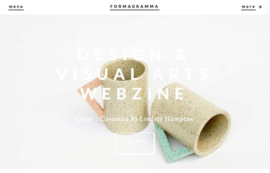
Really interesting visual approach. It has the ‘feel’ of an art or design magazine for sure. I really like the ‘view article’ overlay for the sections as you make your way past the hero area. I also like the way they’ve handled the main nav and the more nav section links. Good stuff here.


Fitts’s Law: Why the Easy Button Wins
Large, close targets are faster to hit than small, distant ones, that’s Fitts’s Law. A look at the 1954 rule behind buttons, prime and magic pixels, thumb zones, and dark patterns.


0 Comments