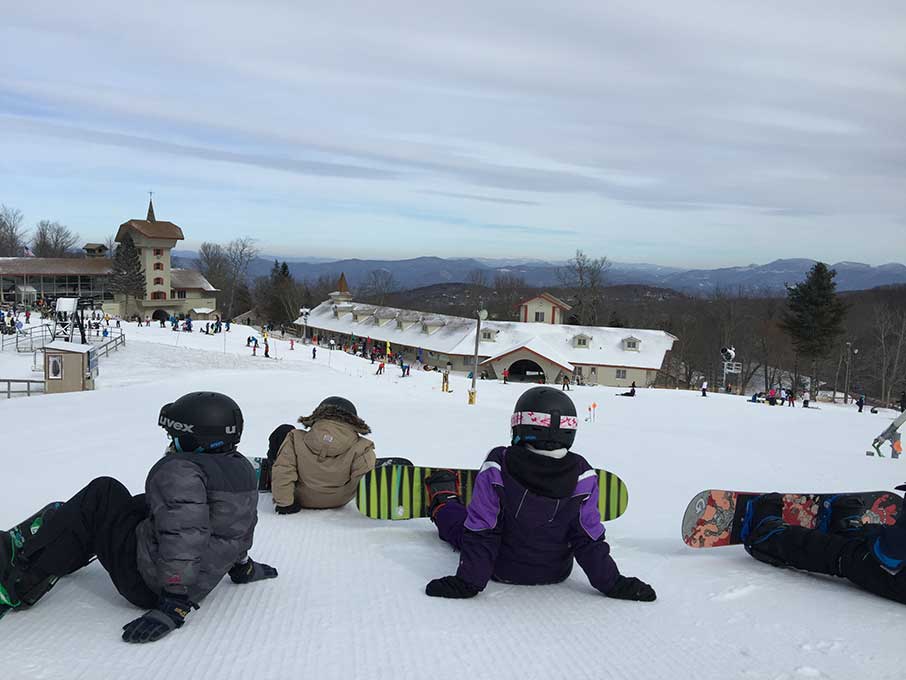
I took my son snowboarding for the first time at Beech Mountain (@BeechMtnResort North Carolina) last Friday (and ok, it was only my second time) – so we took lessons (because last time, 10 years ago, I only lasted 4 hours, and watched my buddies for the rest of the day from the View Haus, with beer in hand).
The lessons we took were through the Burton Learn To Ride program that’s partnered with the resort. Garr was our instructor – yep, Garr (awesome dude, with the patience of Job).
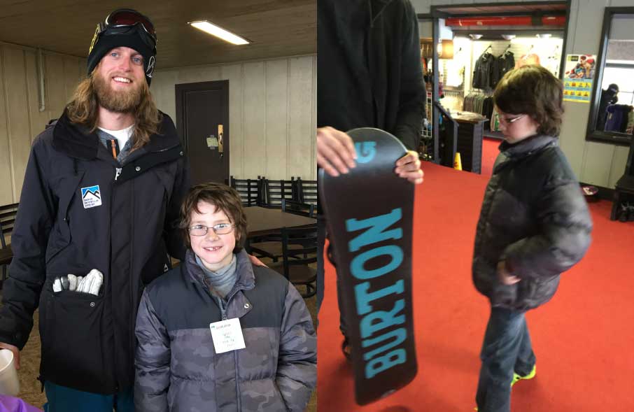
We had such a great time (noted by the fact my 9yo actually said, unprompted, “that was one of the best things I’ve ever done in my life”), that I wanted to throw a little love back to Burton and Beech Mountain – so I figured I’d look at their sites, and hope they were good enough to review – they are.
So here are my thoughts on Burton’s site:
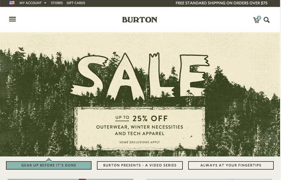
Burton’s website is first and foremost a shopping site – but not your normal shopping site, there is some beautiful, and probably natural strategy here. Burton is a company that sells snowboards, clothing and other gear – all that you can get here, but there is such a community aspect to snowboarding and Burton as a company, that they’ve done a great job bringing it into the website, so you don’t totally feel like you’re on a regular shopping site. Two cases in point:
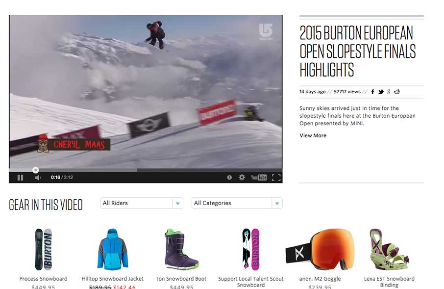
1 – The Video section of the site :
Something we noticed while snowboarding was that every third person on the mountain had a GoPro attached to their helmet, or near the freestyle area, boarders would have someone videoing their tricks. The skateboard culture is very much like this now – you get noticed and pick up sponsors by videoing your skills, and posting them out.
Burton makes good use of the video culture in their Video page – but amps it up with more professional video from events that they put on, or where their teams compete. The “hidden” marketing is below the videos – “Gear in this Video” – complete with a filtered search by Rider and Category. It’s incredibly smart integration of entertainment and marketing.
2 – The Team section of the site :
I love the set up for this. You go from the Team page, that integrates Instagram like bio photos (below) with animated gifs of each of the Boarders’ coolness (again, reaching back to video culture) – and then move on to a detailed bio page (below, below). The bio page is just like your employee’s bio page on your agency site – just that it’s Shaun White and Kelly Clark, two of the best and most heralded snowboarders of all time on your team. The bio page design is stunning – great integration of social media (Instagram – but if Vine or something would catch on, I could see more animated gifs here in the future). The slider is epic, and goes back and forth between images and video. Finally, it still leads to Gear and how to outfit yourself like your favorite pro – again, great integration of showing the coolness – and still coming back to marketing (the purpose of the site).
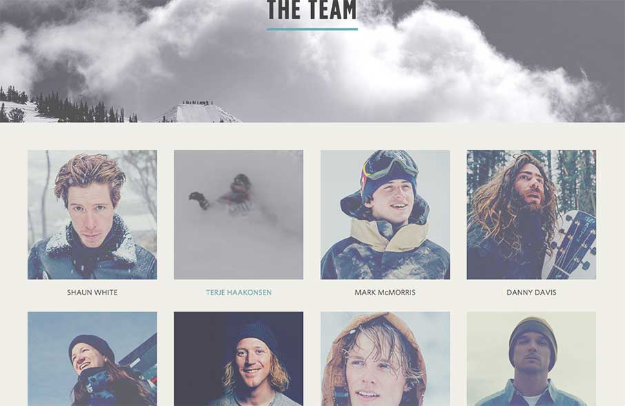

The design, in essence, looks simple and clean – which should be the case, but even more so for this website. The white space, coupled with the muted coloring, is a canvas for the vibrant images, gear and video – which kind of parallels snowboarding life – white snow landscapes with boards and riders as the color on the slopes.
My only suggestion for the Burton website would be to open it up a little more – embrace the video / snowboard culture even more – give a canvas for Burton boarders of every level to showcase what they do. It could give Burton a direct conduit to new talent – but could also be another place to feature / sell gear that your average snowboarder is using (buying). It would also ingratiate Burton even more to a fanatical fan base.
We’re already looking at our next trip snowboarding next month before the season ends. It’s a good deal we’ll come back to the Burton site for inspiration (and probably a little gear too). And if you’r near Boone, North Carolina – definitely check out Beech Mountain – good people (also in the cafeteria in the View Haus) – and a great time!



0 Comments
Trackbacks/Pingbacks