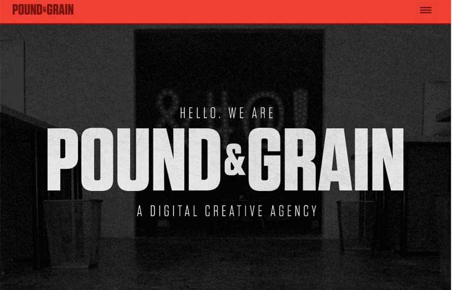
I really like the movement of the Pound & Grain site, out of Toronto. The subtle use of parallax with background shapes and colors, coupled with the images and copy make for a great experience. Also like the little vibrance of the animated gifs hero images, that smartly change to non-animated as you move to smaller screen widths. Content-wise, I also like their Story and Manifesto pages – I like stories that explain a company’s way of thinking, or the genesis of their ideas.


The Call to Action, Revisited
The Call to Action hasn’t changed in a decade, but the bar has. A fresh look at prominence, copy, mobile tap targets, and accessibility, with lessons from three major design systems.


0 Comments