Web Design Inspiration Curated
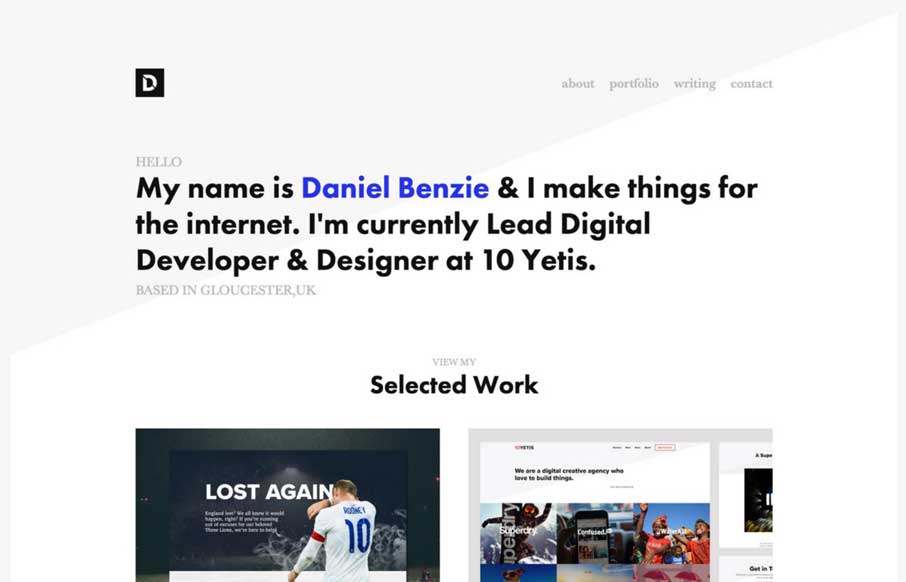
Daniel Benzie
Simple layout and nice typography. The Daniel Benzie portfolio site is quite nice. The angle in the background image really helps drive your eyes down into and through that main tagline then on to the work.
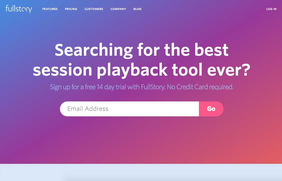
FullStory Session Replay
Post written by John Williams: This is one of my first projects since starting at FullStory in April. I joined the team because FullStory is such an unbelievably cool piece of tech. We wanted to make a landing page that would really hammer the core of what makes us...
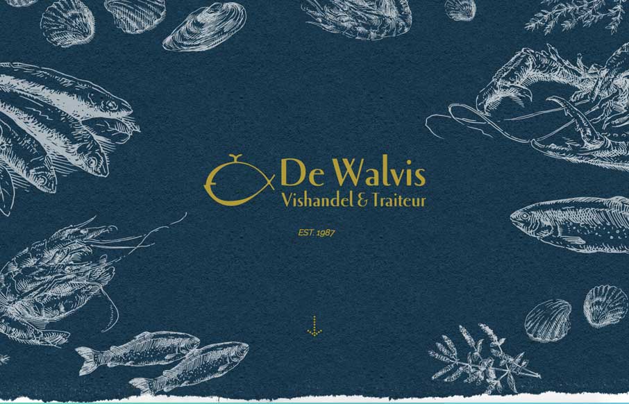
Walvis
Very cool site design for an older well established brick and mortar business. I dig that it's fairly standardized as far as basic layout and navigation go but it's just got some beautiful colors, imagery and details. Good work! We made this website for a very old,...

Bukwild
Pretty great visual vibe here. I love the rhythm the page gives you as you scroll down, you feel like you're getting the vibe of the company. I love the detail work, it's straight up and simple, but really layout focused detail work. Bravo.
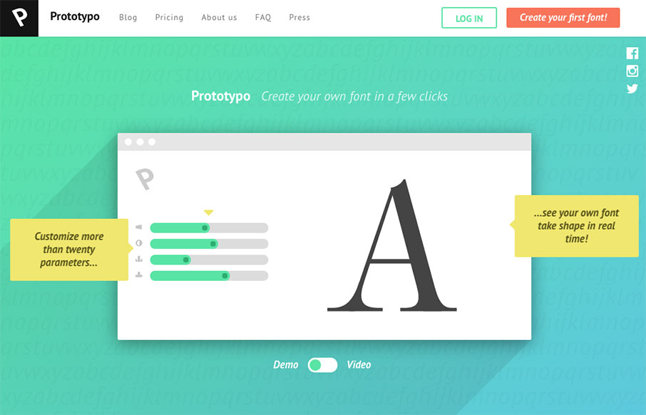
Prototypo
Very cool App, but also very cool design. As product websites go I dig this one a great deal. The demo to video toggle is just awesome. I've never seen that before and it's so clever. It's a very simple layout but the home runs are in the illustrations and clean and...
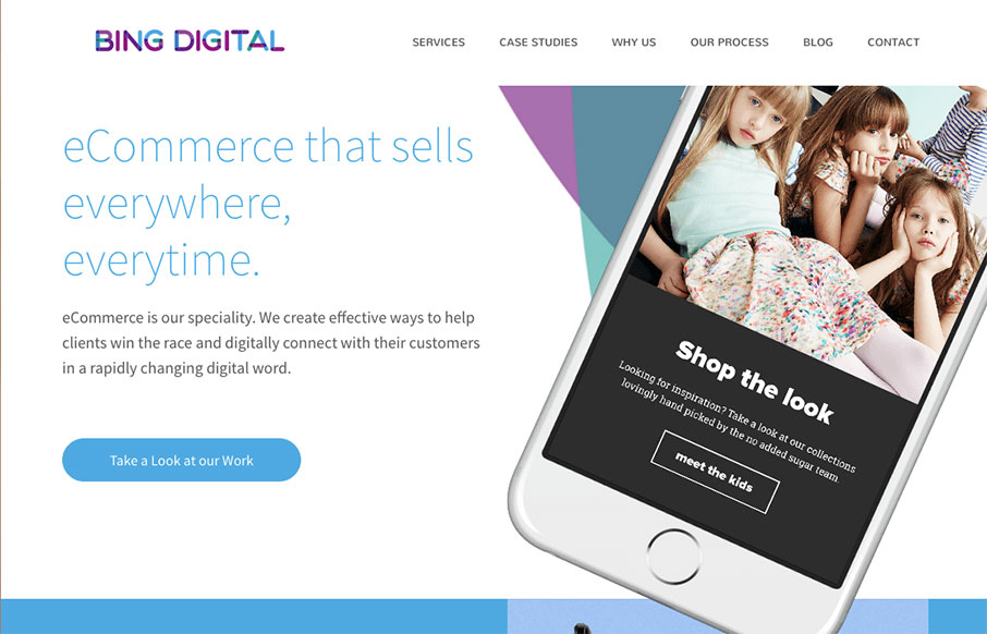
Bing Digital
Nice dynamic looking layout for Bing Digital. I love the soft colors and the imagery that helps sell the idea that they know what's up. The thing I like most is how they list out all the stuff they do in the footer area. So clever and simple, yet most never do just...
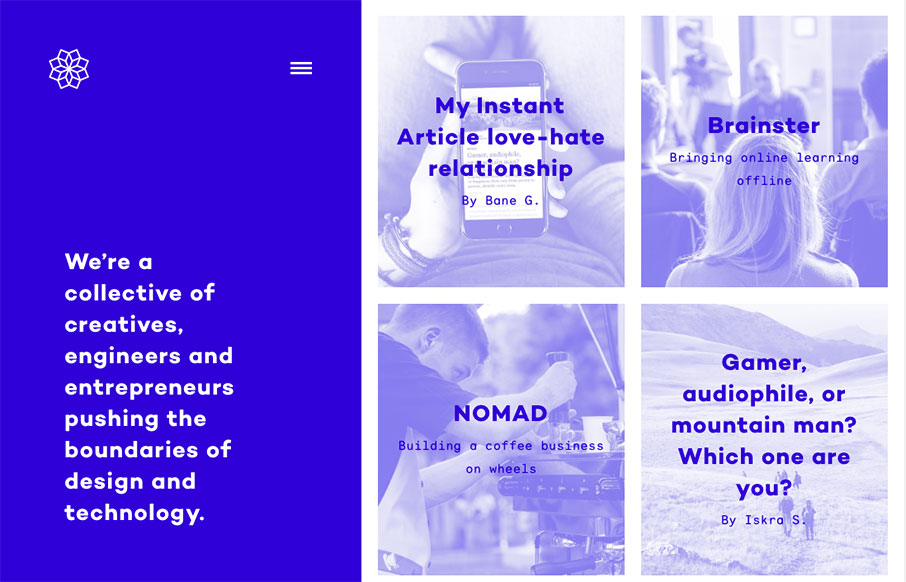
Pogon Collective
One of my new favorite websites. I love the fixed left side and the block imagery on the right. Also check how the hamburger icon kind of twinkles a little to let you know it's there. From the Designer: We’re a collective of creatives, engineers and entrepreneurs...
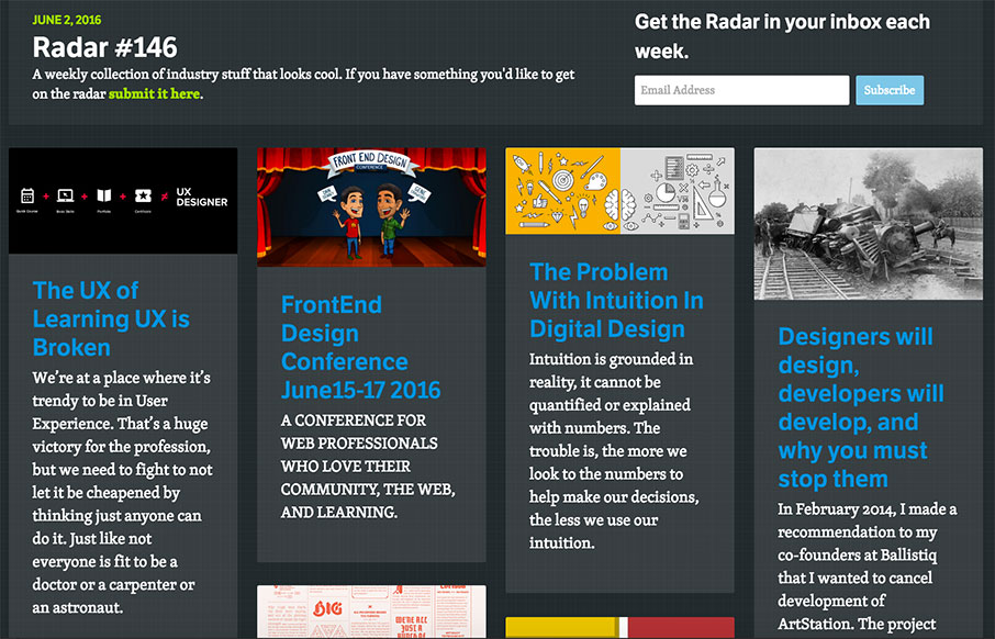
Radar #146
Each week, we do a round up of curated "stuff from the interwebs" that we call Radar. In this week's 146th Radar: The UX of Learning UX is Broken We’re at a place where it’s trendy to be in User Experience. That’s a huge victory for the profession, but we need to...

Citadela
Super simple and probably as minimal as it can get for a site like this. I love the simple placement of the location images and how you can just keep sliding to the right to see more. The search design is pretty sweet too.
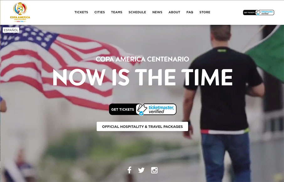
Copa America
I. Love. This. Site. for Copa America (that starts this Friday night in the US) - and not just because I'm a soccer (football to our friends across the pond) fan. It's simply one of the best sports sites I've seen - and the mobile layout may be even better than the...

Formidable
Pretty sweet website. I dig the imagery and the other little details. That main navigation screen is pretty solid too. React!!! Submitted by: Stephen Scaff Twitter: @stephenscaff Role: Developer Country: USA
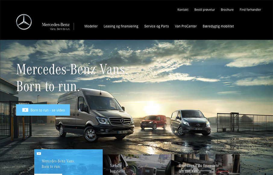
Mercedes-Benz Vans
Now something completely different. This is the marketing website for the Mercedes-Benz Vans. It's pretty straight forward but show's some pretty good maturity and pacing. I love the lower section of the page as you scroll and the images are on left and right and go...

Newgroup Marketing
In a sea of design firm websites that all start to look the same the Newgroup site stands out. It's simple and the grid is clean but overall the way the elements are placed and the spacing used give it a unique flow. That helps the sections that are quite different...
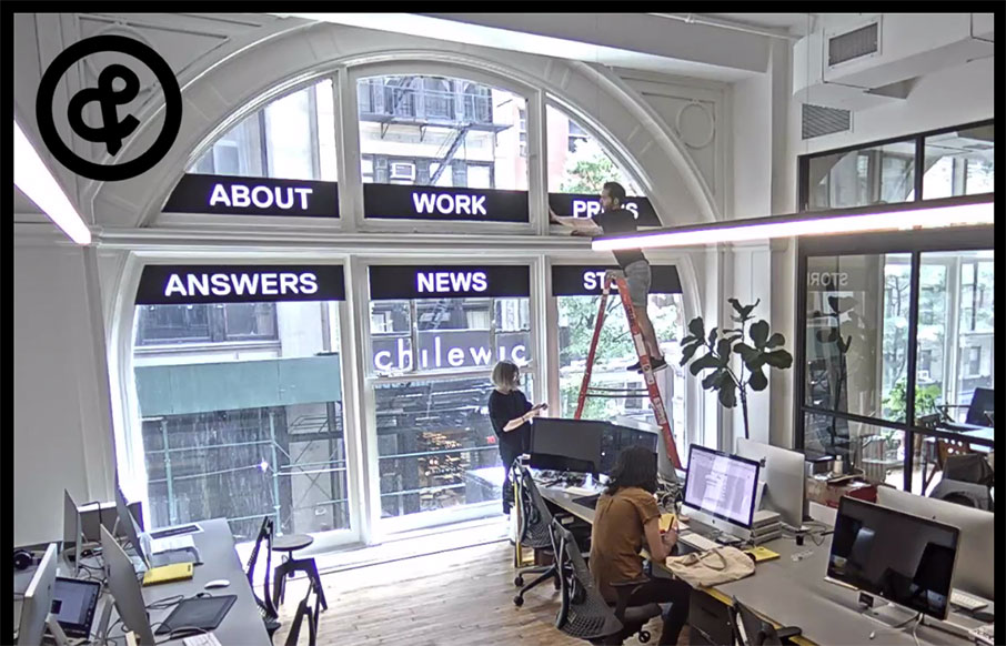
Sagmeister Walsh
Website for the legendary Sagmeister design studio. Pretty interesting, but the most intriguing part is that the home page is a live feed from their office. So weird, and so cool.
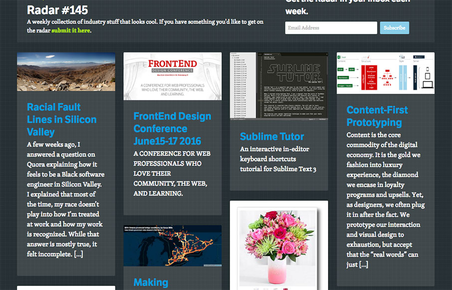
Radar #145
Each week, we do a round up of curated "stuff from the interwebs" that we call Radar. In this week's 145th Radar: Racial Fault Lines in Silicon Valley A few weeks ago, I answered a question on Quora explaining how it feels to be a Black software engineer in Silicon...

Jürgen Hassler
Pretty innovative layout and approach to this designer's portfolio. I love the interactive details here. The overall approach is a vivid example of someone truly thinking outside the box. (see what I did there?) No, really, this site design is intriguing and really...
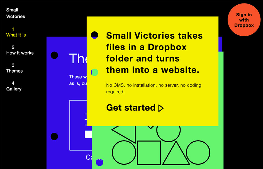
Small Victories
Pretty cool idea, but also a pretty cool site design. I dig how it's a hybrid scroll and page site. It's like you're flipping through pages as you scroll down. Kinda drives the idea home that it publishes stuff in your dropbox box as pages. Clever and well done.

likelikelike
It's a pretty simple design portfolio but it's different enough to elicit a pretty original response from me. I dig the way the project imagery seems to just cascade down the page visually. Pretty fun copy here and there too. The individual project pages are solid...
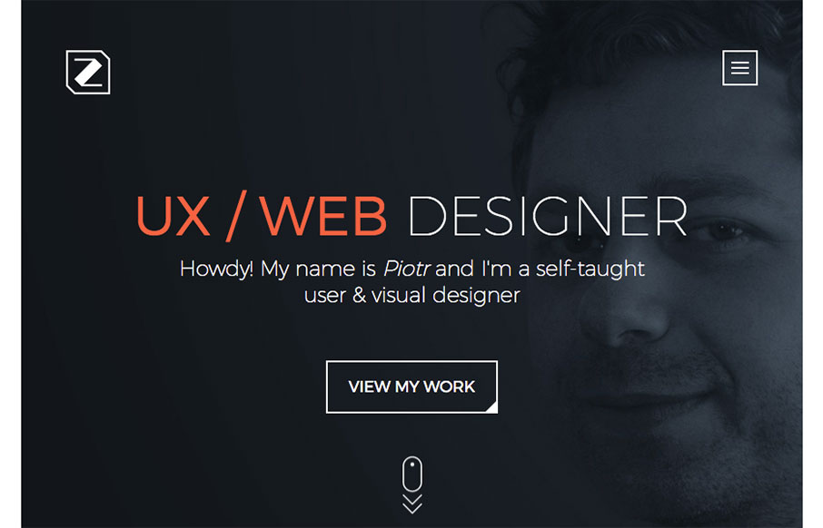
Piotr Zdanowicz
Nifty animations of the content loading as you scroll down for the first time. Overall the layout and tone gives a good reaction too. Solid detail work. I do think the client testimonials part could use some love visually to balance agains the other section there, but...
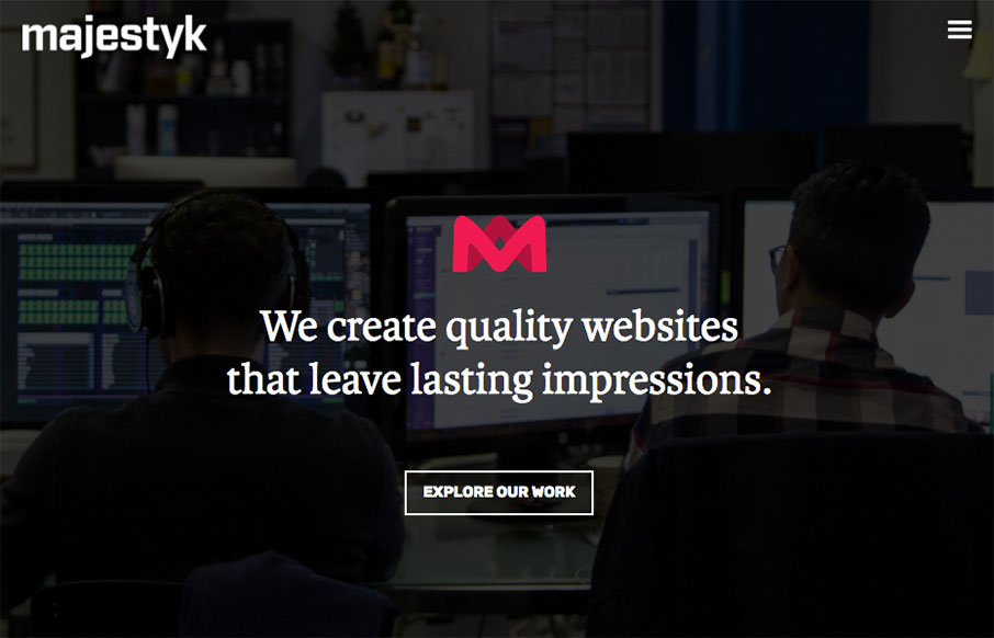
Majestyk
Nice use of the fixed images in the background as you scroll. I like the reveal and the layout is even a bit surprising as you make your way down the page. I dig the dark background and hero area stuff too. Nice work. We are a team of passionate and innovative...
EMAIL NEWSLETTER
News & Articles
BizCraft Episode 43: Let’s talk about time…
 In this episode of BizCraft Carl and Gene talk about managing your time on a life level, saying no to things and how to get things going.
Wren Lanier – Designing on the z-axis
 UMS Video Podcast: Giovanni talks with talks with Wrenn Lanier about her ideas for using visual depth and layering to communicate context and content to mobile web users.
Kickdrop Code Sample: Bootstrap Sliders
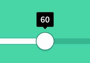 Simple and beautiful form sliders for any bootstrap-based project. We love these sliders because the jQuery is very easy to work with and the overall code quality is fantastic.

HARD WORK. CLEAN FUEL. NO EXCUSES
Use “WARRIOR2023″ for 10% off.