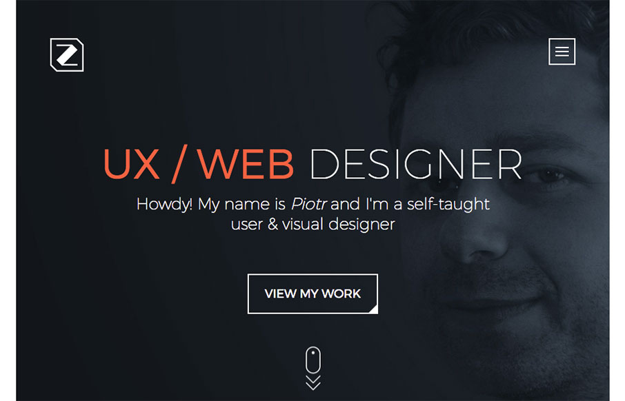
Piotr Zdanowicz

http://zetstudio.pro/

Nifty animations of the content loading as you scroll down for the first time. Overall the layout and tone gives a good reaction too. Solid detail work. I do think the client testimonials part could use some love visually to balance agains the other section there, but it still holds strong.

From the Designer:

I consider myself as UX/web designer with fronted development skills and this is my personal website.

Submitted by: Piotr Zdanowicz
Twitter: @zdanislaw
Role: Designer & Developer
Country: France

0 Comments

Submit a Comment

Your email address will not be published. Required fields are marked *

News & Articles

Sign-Up: Enhancing Conversions through good UX

Sign-Up: Enhancing Conversions through good UX

Optimize your website’s sign-up process by focusing on clarity, ease, and user mindset. Clearly explain the purpose, benefits, and steps, and use social proof to build trust and drive conversions.

The Essential Guide to Getting Started on Freelance Writing

The Essential Guide to Getting Started on Freelance Writing

Explore the lucrative and fulfilling world of freelance writing with our essential guide. Learn about specialties like blogging, social media, article, and technical writing. Build a portfolio, find work, set up your business, and discover the potential earnings. Embrace the freedom of working from home and follow tips for success in your dream career.