Web Design Inspiration Curated
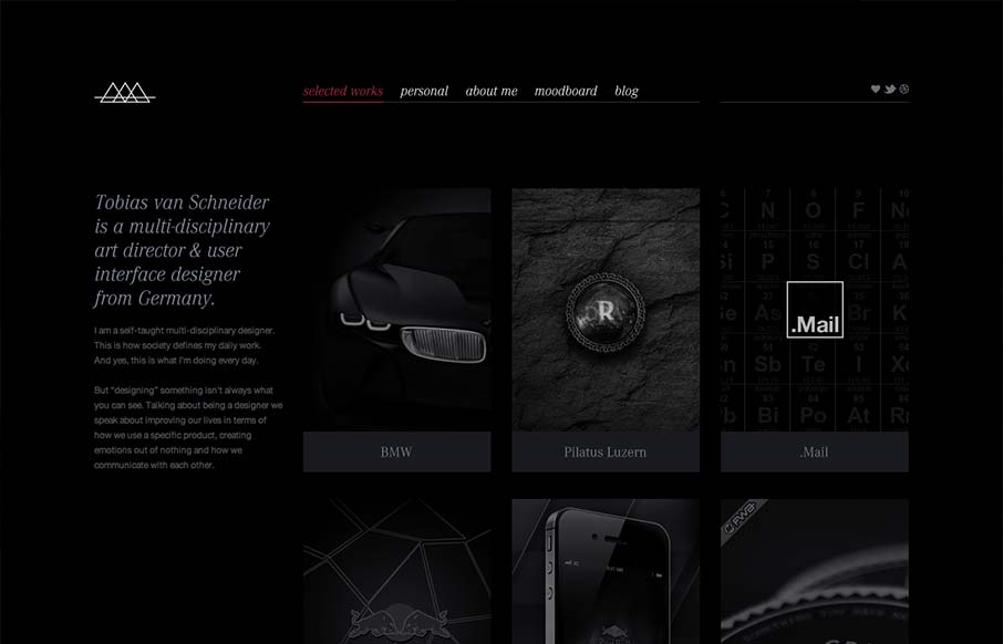
Tobias Van Schneider
I like the moody darkness of this website. The interaction of the X that loads over the work samples is nice and has a good feel to it as you mouse around. The mood board is a clever look into who this designer is and the blog is a superb minimal example IMHO. Love it.
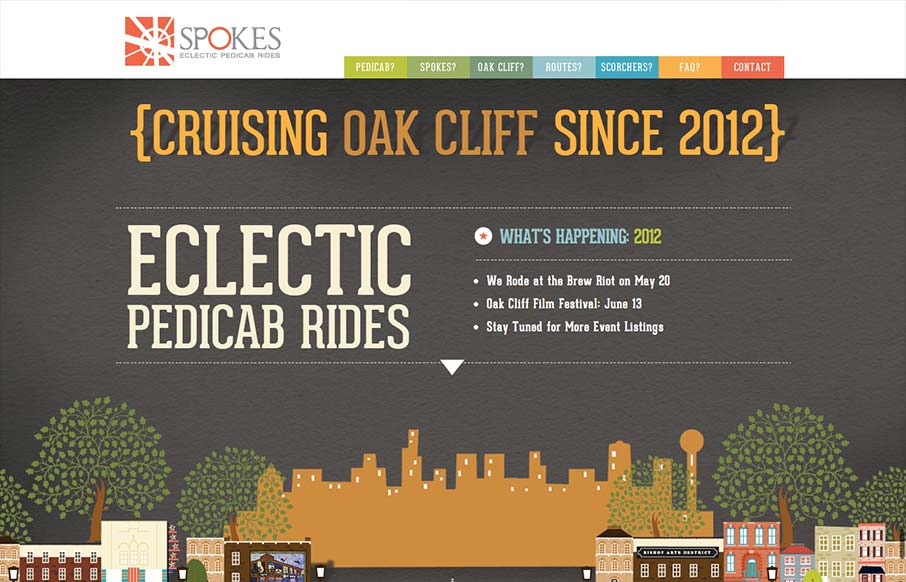
Spokes
Just a fantastic way to share the narrative of what a 'pedi cab' is and how it all works. Beautiful illustrations and scrolling based animations, just wonderful to look at.
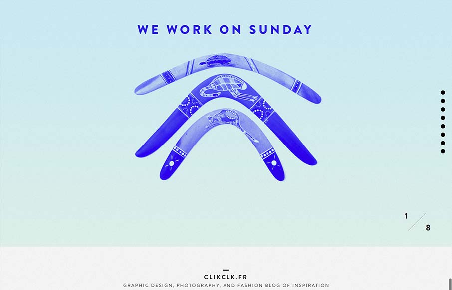
We Work on Sunday
Fun website! I like the duotone color look as well as the way the scrolling is designed. Also cool way to display the work, in the monitors like that, it's not new to see but in this instance it feels fresh somehow - maybe it's the boomerangs?
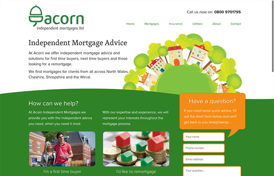
Acorn
There's a lot to like about this design. The animation of the rows of houses spinning in a big circle like that is used perfectly in conjunction with the rest of the otherwise static feeling design. The design doesn't beat you over the head with the animation either....
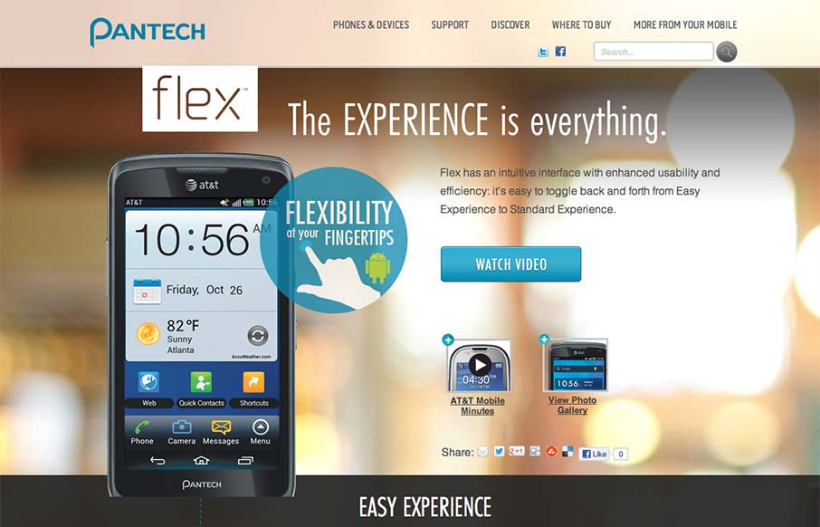
Flex Pantech
Via: Bob Galmarini on Dribbble Really fun little microsite / landing page for the Pantech Flex went live today. Check out the screen swap to show off the different phone UI. What a great website design. It's just a single pager or microsite as they're called but it's...
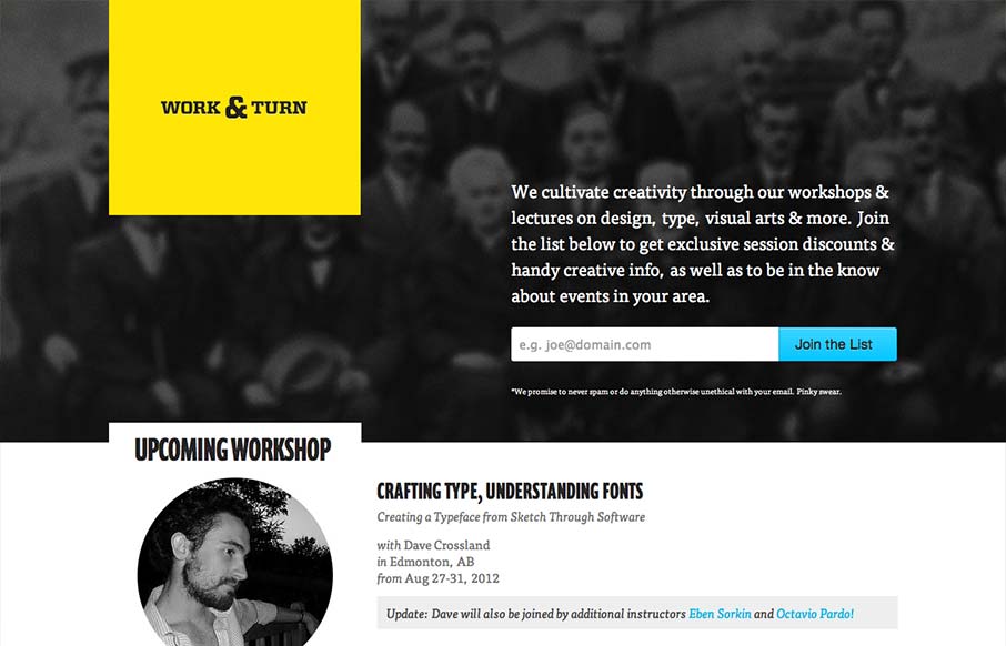
Work Turn
Nice asymmetrical yet super balanced feeling design. From the colors, the yellow and black with that blue is striking - can you make colors feel asymmetrical too? Super clean look and feel with some superb type handling pitched in for good measure.
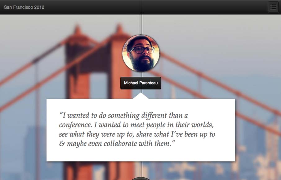
Parenteau SF Journey
This is a tale of a Designer/Developer that went on a trip to meet people in the product space in San Francisco. The plan was simple: take some conference budget and get creative with it. When it is all said and done.. make a small mini-website and tell a story....
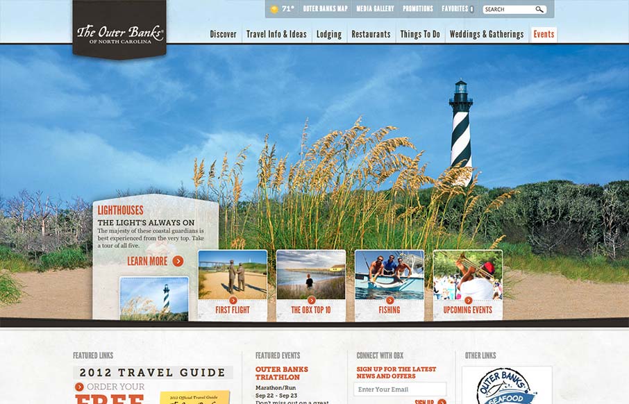
Outer Banks
Really slick vacation marketing site for The Outer Banks of NC. I like the hero area slide show's interactions, they're quite involved but they look tempting to click around on. The mid area feels a bit cramped with the 4 columns at first but they've left it airy...
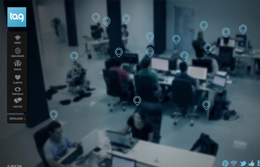
Tag
Pretty crazy design with the full screen background video. Love the cow suit! The interactions are all over the place but look interesting and there is real content here too. Overall pretty fun website design and I dig it.
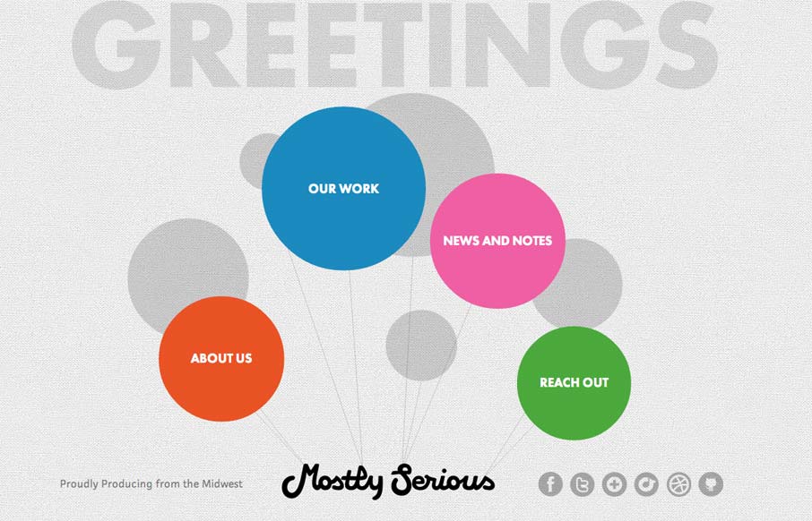
mostlyserious.io
This is an interesting site. It's a pretty sweet idea and the floating balloon nav is kind of mesmerizing. Each page is a custom design, which is great. It's a fun design that sells mostlyserious' brand.
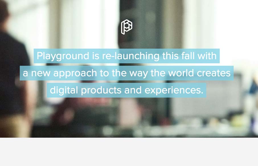
playgroundinc.com
This is how you should post job openings. This is a lovely little site to entice people of the 'web nerd' persuasion. I think that the photo animation is a bit much and seems a little out of place in an otherwise tight and professional design, but everything else is...
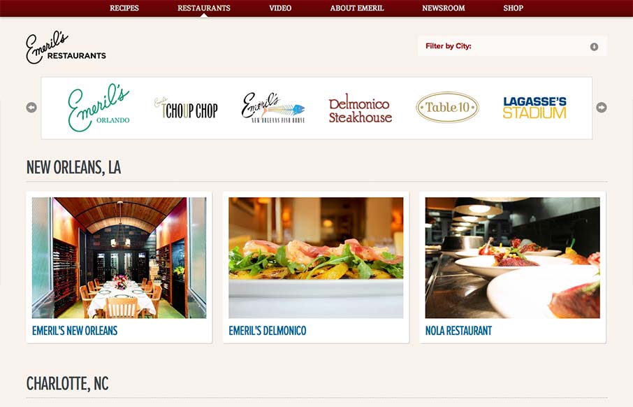
Emeril’s Restaurants
Aside from the oddity of having different sites/URLs in the main nav, the restaurant "site" is really nice. It has a clean design with gorgeous imagery (cuz let's face it, Emeril's food is a dream) and a great layout of information. It's as if each location has its...
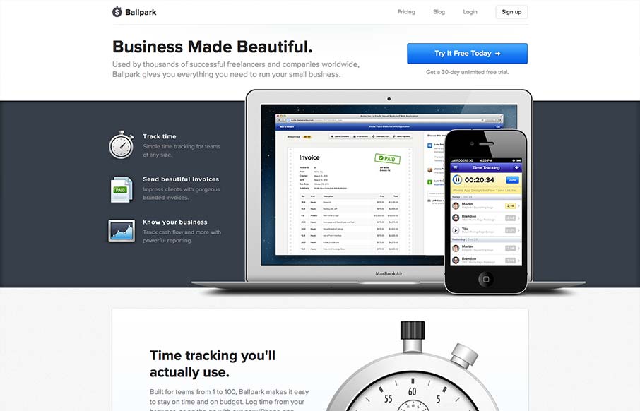
getballpark.com
incredibly elegant getballpark.com — Matthew Smith (@whale) August 15, 2012 Take away the beautiful aesthetic and you're left with a clearly defined product page. The copy is straightforward enough to be informative, and polished enough to be engaging on its own....
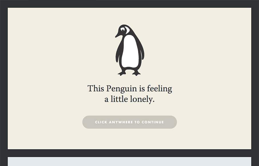
impressapenguin.com
Yet another great site intended to attract new talent. I talk a lot about narrative and this site takes that idea to heart. People respond to stories and what better company to seek out those people? Just click through it, its great. Who can't empathize with a...
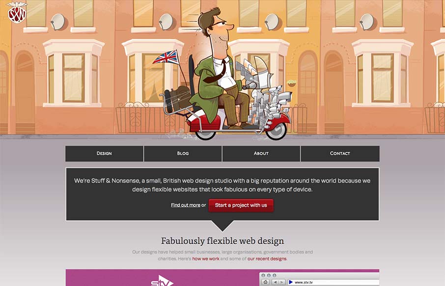
stuffandnonsense.co.uk
Super fun reboot from Andy Clarke's stuffandnonsense.co.uk website. Outside of the technical stuff, which yes you should go view source and pour over it. The header is so fun, the illustrations of the dude on the bike with the animated background makes it so...
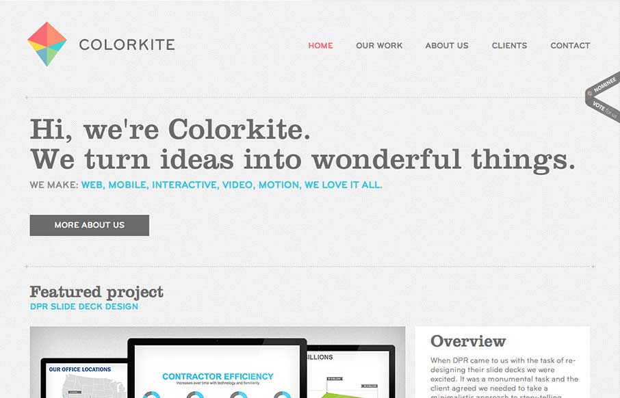
colorkite.com
Colorkite is a clean, minimal design that does a great job at getting out of the way of the content. The typography is pretty solid and the color palette is subtle and sophisticated. The site is responsive, though it looks a little disjoint at some screen sizes. The...
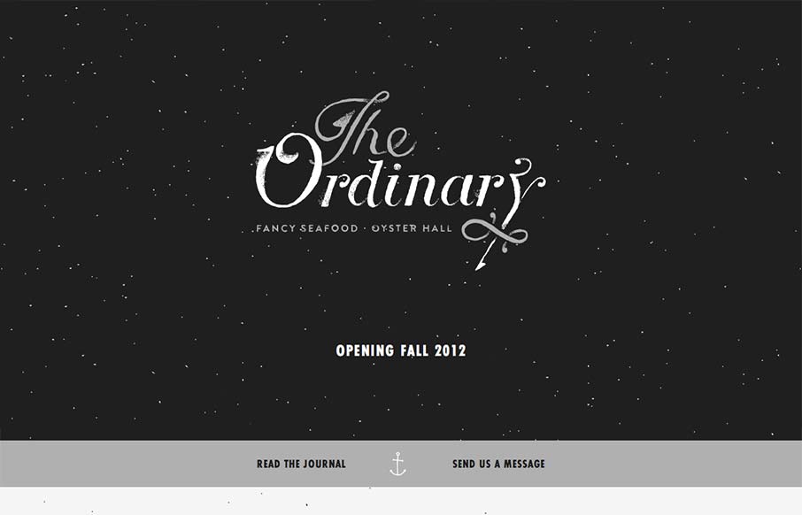
eattheordinary.com
I have to say that I think this is an great site. It has just the right mix of texture, art and typography. My favorite part of the design is the speckled background, which does a great job of softening and activating the negative spaces without making the design...
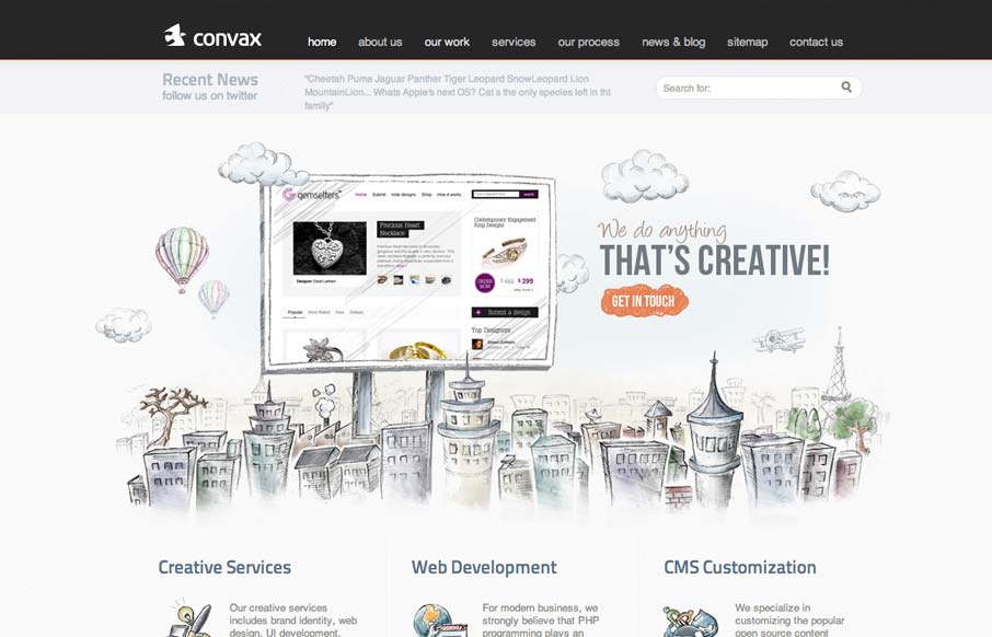
convax.com
This slider is so coolconvax.com— Dan Denney (@dandenney) September 4, 2012 Agreed Dan, the animation that follows your mouse around behind the slideshow is clever. It's something that's pretty minimal really, as fare as interaction goes, but works well to keep...
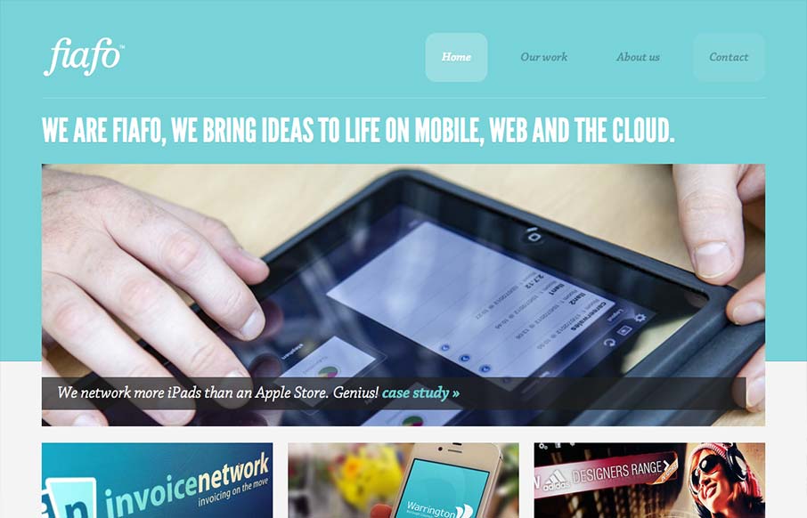
fiafo.com
There's a pretty structured grid feel going on here. The use of League Gothic emphasizes the grid weight, but Chaparral Pro is a welcomed contrast. I think both typefaces are executed well enough to marry the crisp imagery with the fun illustrations. I like the...
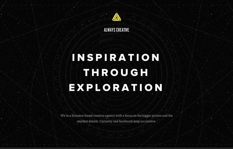
alwayscreative.net
This site is beautifully wide open, with subtle animations and a complex mix of textures. It is somewhat narrative through a combination copy about exploration and imagery of space. Their vision is simply stated, which I like, and the design is super-clean (which I...
EMAIL NEWSLETTER
News & Articles
unmatchedstyle
Google Maps release V3, I missed this when it came out I guess. http://bit.ly/GhSQO #ums
unmatchedstyle
RT @mailchimp: A lesson in email marketing w/videos. Also, the importance of landing page design - http://eepurl.com/bP-Y #ums
unmatchedstyle
AudioBoo from @boagworld: Improve Your Search Box http://boo.fm/b30595 #ums

HARD WORK. CLEAN FUEL. NO EXCUSES
Use “WARRIOR2023″ for 10% off.