shopaholla.com

http://shopaholla.com/

Posted by: Andrew Johnson @and_rwj
Role: Designer & Developer

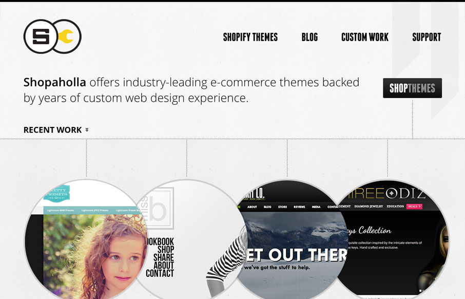
This website looks pretty dynamic on first viewing. It has circular shapes were traditional squares would be used, there’s also lots of great little interactions across the page. I especially like the page transitions from section to section, the sliding is a nice touch. Another thing is just the overall tightness of the design, the brand is crisp and all the typography is well done.

Kinsta

0 Comments

Submit a Comment

Your email address will not be published. Required fields are marked *

Time limit exceeded. Please complete the captcha once again.

News & Articles

Brutalism: The Beauty of Breaking the Rules

Brutalism: The Beauty of Breaking the Rules

Brutalism in web design rejects perfection for authenticity. Stark grids, raw type, and honest structure create interfaces that feel human, intentional, and impossible to ignore. Break the rules, on purpose.

Monochrome Minimalism

Monochrome Minimalism

Monochrome Minimalism merges Bauhaus discipline with IKEA simplicity. Clean grids, muted tones, and functional beauty create digital calm, proof that restraint, not decoration, defines timeless design.