
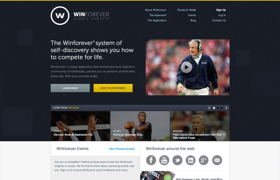
The Winforever website has that corporate/sport look, which is perfectly fitting. I really like the interactions over the three blog post blocks. Having them slide up and over the image is unexpected and adds just a nice extra little level of interaction to this clean reserved layout.


Fitts’s Law: Why the Easy Button Wins
Large, close targets are faster to hit than small, distant ones, that’s Fitts’s Law. A look at the 1954 rule behind buttons, prime and magic pixels, thumb zones, and dark patterns.


0 Comments