
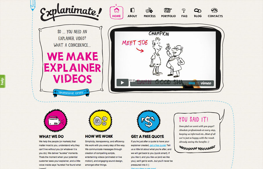
The website is built visually around what these guys do as a service. They illustrate what your product or service does, so they use that same skill on their own stuff. Very fun and open feel. Simple colors and type all work in tandem together like it should. I’m not sure about the chat box that pops up after a while, it feels a bit intrusive for the type of website and service this is. The site looks great though, which is why I noticed it.


Fitts’s Law: Why the Easy Button Wins
Large, close targets are faster to hit than small, distant ones, that’s Fitts’s Law. A look at the 1954 rule behind buttons, prime and magic pixels, thumb zones, and dark patterns.


Thanks Gene! Glad you like it. And thanks for featuring us…