
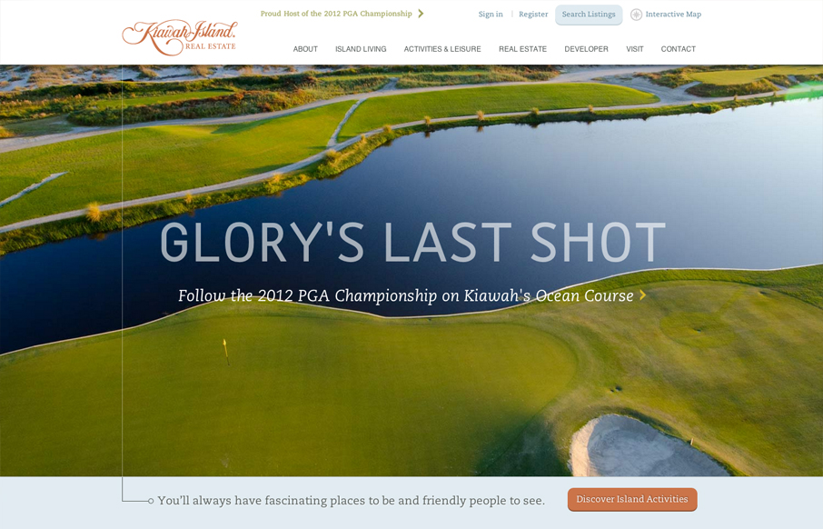
Another great website from the fine folks at e house studio with kiawahisland.com. My favorite part is how the nav is fixed until you get a to a certain target point in the page, then folds up into the top of the page. I also like the change from rectangular imagery to the circles, this gives the page a more dynamic feel as does the footer area layout. It’s not encased in a shape and feels open yet grounded to the bottom of the site just the same.


Fitts’s Law: Why the Easy Button Wins
Large, close targets are faster to hit than small, distant ones, that’s Fitts’s Law. A look at the 1954 rule behind buttons, prime and magic pixels, thumb zones, and dark patterns.


0 Comments