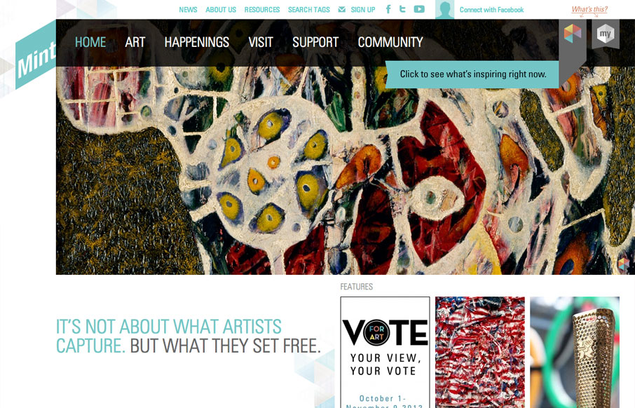
The way they’ve used the logo in the mint museum website is pretty clever it’s off the side and sort of slanted and it’s not the central element but yet it’s very noticeable. The large hero image slideshow is pretty standard but they’ve cropped and created different ways to use images from the art that’s in the museum in a clever way. It isn’t a purely responsive design, more adaptive than anything, but it gets the job done and seems appropriate here.


The Call to Action, Revisited
The Call to Action hasn’t changed in a decade, but the bar has. A fresh look at prominence, copy, mobile tap targets, and accessibility, with lessons from three major design systems.


0 Comments