Web Design Inspiration Curated
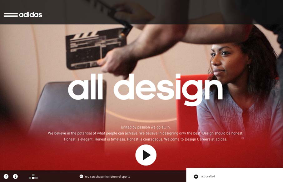
Adidas Design Studios
Damn this is a sexy website for the Adidas design studios. I love the navigation design and it incorporates with the overall UX and look of the rest of the site. Overall the narrative driven design just gets me excited. I love the sections and the keyboard nav...
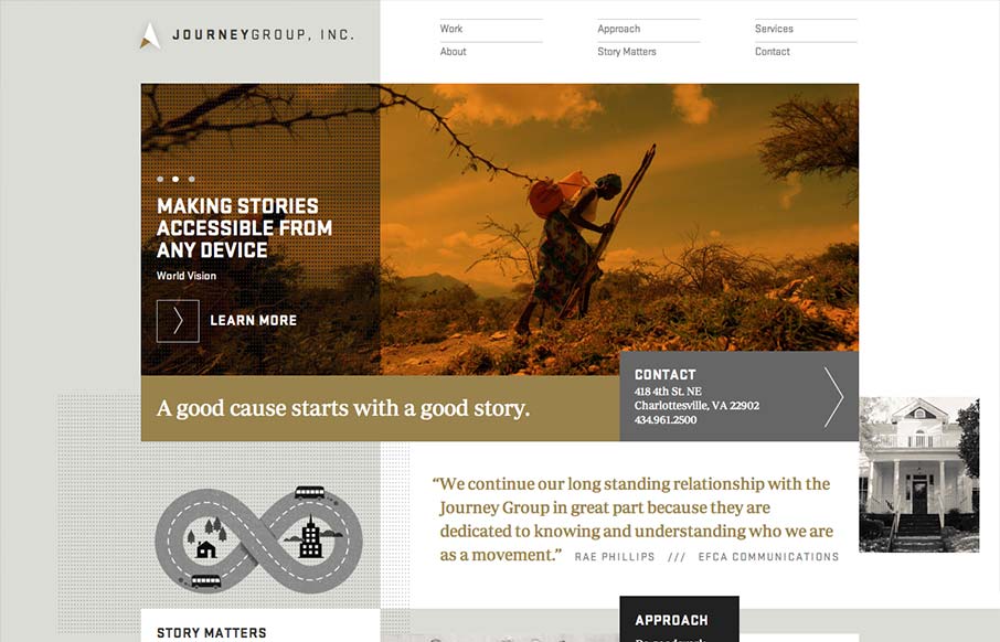
Journey Group
Order yet disorder. That's how I like to think about this design. It starts off with this really strong grid feel and then the shapes and blocks of copy/images start to feel really asymmetrical and wonderful. I like the blocky vibe with the type and the flat colors...
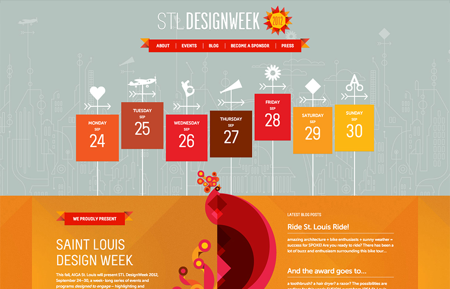
STL Design Week
Super rich design for STL Design Week. I love the way the icons are mixed into the design so smoothly. The page to page transitions are strikingly interesting visually speaking, they get a bit tedious if you've been to the site a few times however. Overall though this...
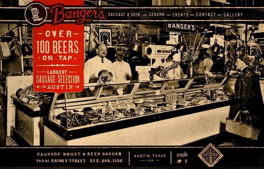
Banger’s
Such a visually rich design. I love the distressed graphic feel to this and the red really makes it "pop" (that was sarcasm, did I just make some of you designer's brains explode?). It looks like there's a slight parallax with the background and content too, very nice...
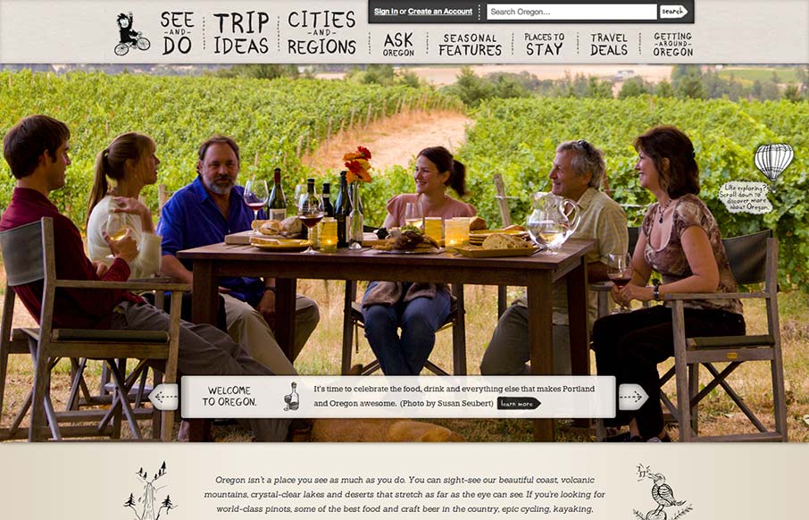
Travel Oregon
Oh man, I love this design. There's so much going on here with the responsive design. The search box has some interesting changes across screen sizes, which is worth some study. I also really like how the main hero/slide show is done, where when you get down to the...
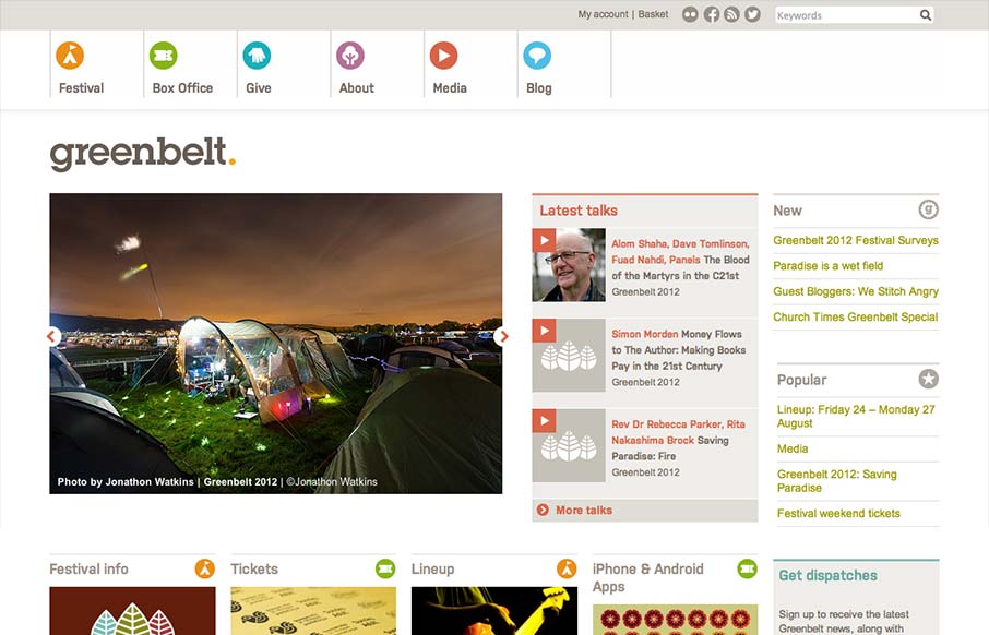
Greenbelt Festival
Nice responsive work here. I like the changes in the main hero/slide show area and the column work in the image blocks under it. I also really dig the menu icon/link that shows up in place of the main nav, they keep the icons near those nav links which is really smart.
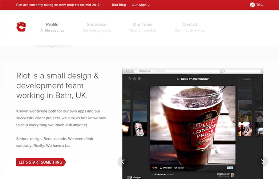
Riot
Very nice clean looking design. I love how the "out apps" is used to slide down from the topmost header area. It's a tight design all the way through too. Great looking work.
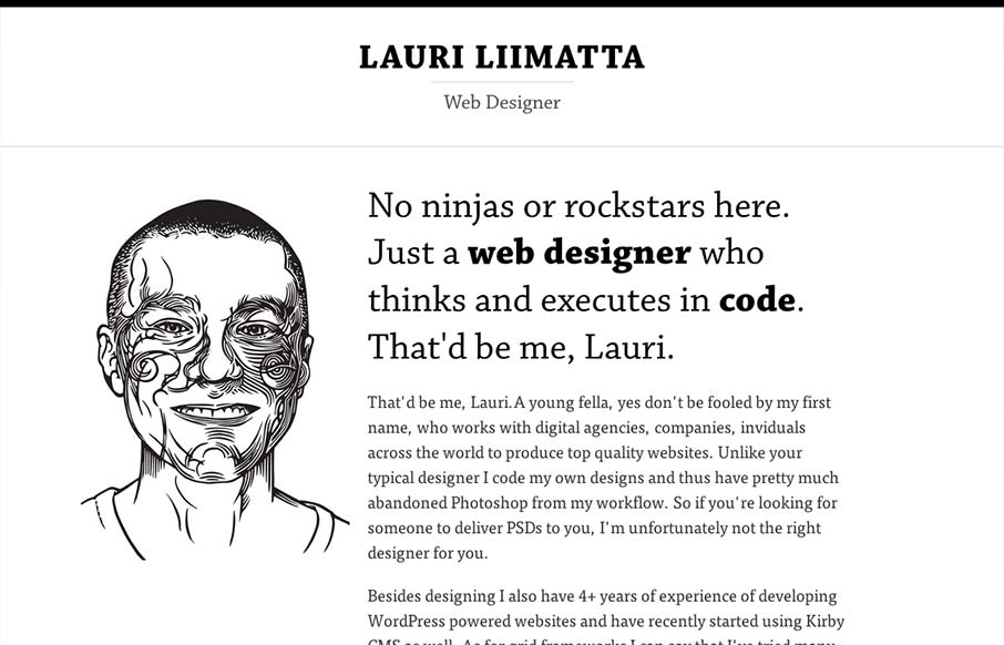
Lauri Liimatta
Submitted by: Lauri Liimatta @laurilii Role: Designer & Developer My new redesigned portfolio. Responsive design and powered by Kirby CMS. I like the design approach of going light to dark from top to bottom, or light to dense visually. However you want to look at it....
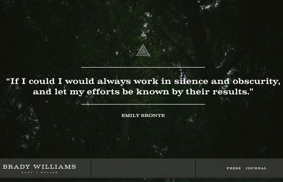
Brady Williams
"Brady Williams, a chef in Dallas, TX, shows his craftsmanship and passion for the culinary arts in this elegantly simple website. Personal sites tend to focus on the maker first, and the things created second. Not so here. Brady shows his passion, he doesn't have to...
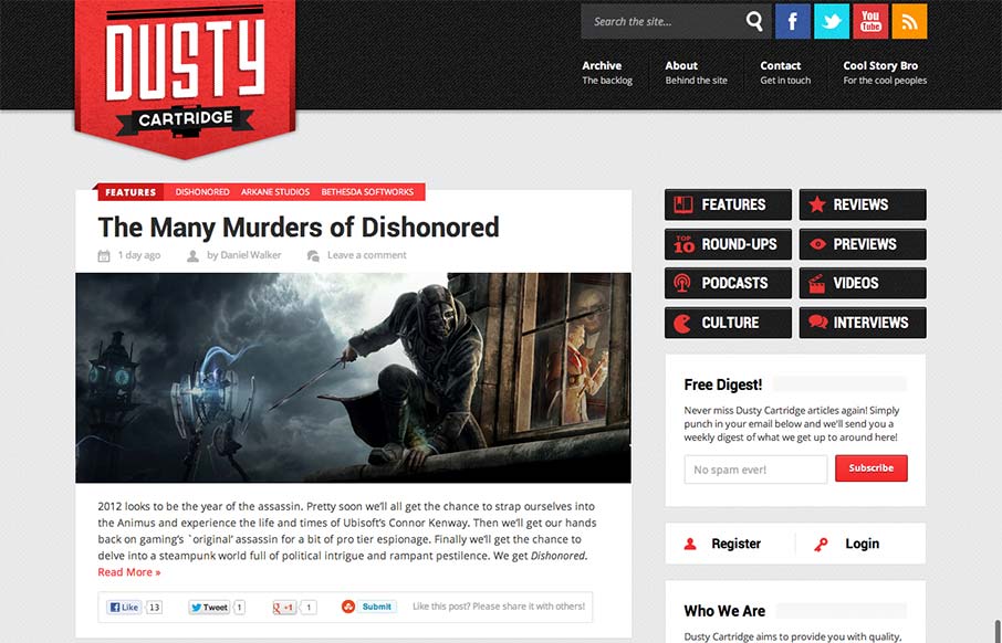
Dusty Cartridge
I like the blocky type design of this blog. It looks like it may be a theme but that doesn't take away from it being a nice design. The logo is bold and the nav matches it in simplicity visually. Nice responsive layout too.
Haatch
Interesting single pager. Chock full of bright colors and solid looking illustrations/icons. I like the fixed nav on the left, it's a nav design i've seen before but it just looks like it fits here better than others. There are some sections where the black text on...
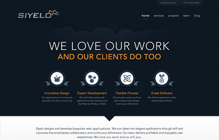
Siyelo
I like the contrast between the dark background in the top half and the white in the bottom half. It's a nice responsive layout too, check out how those main 4 icon/sections change when targeting different screen widths yo. I also really dig how there is consistency...
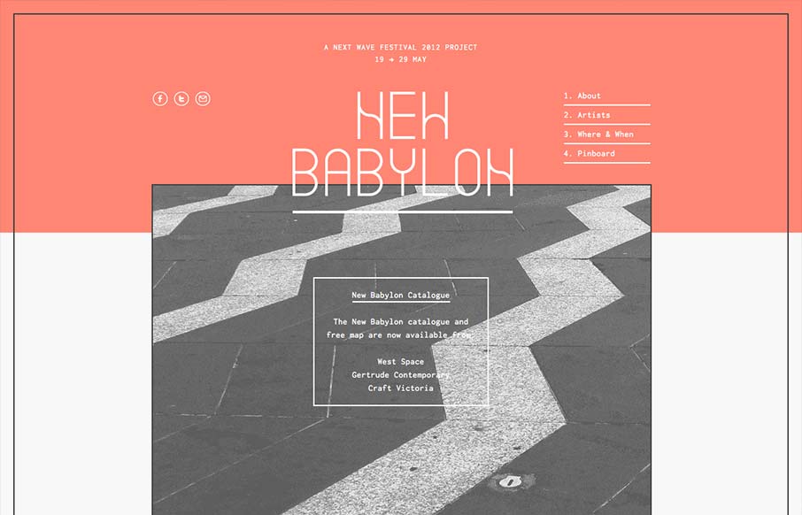
New Babylon
I like the way the lines used in this design and the big blocks of color or no color work together. Even into the type it feels unified yet unbalanced. Rich yet minimal that's how i'd describe this design. Lovely.
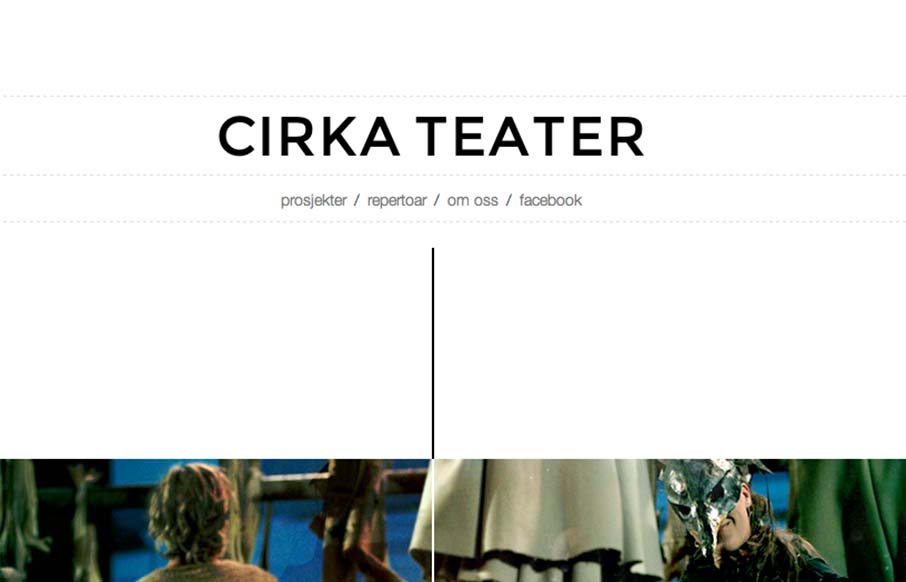
Cirka Theater
Cool vibe to this scroller website. I really dig how there's a slight parallax thing going on with the show sections/images, it really helps give it some depth interaction wise. The flip over effect on the lightbox windows for the show details is unexpected yet fun....
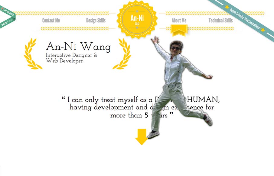
An-Ni Wang
This website represents a great mixture of going too far yet being minimal (almost) at the same time. I love the humor built in and the movement as you scroll down the page. It's hard to take in some of the content with all the movement but I think the fun approach...
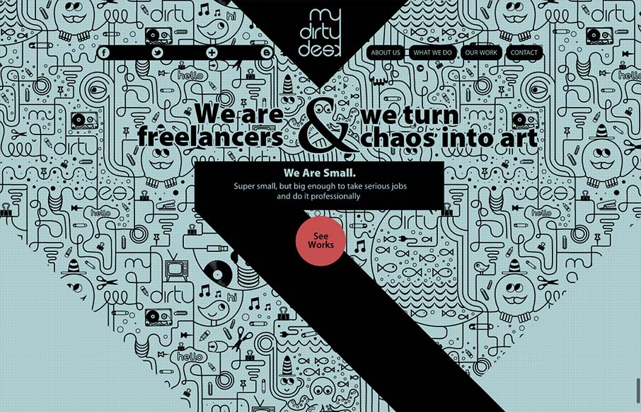
My Dirty Desk
This site design is all about the scroll. By engineering the design and illustration layout to work so well with the scrolling of the page it's just turned into a great experience visually. I scrolled around on this thing for a good 5 or 10 minutes too, lovely work...
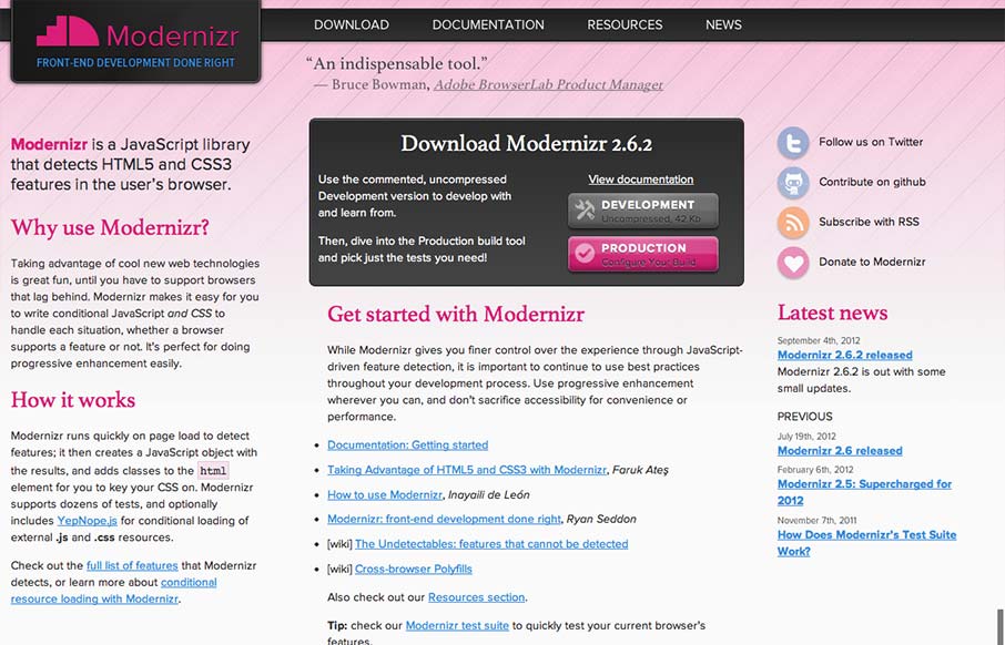
Modernizr
I gave Modernizr․com a small facelift: faster, less finicky, clearer intro text. Enjoy! modernizr.com— Faruk Ateş (@KuraFire) July 20, 2012 Been meaning to put the Modernizr site in the gallery for a while now. Faruk does a great job keeping the site alive...
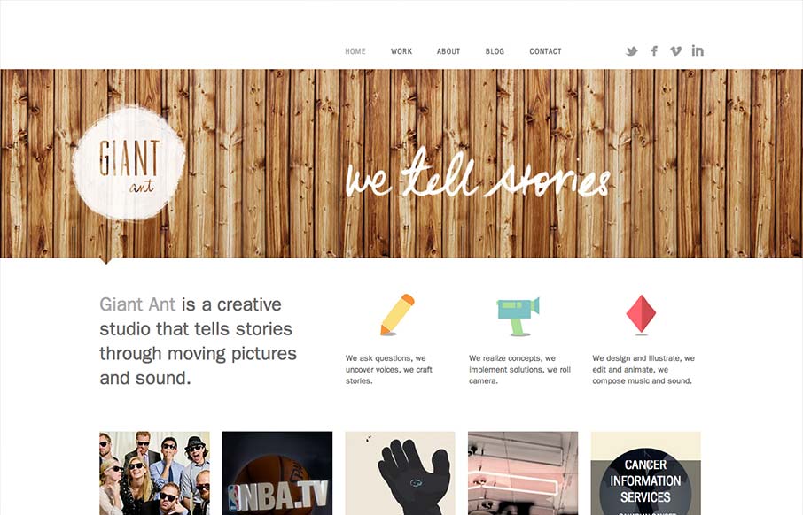
Giant Ant
Nice simple and effective website design, it does what it needs to do and packs it in with a clear yet dense layout. I like the way these guys are selling themselves as a "storytelling" agency, that's a fun and compelling message to me. Love the wood background for...
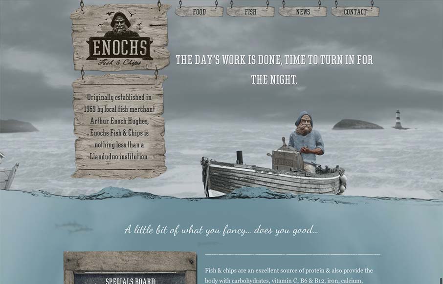
Enochs
An unexpected responsive design here. It's one of a few sites i've seen recently that takes a lot of the same RWD patterns and adds a layer of decoration on top of it (with the ship captain/fisherman theme) and pulls it off really well. I love the hook that takes you...
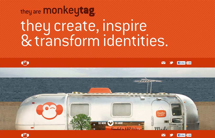
MonkeyTag
I like this website because it's not overly fancy. It has a strong graphic punch and some neat visuals that have been clearly crafted by hand, like the timeline section. It's a nice example of a website doing what it needs to do for you.
EMAIL NEWSLETTER
News & Articles
unmatchedstyle
RT @KISSmetrics: Top Ten Myths About Google Analytics - SEO Edition http://klck.me/5k #wa #ums
unmatchedstyle
A really big 1-page list of plugins & examples for jQuery http://jquerylist.com #ums
unmatchedstyle
Installing Ruby, Rails, and MySQL on Mac OS X with Macports. http://bit.ly/pMiDZ #ums

HARD WORK. CLEAN FUEL. NO EXCUSES
Use “WARRIOR2023″ for 10% off.