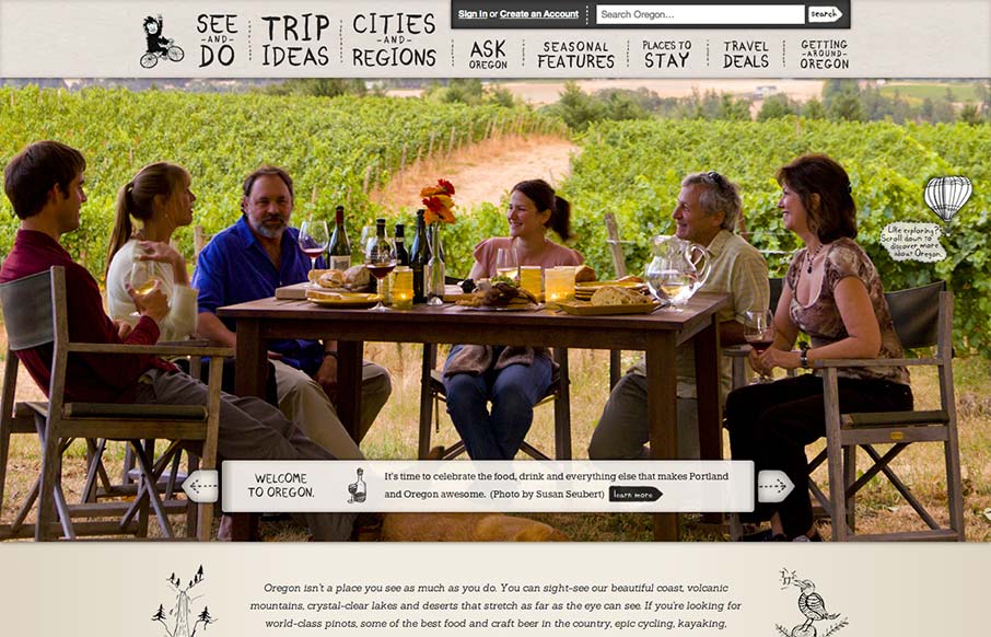
Oh man, I love this design. There’s so much going on here with the responsive design. The search box has some interesting changes across screen sizes, which is worth some study. I also really like how the main hero/slide show is done, where when you get down to the iPhone screen width you just get that static illustration for Oregon instead of it just going away. The navigation design is visually interesting with the mouseover designs, keeps you mousing around the nav too. Really really good stuff here. Dig in for a few on this one okay!
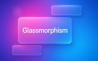
Glassmorphism: The Transparent Design Trend That Refuses to Fade
Glassmorphism brings transparency, depth, and light back into modern UI. Learn how this “frosted glass” design trend enhances hierarchy, focus, and atmosphere, plus how to implement it in CSS responsibly.


I love this design, but there’s a few technical flaws with it in terms of bandwidth for mobile devices (or slow connections). When the page is loaded on a mobile device, there is a lot of images which are loaded, but are never displayed (because they are hidden by media queries). It’s quite a bandwidth penalty and could make the site loading time quite slow on poor connections.
That said, the large hero images are loaded dynamically, so they aren’t even requested until the viewport is large enough to display them.
I like the site, and it has been made very well, I just wanted to provide a few technical criticisms.