Web Design Inspiration Curated
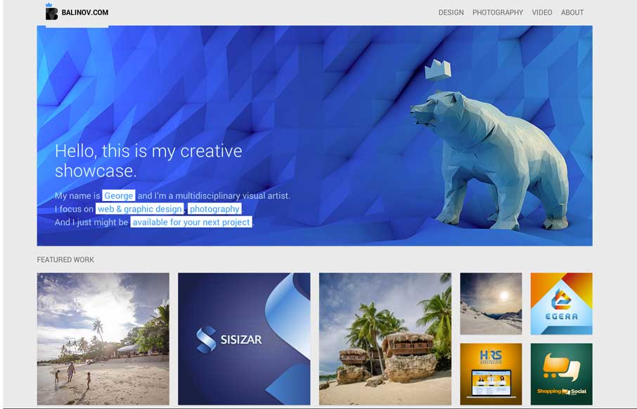
Balinov
Clever looking design. I like the Isotope interface piece and how it's used, in that the design isn't just based on using it. Beautiful work too.
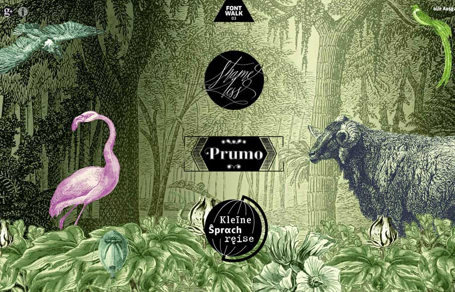
fontwalk.de
Really cool way to show off the fonts. It is almost indeed like taking a walk or a tour. Lovely.
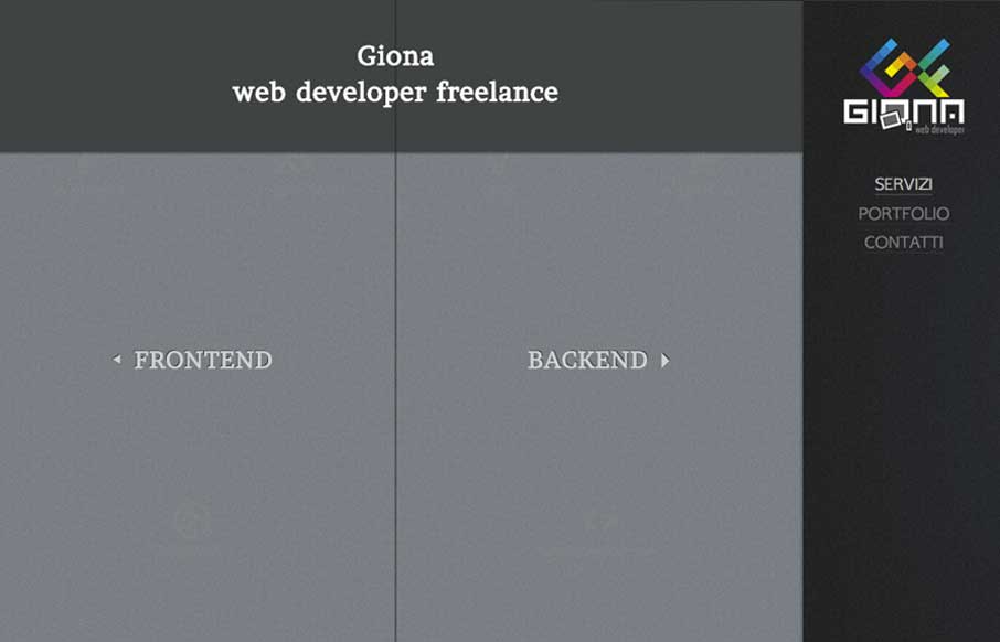
Gionaf
Really nifty interaction design. I like how the interactions allow you to play, the left and right sides of what this person can do are represented pretty well with this design too. It's also responsive which looks like it was a lot of work.
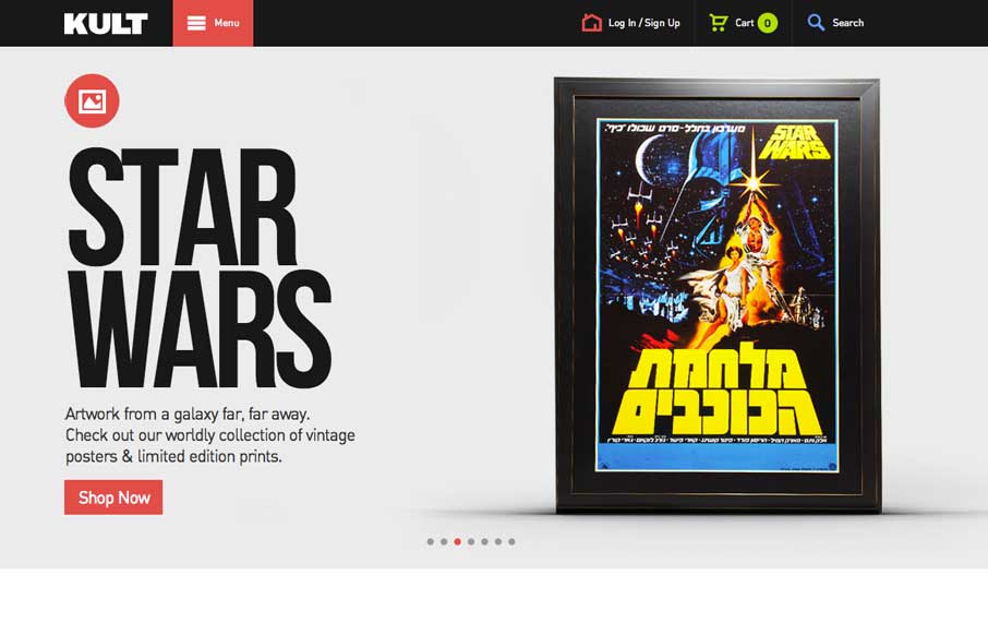
Kult
Good simple layout, just kind of a blocky and bold presentation of stuff. What's interesting to me is how when you interact with the menu it grays out the content, keeping you focused on the menu navigation itself. What do you guys think of that?
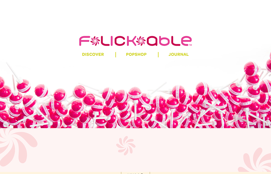
Flickable
You don't see too many "fashion" sites that are decently done. If you have, please send 'em in to us. This one is of course over the top with all the "pop" stuff but it is well done. It's responsive, and has some nifty interactions when you scroll to make it...
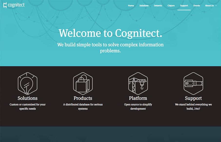
Cognitect
Pretty slick looking design. I love the colors and illustration work a lot. I also really dig the interactions/animations on the main marquee blocks - those are just great. Overall a really great and simple experience picked up by some clever illustration and...
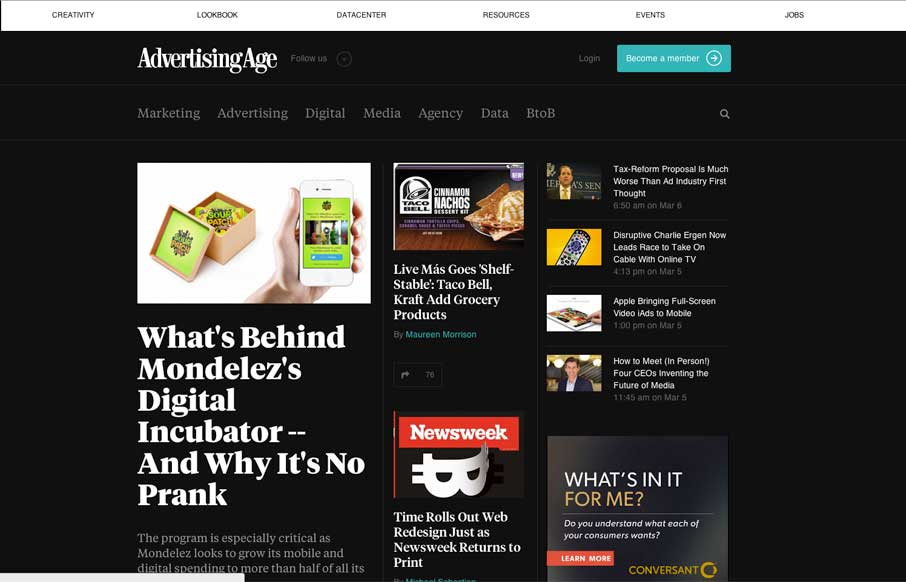
Ad Age
I dig the new Ad Age website. I like the top section that has the black background and how it uses that section for featured content. As you make your way down the page there's some nice "sectioning" of specific styles of content. I love how the header section changes...
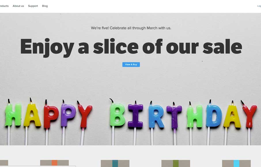
Five Simple Steps
The Five Simple Steps isn't one of those sites that has tons of interactions and moving elements. But the design is simple and effective. I really like how the main hero image/area isn't just a big JPG, that'd be lazy, they add the extra effort and make the text...
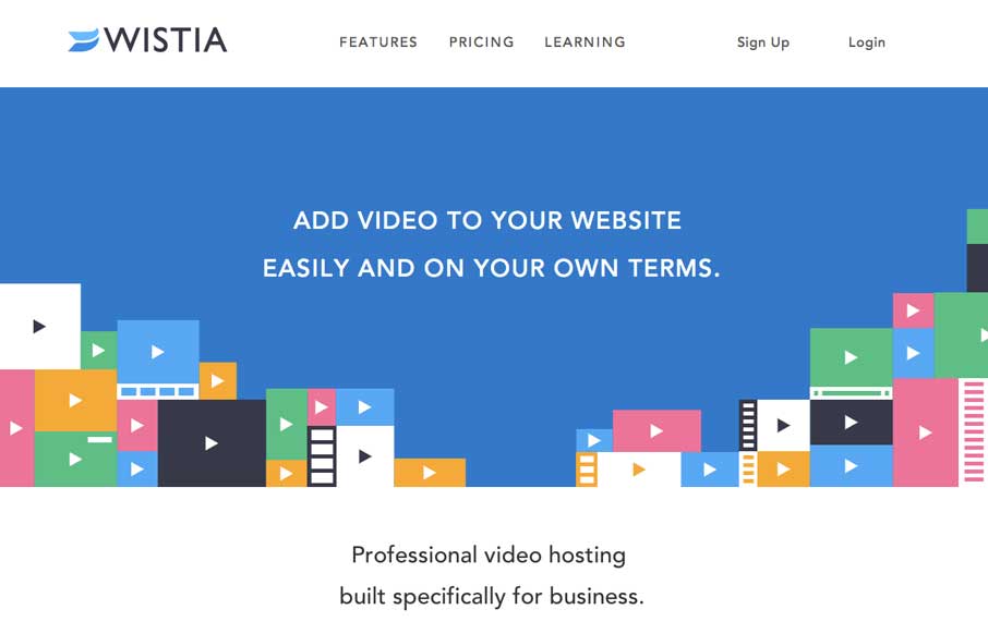
Wistia
This is a great example of how you can use a simple game like experience to create something memorable. Go ahead, click the colored boxes, they "pop" like one of those addicting games on your phone. The overall website experience is superb for a product/company site...
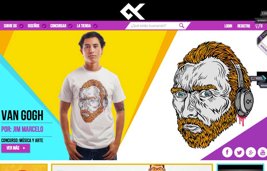
OX
Great design and vibe throughout this site design. I like the transitions between screen widths too. Loud coloring to help push the products as well as bold previews of the artwork itself.
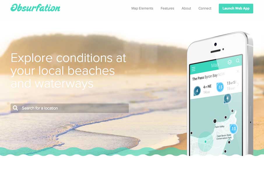
Obsurfation
I'm not a surfer, nor live near an ocean, but if I did i'd use this app just because of the website. I love the slight animation of the waves and the little mouse interactions here and there.
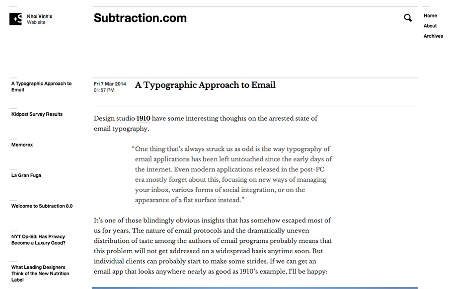
Subtraction
New site design for Subtraction, which is Khoi Vinh's personal website. Know to be pretty prolific in writing posts i've been a visitor to his blog for years. The new site follows the same basic form that the old one did with the black and white treatment and lines....
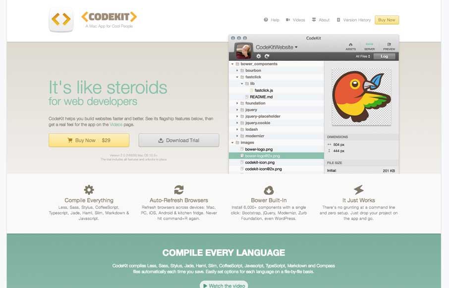
CodeKit
The CodeKit page/site is one of the better product pages i've seen. Plenty of good design down the page, animation, funny little sections and a superb overview of the guts of the app itself.
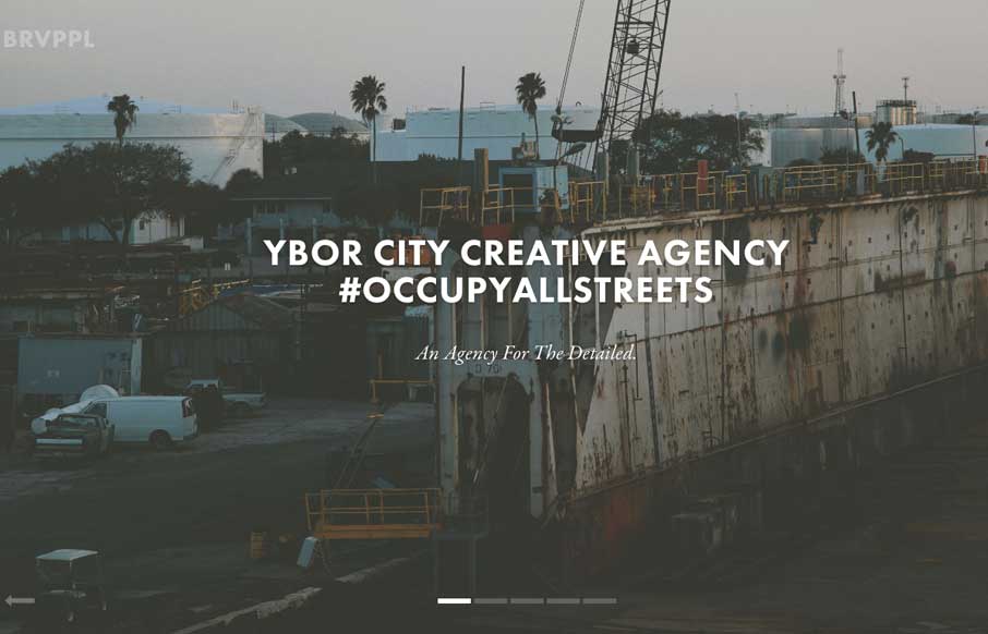
Brave People
Nice slick feel to the design. I like the soft almost washed out colors, almost black and white feel to the design. Things move well and the rhythm is good as you make your way down the page. I also really dig the plan a project form.
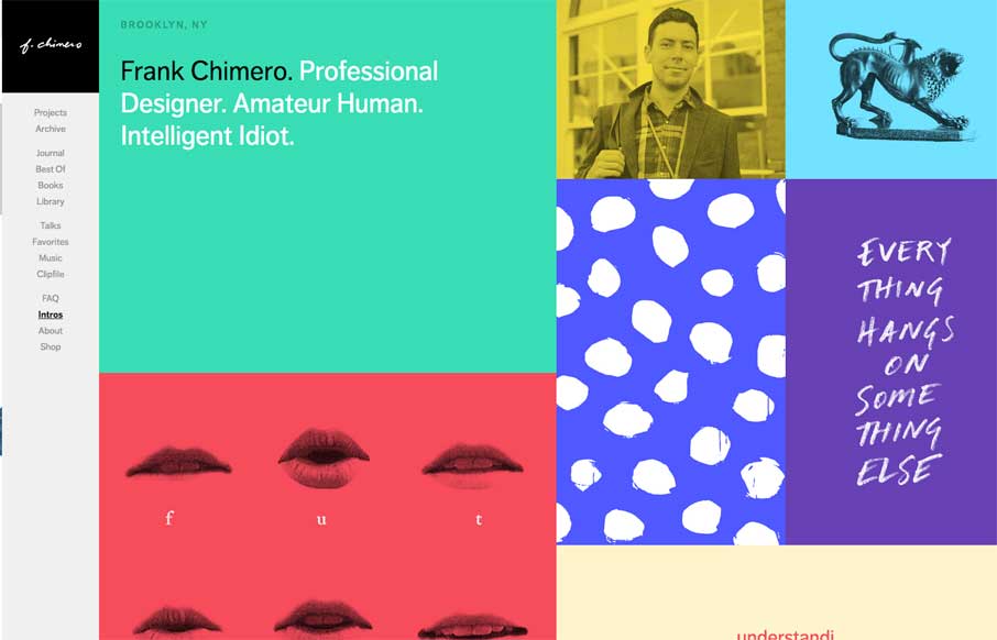
Frank Chimero
The latest version of Frank Chimero's personal website is just great. I love that it's largely traditional in that the nav is just there on the left, in text form, for anyone to see and click. It's this kind of understated beauty that reminds me why I love what I do....
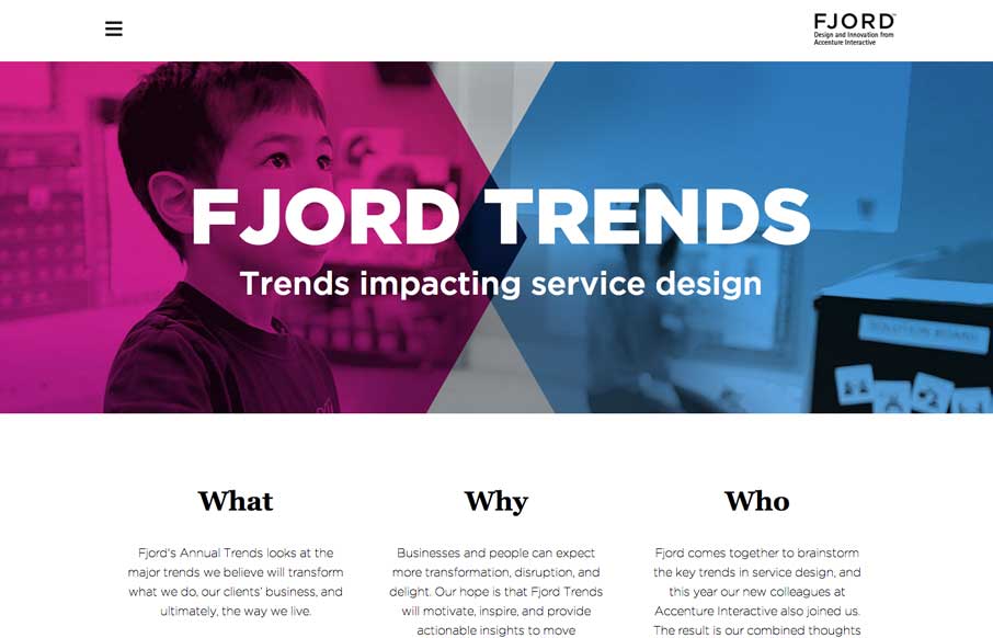
Fjord Trends
What a great reading experience the Fjord Trends site turns out to be. Both on the desktop and your mobile device. I love how the stories flow with nice bold blocks of imagery then "fold" out so you can read them right there. The tracking nav on the right side (when...
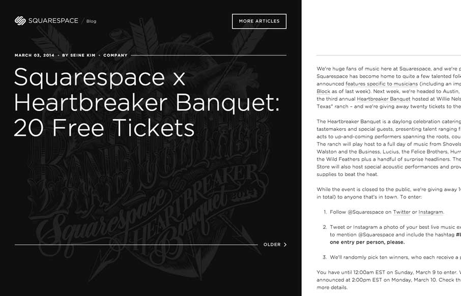
Squarespace Blog
The Squarespace Blog is very simple at first glance. Keeping all the relevant content for the post (or most recent post) front and center. You can slide open a list of past posts, that have nice little hover effects of the images. On the right is the now standard...
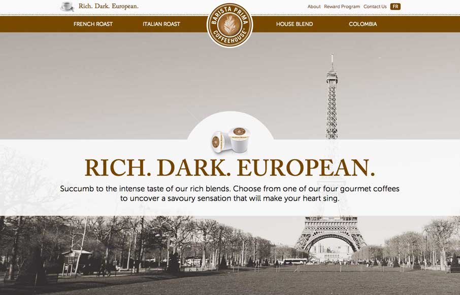
Barista Prima
So... as soon as I saw this site, I fired up the Keurig. The black, white, gray and coffee brown immediately put me in a mood to enjoy coffee. The entire site is centered around the brand's tagline: "Rich. Dark. European." The background images, the parallax effects,...
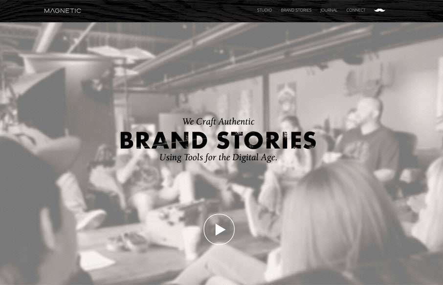
Magnetic
Really cool looking mix of tight straight edges and hand made type treatments, mixed with the sepia colored imagery. This site has a nice hand made feel but also very high end. The slight movement of the images behind the type overlays add that extra little dimension...
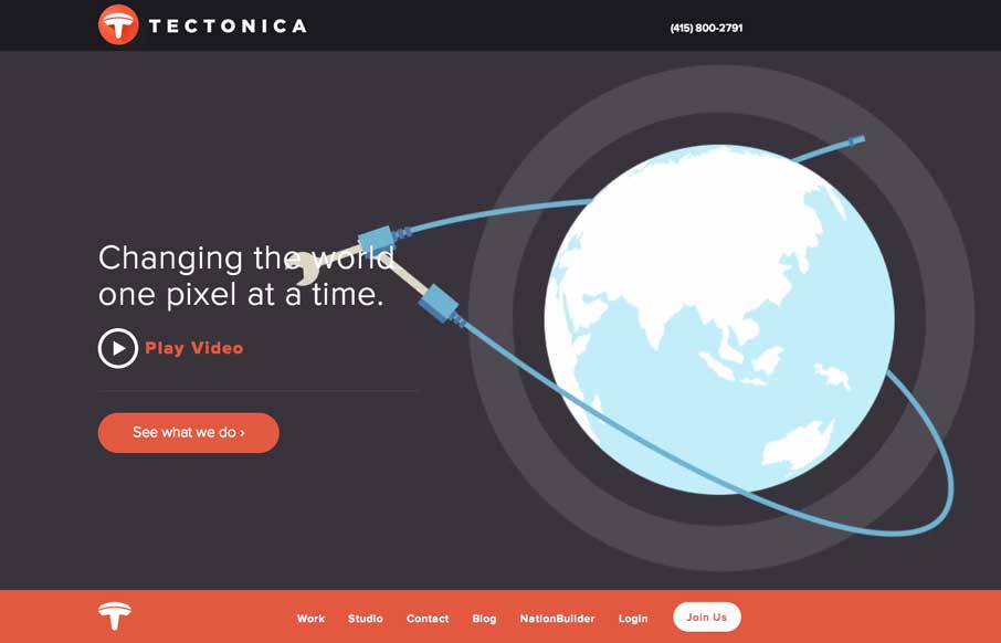
Tectonica
Engaging illustrative website. There's also plenty of interaction stuff happening on the home page to keep you interested. The thing I like most is that it's not intrusive at all. You can engage with it by continuing to scroll or not. The look and feel of the site is...
EMAIL NEWSLETTER
News & Articles
Chat Session with Ryan Carson
Discussing membership.thinkvitamin.com, how it came about, the future of it’s brand and other things Carsonified.
An Event Apart Atlanta with Eric Meyer

Talking with Eric Meyer about An Event Apart coming back to Atlanta, how the conference started and some tips for first time talks.
Microcopy – Why is it so important?
A deep dive into microcopy, what it is, good examples and some great stories to get you thinking about it.

HARD WORK. CLEAN FUEL. NO EXCUSES
Use “WARRIOR2023″ for 10% off.