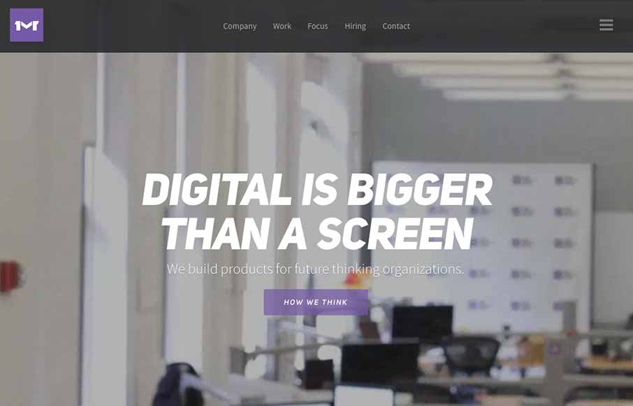
I like the first pass minimal look to the One Mighty Roar website. However once you start to click through the site you find that the pages are lengthly and deep with content and imagery. I also like how they’ve used the hamburger icon to show you what’s beyond the main navigation links instead of just to hide the nav to keep it more minimal feeling.


The Call to Action, Revisited
The Call to Action hasn’t changed in a decade, but the bar has. A fresh look at prominence, copy, mobile tap targets, and accessibility, with lessons from three major design systems.


0 Comments